Distribution by Design: How AI Products Engineer Their Own Virality in 2026
The AI products of 2026 do not buy ads, they engineer share loops directly into the product surface. Five distribution-by-design patterns from Cluely, Granola, Cursor, Linear, Vercel, Claude.ai, Perplexity, Notion AI, and v0, plus the cautionary tale of every enterprise SaaS that bolted social on at the end.
The AI products winning in 2026 stopped buying ads. They engineered share loops into the product surface, and the design team owns those loops. Cluely's overlay, Granola's transcript pages, Cursor's "share this thread" export, Linear's bug reports, Vercel's deploy-and-tweet flow, Claude.ai's shareable conversations, Perplexity's research links, Notion AI's blocks, Lovable's preview pages, and v0's component playgrounds are not marketing surfaces, they are the product. The screenshot is the ad unit. The first thirty seconds is the demo. The output is the share.
The cautionary tale is every enterprise SaaS that shipped a "tweet this" button on the export modal in 2024 and watched the click-through stay near zero. Bolted-on social does not work. The shareable moment has to be the core flow, not a flourish bolted on the end. This piece is the operating manual: five patterns, named products shipping each one, the cautionary contrast, and a pre-ship checklist.
Distribution is now a design problem, not a marketing one
In a SaaS world, distribution lived downstream of the product, filled by a brand site, a launch post, and a paid acquisition budget. In an AI world that gap collapses. The product is the brand site, the launch post, and the acquisition channel.
The reason is the artifact. AI products generate outputs that travel: a Cursor thread, a Granola summary, a Perplexity answer, a v0 component, a Claude.ai conversation, a Lovable preview. Every one is social currency that pulls a stranger back to the source if the source designed it that way. The product team that owns the output owns the distribution. The same posture sits underneath the broader AI-native product design shift, where the model is the product and the surface is the brand.
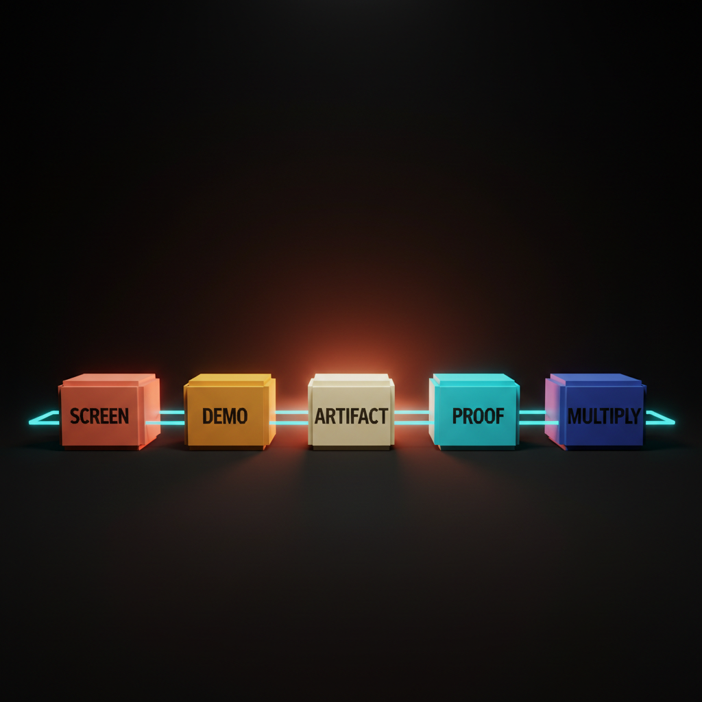
The five patterns of distribution by design
Screenshottable surfaces, demo-friendly first thirty seconds, copy-pasteable artifacts, built-in social proof, and share-multiplier outputs. Every AI product worth studying ships some combination of these five.
The patterns are a posture, not a checklist. A team that designs every screen as a share surface from day one will arrive at most of these. A team that bolts social onto a finished product in the launch sprint will fail all of them.
The gap between those two postures is what separates Cluely from any productivity tool with a share menu.
Screenshottable surfaces are the new ad unit
Every screen has to be designed as if a stranger will see it cropped on a timeline. Most products fail this because the team designed for the user inside the app, not the stranger seeing a thumbnail in a feed.
Screenshottable means three things. Visual hierarchy strong enough to read at thumbnail size. One anchor element that survives the crop. Brand baked in so the screenshot is traceable back to the product. Cluely's overlay composes as one self-contained share. Granola's augmented-notes view does the same. Cursor's diff view is more legible cropped than any IDE shipped before it. Linear's bug reports ship as composed share surfaces with project, status, and assignee visible.
The fix is not a "share screenshot" button, it is composing every screen so the screenshot was ready before the button existed. The same visual hierarchy discipline that drives a strong landing page drives a strong product screenshot.
The first thirty seconds is the marketing video
Demo-friendly UI means the first thirty seconds of using the product is the marketing video future users will see in a tweet. Not the onboarding modal, not the welcome tour, the actual first thirty seconds of the user doing the thing the product is for.
The test: open cold, complete the primary task, record the screen, watch it back silent. Is the value visible inside thirty seconds? Cluely passes in five seconds. Granola passes the moment a meeting starts. v0 passes because typing a prompt produces a working component before the user finishes scrolling. Lovable passes because the app builds itself on screen. Arc Search passes on the first "Browse for me" tap.
The fix for products that fail is not editing the launch trailer, it is redesigning the cold open until the value lands inside thirty seconds without narration. The same discipline drives AI product onboarding, where the first interaction delivers value before the user has invested setup time.
Copy-pasteable artifacts travel further than links
The artifact is the unit of distribution. The output has to be copyable, pasteable, and shareable as a standalone object. Notion AI's blocks paste across products. Claude.ai's shareable conversations paste into anything supporting link previews. Perplexity's research links travel as citation packets with the answer, sources, and trust loop. v0's playgrounds are copy-pasteable into any IDE. Cursor's "share this thread" exports a fully-rendered page with code, diffs, and model context preserved.
A link to a tool is dead in feeds. A link to a specific output, pre-rendered with the source baked in, travels on its own merits. Products that ship artifacts as walled-garden objects (only viewable inside the app, only if logged in, only if the recipient signs up) are killing their own distribution. Ship every output as if it will leave the product. Add the source link. Add the brand mark. Add the remix path.
Built-in social proof beats a logo wall
Social proof shipped inside the product surface beats a logo wall on a marketing site every time. Linear surfaces real customer logos where teams browse public roadmaps. Vercel's deploy success state surfaces deploy counts inline as the user ships. v0 surfaces remixable templates with the original creator credited at the moment the user starts a project. Cursor's onboarding surfaces named companies whose engineers use the product daily as part of the actual flow.
The proof appears at the moment of trust friction, not on a separate page nobody reads. A user about to ship their first deploy sees the deploy count rolling. A user starting a project sees real templates from named creators. Relocate the proof into the surface at the moments the user is deciding whether to trust the next step. That is a design move, not a copy move.
Want a product where every screen is a share surface and the first thirty seconds is the marketing video? Hire Brainy. UXBrainy ships distribution-by-design audits. AppBrainy ships AI product UI built around screenshottable flows and share-multiplier outputs. BrandBrainy ships the visual system that makes every screenshot read as your brand on a stranger's timeline.
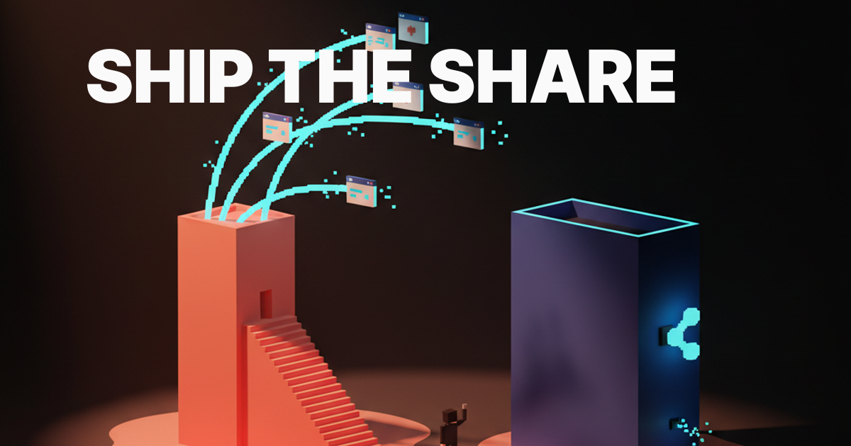
Share-multiplier outputs do the marketing for you
Share-multiplier means the product generates a tweet-sized, screenshot-ready, link-back artifact every time the user finishes a task. One task in, many shares out. Granola auto-generates tweet-length summaries the user copies into a feed. Cursor exports code playgrounds as standalone shareable surfaces. Vercel's deploy success page is a one-tap "tweet this deploy" with URL, brand, and metrics pre-composed. Perplexity's "share answer" produces a full-fidelity recreation with citations. Lovable's preview links ship with custom OG images.
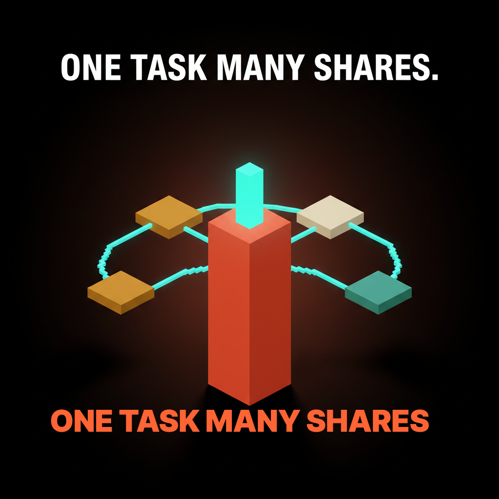
If one task produces three shareable artifacts at fifteen percent share rate each, every task has roughly a thirty-eight percent chance of generating at least one share. If the product asked the user to write a tweet manually, the rate sits closer to two percent. The multiplier closes the gap, shipped at the artifact layer.
Identify the moment the user finishes a task, then ship two or three pre-composed artifacts. A summary tweet. A screenshot card. A link with a custom preview. The user picks the format, the product captures the share, the loop closes.
The bolted-on social pattern is the new chat sidebar
For every product engineering distribution into the design, there is an enterprise SaaS that bolted a "tweet this" button onto the export modal in 2024 and is wondering why the click-through is near zero.
The shape is familiar. A finished product. A final-step modal asking the user to share to LinkedIn or Twitter. A sparse pre-filled message with a tracking link. A "share intent" metric nobody trusts. The user closes the modal. The product team reads that as the user choosing not to share, when the actual signal is that the share moment was bolted onto the exit, not designed into the flow. Compare to Cluely, where the share moment is the moment the overlay appears, or Granola, where the tweet-length summary is the artifact the user already wants to send.
The fix is the same shape as the chat-sidebar fix in AI-native product design: kill the bolt-on, redesign the primary flow so the share is the natural output of finishing the task.
Design the screenshot first, then design the product around it
The new operating rule for 2026 is that the screenshot is upstream of the screen. Design the screenshot first, then design the product around it.
The design review starts with one question: what does a stranger see if they encounter this screen as a cropped image in a feed with no context? Mock the screenshot before the screen. Pick the anchor element, the brand cues, the legibility at thumbnail size, then design the rest of the surface to support that crop. The screenshot is what most future users will see before they ever open the app.
The same rule applies down the stack. Design the demo before the onboarding. Design the artifact before the export flow. Design the proof surface before testimonial collection. Design the multiplier output before the task completion screen. Distribution sits upstream of product surface in every case. The same constraint shows up in designing for AI latency, where the rhythm of the response shapes the moment the user wants to share.
The pre-ship distribution checklist
Run this before any AI product launches.
- Screenshot crop test. Crop every primary screen to a phone aspect ratio at thumbnail size in a feed mockup. Is the value visible? The brand? Is the surface composed for the crop, or noisy chrome?
- First thirty seconds test. Record the cold open of a new user completing the primary task. Watch silent. Does the value land inside thirty seconds? If not, the cold open needs a redesign, not a tutorial.
- Copy-pasteable artifact audit. List every output. Can each be copied, pasted, and shared as a standalone object with the source baked in? If not, the artifact is walled.
- Built-in social proof inventory. List every moment of trust friction (first deploy, first task, first invite). Is the proof inside the surface, or on a separate marketing page?
- Share-multiplier check. At task completion, count pre-composed shareable artifacts. One (a share modal) or zero means the multiplier is missing.
- Bolted-on social audit. Count the "tweet this" buttons and exit-flow share prompts. If they are not the natural output of the user's task, kill them and redesign the task to produce the share.
- Brand-on-screenshot check. For every postable screen, is the brand visible without effort? Not a watermark, an integrated cue that survives the crop.
- Demo-without-narration test. Show the first thirty seconds to a non-user with sound off. Can they describe what the product does? Muted auto-play is the most common consumption pattern.
- Distribution ownership test. Ask: who owns the share loop? If the answer is the marketing team, the loop is bolted-on.
A product that passes those nine checks is genuinely distribution-by-design. A product that fails most will spend the launch budget chasing CAC that will not stay paid.
FAQ
What does product distribution design mean?
The product itself is the distribution channel, not a downstream surface a marketing team retrofits. The product ships screenshottable surfaces, a demo-friendly first thirty seconds, copy-pasteable artifacts, built-in social proof, and share-multiplier outputs. Cluely, Granola, Cursor, Linear, Vercel, Claude.ai, Perplexity, Notion AI, Lovable, v0, and Arc Search ship some combination of these five.
How do you design for distribution?
Design the screenshot first, then design the product around it. Start the design review with: what does a stranger see if they encounter this screen as a cropped image in a feed with no context? Pick the anchor element, brand cues, and thumbnail-size legibility before designing the rest of the surface. Apply the same posture to the demo recording, the artifact, the proof, and the multiplier output.
What is viral product design in 2026?
Engineering share loops directly into the product surface rather than buying ads. The five operating patterns are screenshottable surfaces, demo-friendly cold opens, copy-pasteable artifacts, built-in social proof, and share-multiplier outputs. Cluely, Granola, Cursor, Vercel, Claude.ai, and Perplexity are the cleanest examples.
What makes a product screenshottable?
Three properties. Visual hierarchy strong enough to read at thumbnail size. One anchor element that survives the crop. Brand cues integrated so the screenshot is traceable back to the product. Cluely's overlay, Granola's transcript pages, Cursor's diff view, and Linear's bug report all pass.
How do AI products go viral without ads?
The output is the ad. The first thirty seconds is the demo. The artifact is the share. The proof is inside the surface. The multiplier produces multiple shareable artifacts per task. Every loop is owned by the design team. Marketing-led distribution sits on top of these loops, not in place of them.
The shift distribution by design actually unlocks
Distribution by design is a structural decision about who owns virality inside an AI company. In 2026 that owner is the design team. The product surface is the share surface. The output is the ad. The brand on the screenshot is the marketing site.
The brands shipping this (Cluely, Granola, Cursor, Linear, Vercel, Claude.ai, Perplexity, Notion AI, Lovable, v0, Arc Search) did not bolt social onto a product, they designed the product as a distribution surface. Users no longer find products through ads, they find them through screenshots, threads, and artifacts shared by other users. Products built for the old model will feel slow and expensive within two years. Products built for the new model will feel inevitable.
If your team is shipping an AI product or trying to figure out why the loops are not closing, the patterns on this page are the operating manual. Hire Brainy. UXBrainy ships distribution-by-design audits. AppBrainy ships AI product UI where every screen is a share surface. BrandBrainy ships the visual system that makes every screenshot read as your brand on a stranger's timeline.
Want a product where every screen is a share surface and the first thirty seconds is the marketing video? Brainy ships UXBrainy for distribution-by-design strategy and audits, AppBrainy for full AI product UI built around screenshottable flows, and BrandBrainy for the visual system that makes every screenshot read as your brand on a stranger's timeline.
Get Started