Appointment Booking App Design: A Doctor Booking Screen, Before and After
A doctor booking screen that shows a whole month and sixteen identical time chips, and the same screen fixed: the doctor first, a seven day strip, times grouped by morning and afternoon, and the time inside the button. Every change side by side, with the free Figma file.
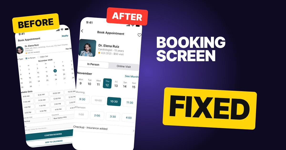
A booking screen has one job: get a person from "I need to see this doctor" to a confirmed time. The first draft below can book the visit, but it spends most of the screen on a whole month and sixteen identical time chips, shrinks the doctor to a small circle, and ends on three equal buttons in caps. The person wants a time. The screen shows them a calendar.
The fix keeps every function and changes what comes first: the doctor, then a week, then the times, then one button that says what will happen.
The whole screen, before and after
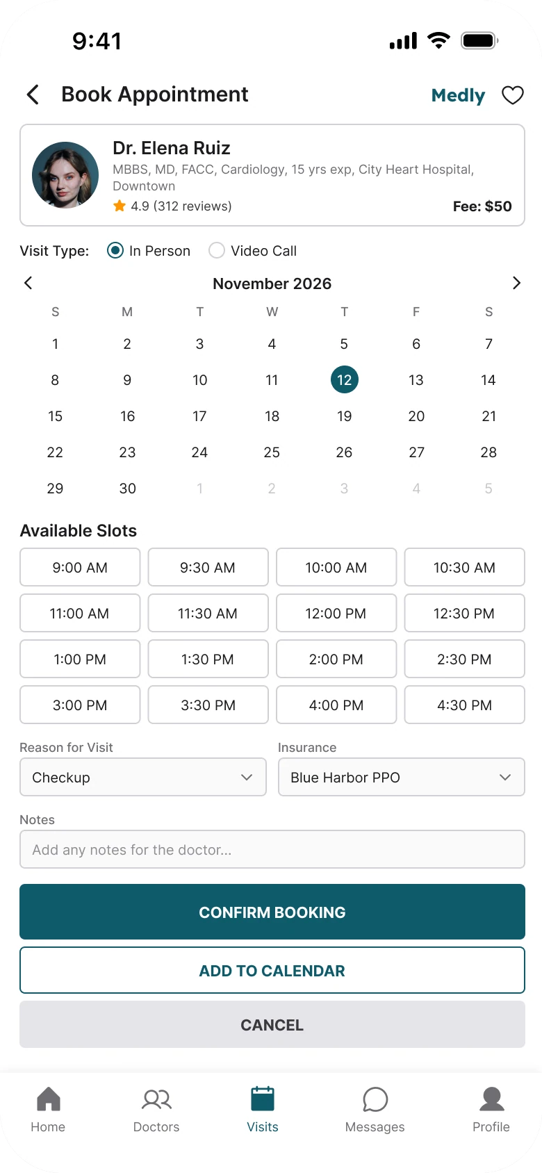
Junior draft
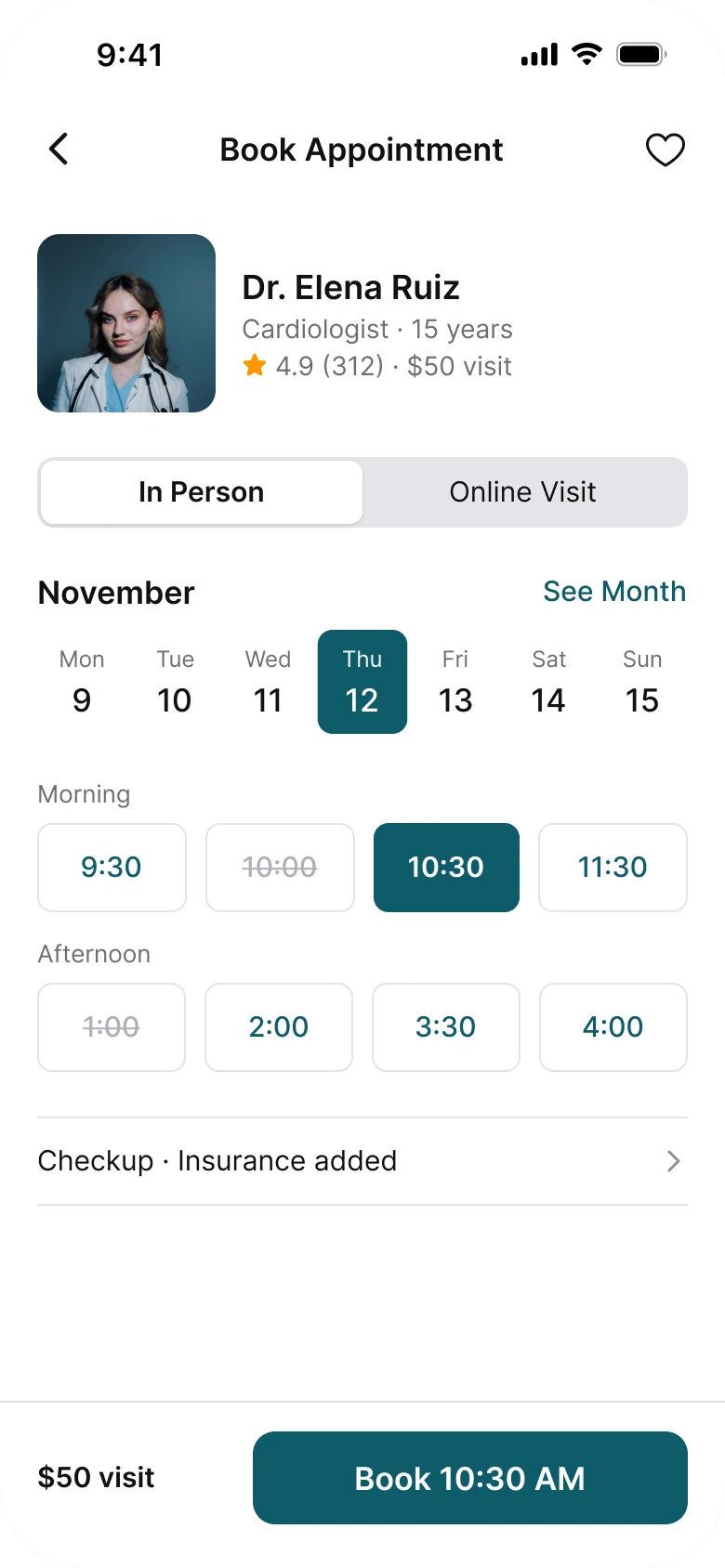
Fixed
On the left, everything is the same size. The calendar, the slots, the dropdowns and the notes field all get the same thin outline and the same 10 to 12 px text, so the eye has no order to follow. The one thing the person came for, a time that works, is one chip among sixteen.
On the right, the screen reads top to bottom as the questions a person asks: who is it, which day, which time, how much, and go. Deep teal appears only on what is selected and on the button, so the color tells you what you have chosen.
What changed, measured
| Junior draft | Fixed | |
|---|---|---|
| Doctor | 48 px avatar, 9 px credentials line | 96 px photo, whole head with room around it, text 12 to 28 px |
| Date | A five week month at 10 px | A flat strip of seven days, selected day at radius 8 |
| Times | Sixteen outlined chips at 10 px | Eight chips in two groups, four columns, 48 px tall |
| Taken times | Not shown | Crossed out, so a gap reads as a gap |
| Visit type | Two radio buttons at 12 px | An iOS style segmented control |
| Extras | Reason, insurance and notes always open | One row: "Checkup · Insurance added" |
| Action | Three equal stacked buttons in caps | One 50 px button with the time in it |
| Price | "Fee: $50" in the doctor card | "$50 visit" beside the button |
| Tab bar | Five tabs | None, because this is a task screen |
| Margins | 14 left, 12 right | 20 on both sides |
Fix 1: lead with the doctor
Before
After
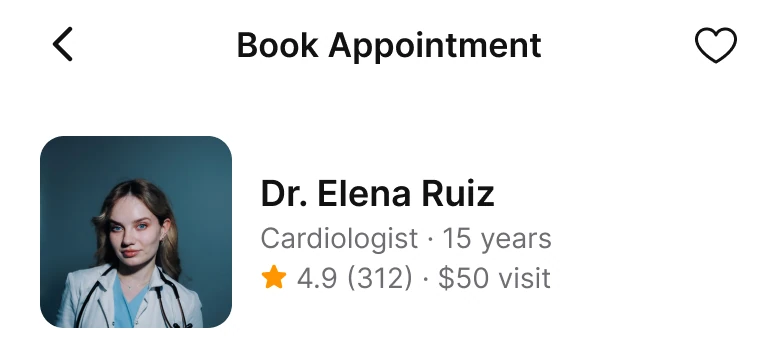
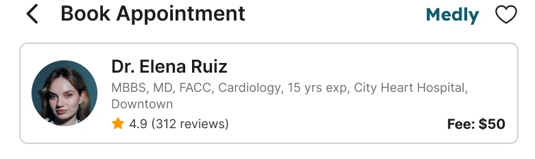
A header with Book Appointment, a Medly wordmark and a heart above a boxed card with a 48 px round photo and a line reading MBBS, MD, FACC, Cardiology, 15 yrs exp, City Heart Hospital, Downtown, with the rating and Fee: $50 under it, against a header with a back arrow, a centered title and a heart, and a row with a 96 px photo, Dr. Elena Ruiz, Cardiologist · 15 years, and a star with 4.9 (312) · $50 visit.
People choose a doctor partly by face. At 48 px, cropped to a circle, the photo shows a patch of hair. At 96 px with rounded corners, the whole head fits with room on every side, and the person can tell it is a real human being.
The credentials line was the other problem: it ran to two lines at 9 px, with five abbreviations and a hospital name. The fix says what a patient needs, "Cardiologist · 15 years", then the rating and the visit price in one line. The long credentials, the hospital and the reviews open when you tap the row.
The Medly wordmark left the screen because it sat on top of the photo area and added nothing here. The title and the heart stay.
Rule to reuse: show the person before the form, and let the long details live one tap away.
Fix 2: a week, not a month
Before
After
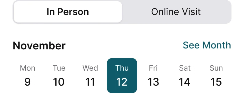
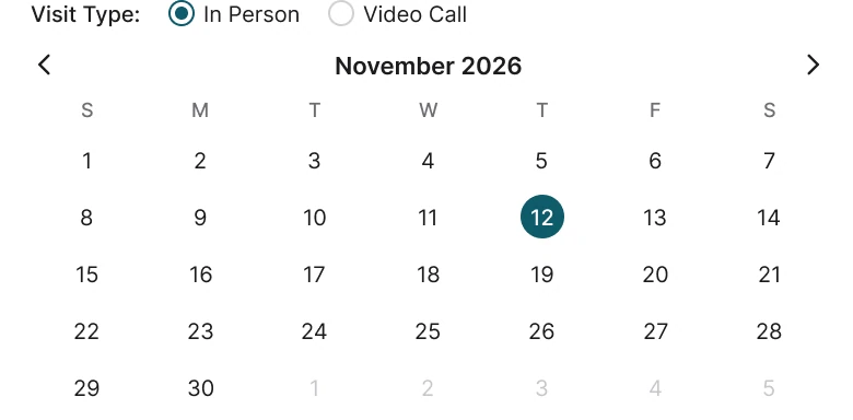
A Visit Type row with In Person and Video Call radios above a November 2026 month grid with arrows, a row of single letters and five rows of small numbers with the 12th in a small teal circle, against a segmented control reading In Person and Online Visit, the word November with See Month on the right, and a row of seven days, Mon 9 to Sun 15, with Thu 12 filled in deep teal.
A month grid answers "what day is it in November?", which is not what a booking screen asks. It spends about 166 px of a phone showing 35 small numbers, most of which the person will never tap, and then pushes the times below the fold.
A booking is usually for the next few days. A strip of seven shows the weekday name and the number together, so "Thu 12" needs no counting across a grid, and the selected day is a solid block you can see from arm's length. The full month is still there: See Month opens it.
Visit type became a segmented control, the same pattern iOS uses for two options. Two radio buttons at 12 px are hard to hit. Two halves of a control are easy.
Rule to reuse: show the range people book into, and let the rest sit behind a link.
Fix 3: group the times
Before
After
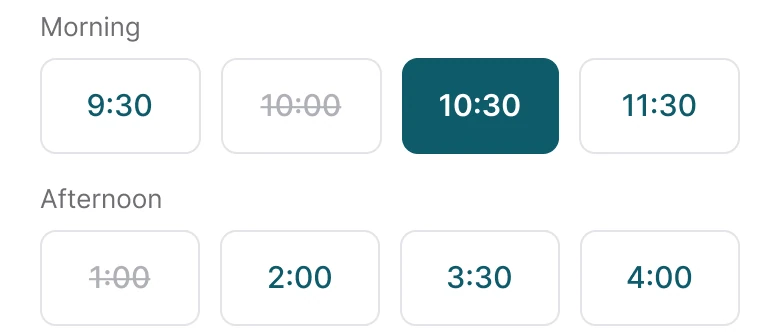
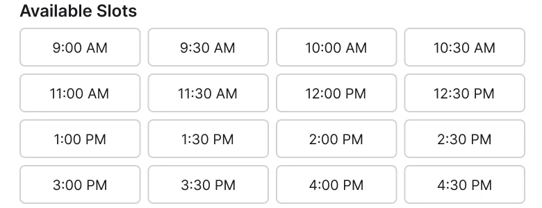
A heading Available Slots over a grid of sixteen identical outlined chips from 9:00 AM to 4:30 PM, in four rows, against two groups headed Morning and Afternoon, each a row of four 48 px chips, with 10:30 filled in deep teal and 10:00 and 1:00 crossed out.
Sixteen identical chips make the person read every one. Grouping them under Morning and Afternoon lets them skip half the list at once, because most people know which half of the day they can do. AM and PM labels drop out, since the group already says it.
Each chip is 48 px tall with a hairline border and radius 8, comfortably bigger than a fingertip. The chips were 28 px tall before. The taken times are crossed out instead of removed, so a missing slot reads as "someone has it" and not as a bug.
The other eight times are still there: they open from a later morning or afternoon pick, so the screen shows four per group and nothing is lost.
Rule to reuse: when a list is long and has a natural order, give it two or three headings.
Fix 4: put the time in the button
Before
After

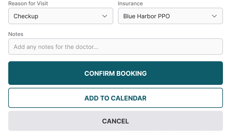
Reason for Visit and Insurance dropdowns and a Notes field above three full width buttons, a filled CONFIRM BOOKING, an outlined ADD TO CALENDAR and a gray CANCEL, against a flat bar with a hairline on top, $50 visit on the left and one deep teal button reading Book 10:30 AM on the right.
Three equal buttons in caps ask the person to decide again, after they have already decided. CANCEL is the worst of them: nothing has been booked yet, so there is nothing to cancel. The back arrow already does that.
The fix turns the final step into one button that repeats the choice, "Book 10:30 AM", with the price next to it. If the time on the button is wrong, the person sees it before tapping. The bar is sticky, so it stays in reach however long the page is, and it is a flat 96 px strip with a hairline, no shadow.
The other buttons found a better place. Add to Calendar belongs on the confirmation screen, after the booking exists. Reason, insurance and notes fold into one row, "Checkup · Insurance added", that opens a sheet.
Rule to reuse: name the outcome in the button, and move every other action to the moment it makes sense.
The smaller fixes
- Every function stays. The full month opens from See Month. Credentials, hospital and reviews open from the doctor row. Reason, insurance and notes open from the Reason row.
- The same facts on both screens. The doctor, the fee, the date and the selected time match, so you are comparing layout and nothing else.
- One accent color. Deep teal, #0F5B6B, marks the selected day, the selected time and the button, and nothing else.
- A white ground and 20 px margins. The draft used 14 on the left and 12 on the right. The fixed screen uses the same 20 on both sides and white behind everything, with hairlines instead of boxes.
- Text from 12 to 28 px. The draft ran from 9 to 15 px, with most of the screen at 10.
- No tab bar. Booking is a task. The five tabs take 72 px of height that the times need, and back returns to them.
Audit your own booking screen
| Question | Why it matters |
|---|---|
| Does the doctor have a face people can read? | People pick by trust before they pick by time |
| Is the date picker the size of the choice? | A month grid for a next-week visit hides the times |
| Are the times grouped? | Sixteen equal chips mean sixteen reads |
| Can you see which times are taken? | A crossed-out slot is a clear answer |
| Does the button say what will happen? | "Book 10:30 AM" is checked at a glance, "Confirm" is not |
| Is there a Cancel button before anything is booked? | Back already does that |
Get the Figma file
The free file has the junior draft, the fixed screen and every part as a component.
Free Figma file
Appointment booking screen redesign, before and after
Both screens and every part as a Figma component. Free, view only, duplicate it to your drafts.
FAQ
How should an appointment booking screen be designed?
In the order the person decides: the doctor or service, the day, the time, then one button. Use a seven day strip, group the times, and keep the price and the action in a sticky bar.
Should a booking app show a full month calendar?
Usually not on the first view. Most bookings are for the next few days, so a week strip with one selected day is faster, and a "See Month" link covers the rest.
How do you design a time slot picker?
Put the slots in a grid of four columns, at least 44 px tall, grouped under Morning and Afternoon. Mark the selected time with a solid color and cross out the taken ones.
How many time slots should a booking screen show at once?
Enough to choose without scrolling, here eight in two groups. Show more from a later morning or afternoon pick.
What should the confirm button on a booking screen say?
The outcome, with the details in it: "Book 10:30 AM". It lets the person catch a wrong time before tapping.
Does a booking screen need a cancel button?
Not before anything is booked. The back arrow already leaves the screen, and a cancel option belongs on the confirmation or on the booked visit.
Sources
- Both screens are our own, designed and measured in Figma. The app, Medly, Dr. Elena Ruiz, City Heart Hospital, Blue Harbor PPO and the numbers are made up. November 2026 starts on a Sunday, so Thursday the 12th is right on both screens.
- Measured: before, margins 14 left and 12 right, text 9 to 15 px, a 48 px avatar, a five week month at 10 px, sixteen outlined chips at 10 px, three stacked caps buttons, five tabs. After, margin 20, a 96 px photo at radius 12, times 48 px tall at radius 8, a 50 px button at radius 12, a 96 px sticky bar, deep teal #0F5B6B.
- Pattern studied: Zocdoc, which puts the doctor first, a day strip, grouped times and one action.
- Icons: Phosphor (MIT). Doctor photo from Pexels: Daniil Kondrashin.
- First published as a carousel on App Brainy.
Get new papers by email
New Brainy papers in your inbox. Confirm once, unsubscribe anytime.