Barrierefreier Farbkontrast: WCAG ohne Grauschleier
Wie Sie WCAG 2.2-konformes Kontrastdesign umsetzen, ohne Ihre Marke zu verflachen. Verhältnisse, APCA, Beispiele aus der Praxis und ein tokenisierter Test-Workflow.
Barrierefreiheit und Designpersönlichkeit stehen nicht im Widerspruch. Diesen Mythos erzählen sich die meisten Markenteams, wenn sie das Thema Kontrast meiden. Und genau deshalb sehen so viele „barrierefreie“ Rebrandings am Ende aus wie Flughafenschilder.
Barrierefreier Farbkontrast ist ein messbares Problem. Moderne Designsysteme haben es bereits auf der Ebene Token gelöst. Das bedeutet, Sie müssen sich nicht mehr zwischen WCAG und der Attraktivität Ihrer Marke entscheiden. Sie müssen lediglich die Regeln kennen, wissen, wo sie fehlerhaft sind und wo die eigentliche Arbeit anfällt.
Warum Kontrast die wichtigste Regel ist, die Sie nicht ignorieren dürfen
Etwa 300 Millionen Menschen nehmen Farben anders wahr, als Ihre Basispalette annimmt. Noch mehr nutzen Benutzeroberflächen bei schwachem Licht, auf schlechten Bildschirmen oder mit Sehbehinderung, ohne dass dies gemeldet wird.
Geringer Kontrast ist der häufigste Mangel an Barrierefreiheit im Web. Und er ist gleichzeitig der am einfachsten zu behebende. Blinde Flecken, Farbsehschwächen, Blendung, alternde Augen, minderwertige Monitore, direktes Sonnenlicht auf einem Smartphone-Bildschirm – all das führt zu derselben Lösung: ausreichend Kontrast zwischen Text und Hintergrund, damit die Botschaft auch unter schwierigsten Bedingungen lesbar bleibt, nicht nur auf dem Retina-Display des Designers.
Fehler in diesem Bereich können nicht nur zum Ausschluss führen, sondern auch die Einhaltung von Vorschriften gefährden. Der Europäische Accessibility Act (EAA), Section 508 in den USA, AODA in Ontario und eine wachsende Zahl nationaler Gesetze nutzen die WCAG als rechtliche Grundlage. Der Kontrast gehört zu den ersten Dingen, die bei einem Audit überprüft werden, da er oft als erstes Mängel aufweist.
WCAG 2.2 Kontrastregeln in einfacher Sprache
Die WCAG gibt drei Werte vor: 4,5:1, 3:1 und 3:1. Jeder Wert gilt für einen bestimmten Typ von UI-Element.
| Element | Mindestanforderung AA | Mindestanforderung AAA | Hinweise |
|---------|-----------|-------------|-------|
| Fließtext | 4,5:1 | 7:1 | Jeder Text kleiner als 18 pt normal oder 14 pt fett |
| Großer Text | 3:1 | 4,5:1 | 18 pt+ normal oder 14 pt+ fett |
| UI-Komponenten und Grafiken | 3:1 | Nicht spezifiziert | Schaltflächen, Symbole, Formularrahmen, Fokusringe |
| Text in Logos oder dekorativen Bildern | Ausgenommen | Ausgenommen | Markenelemente und beiläufiger Text zählen nicht |
AA ist das Niveau, das die meisten kommerziellen Produkte anstreben und das die meisten Gesetze zur Barrierefreiheit vorschreiben. AAA ist ein strengeres Ziel, das hauptsächlich von Behörden, dem Gesundheitswesen und dem Bildungsbereich verwendet wird. Sofern Ihnen kein Konformitätsdokument mit AAA vorliegt, ist AA die Mindestanforderung.
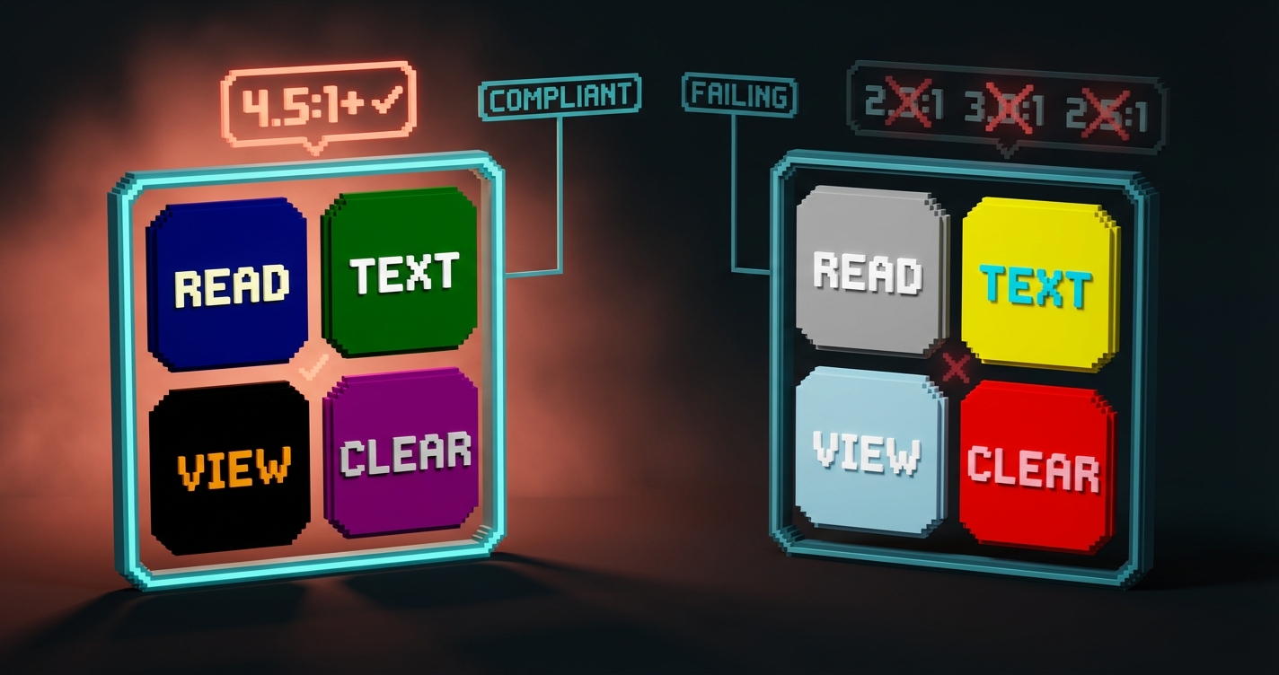
Die meisten Designer tappen in die Falle, die 3:1-Regel für Nicht-Text zu vergessen. Ein Formularfeldrahmen im Verhältnis 2:1 zum Seitenhintergrund ist nicht barrierefrei, selbst wenn die Beschriftung darin den Anforderungen entspricht.
Ein Fokusring mit unzureichendem Kontrast fällt durch. Ein Symbol, dessen Bedeutung von der Farbe im Verhältnis 2,5:1 abhängt, fällt durch. Nicht-Text-Kontrast ist unerlässlich.
Warum die WCAG-Berechnungen oft fehlerhaft sind
Die WCAG-2-Formel ist 30 Jahre alt und ignoriert die visuelle Wahrnehmung. Daher werden Farben, die schlecht aussehen, manchmal als akzeptabel eingestuft, während Farben, die gut aussehen, als nicht akzeptabel gelten.
Die WCAG-2-Formel basiert ausschließlich auf der Luminanz. Sie behandelt Text auf Hintergrund als lineares Verhältnis der relativen Helligkeit zweier Farben. So nimmt das menschliche Sehsystem Kontraste jedoch nicht wahr.
Die WCAG-2-Konformität bedeutet nicht, dass ein Farbpaar lesbar ist. Die WCAG-2-Konformität bedeutet nicht, dass ein Farbpaar unlesbar ist. Die mathematischen Berechnungen sind nur eine grobe Annäherung, keine exakte Wahrheit.
Der tatsächliche wahrgenommene Kontrast hängt von Schriftstärke, Schriftgröße, Farbtemperatur und dem ab, worauf das Auge eine Sekunde zuvor blickte. WCAG 2 berücksichtigt all dies nicht. Das Ergebnis ist ein Verhältnis, das hellgrauen Text auf Weiß genauso behandelt wie schwarzen Text auf Hellgrau, obwohl der eine lesbar und der andere schmerzhaft ist.
Wie APCA das Wahrnehmungsproblem löst
APCA, der Accessible Perceptual Contrast Algorithm, misst Kontrast so, wie das menschliche Sehen tatsächlich funktioniert. Deshalb schlägt der WCAG-3-Entwurf ihn als Ersatz vor.
APCA-Werte reichen von 0 (kein Kontrast) bis etwa 108 (extremer Kontrast). Im Gegensatz zu WCAG 2 berücksichtigt APCA Schriftstärke, Schriftgröße und Polarität (hell auf dunkel und dunkel auf hell werden vom Auge unterschiedlich wahrgenommen).
Ungefähre APCA-Schwellenwerte für Standardtexte:
- Fließtext (16px): 75+ (erforderlich), 90+ (ideal)
- Kurzer Fließtext (14px): 90+ (erforderlich)
- Großer Text (24px+): 60+ (erforderlich)
- Benutzeroberfläche (ohne Text): mindestens 45+
APCA ist derzeit nirgendwo gesetzlich vorgeschrieben. Dennoch wird es in der Praxis bereits als interner Standard für fertige Produkte verwendet, da es besser mit tatsächlicher Lesbarkeit korreliert. Es empfiehlt sich, die WCAG 2 AA-Konformitätsanforderungen zu erfüllen und gleichzeitig die APCA-Anforderungen für tatsächliche Qualität zu erfüllen. Beide Ziele gleichzeitig zu erreichen ist nicht schwierig, wenn Ihre Farbplättchen entsprechend gestaltet sind.
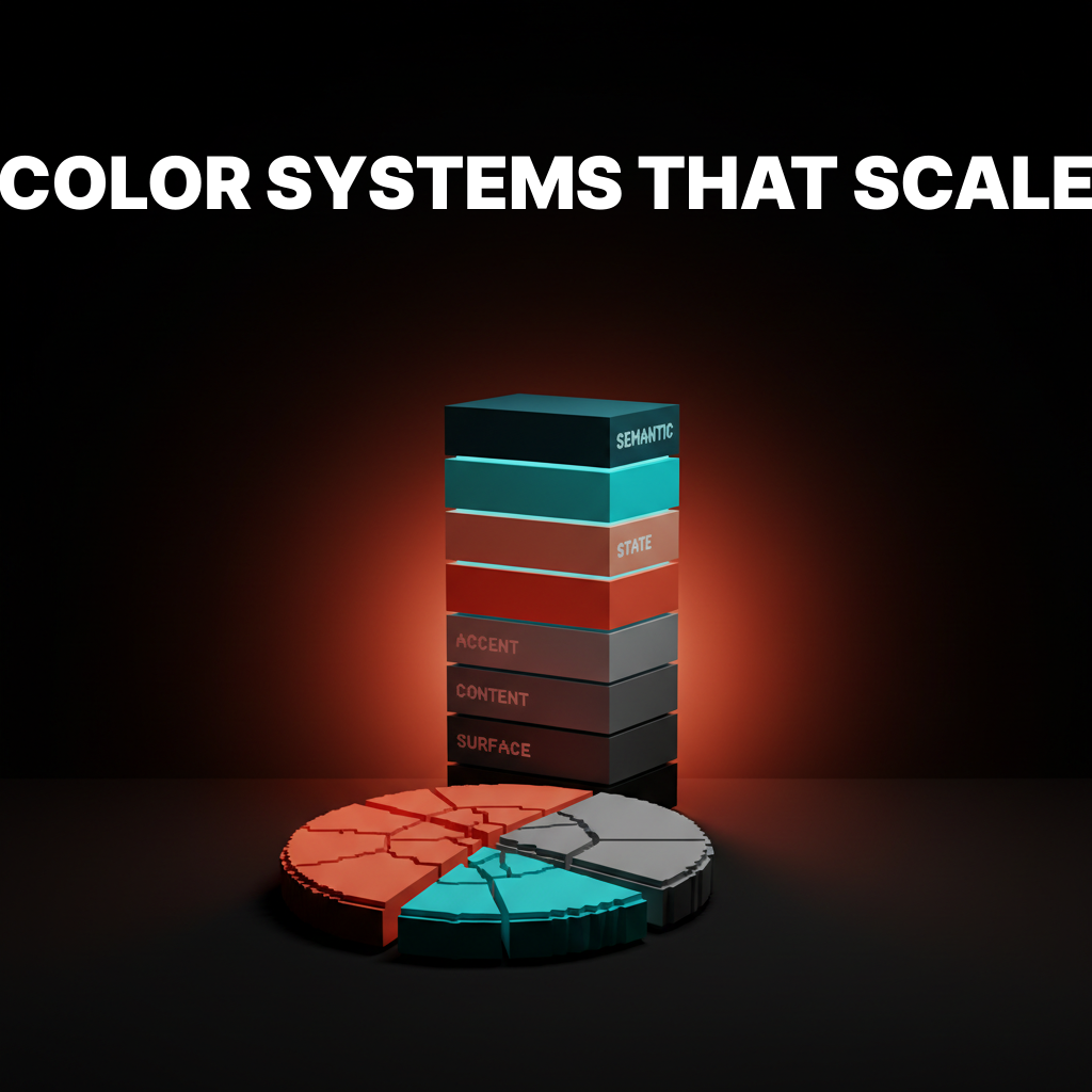
Vier Designsysteme mit Tokenisierung des Kontrasts
Diese Systeme kodieren Barrierefreiheit bereits in der Token-Ebene, sodass Designer eine Rolle auswählen, anstatt ein Verhältnis zu berechnen.
Radix Colors
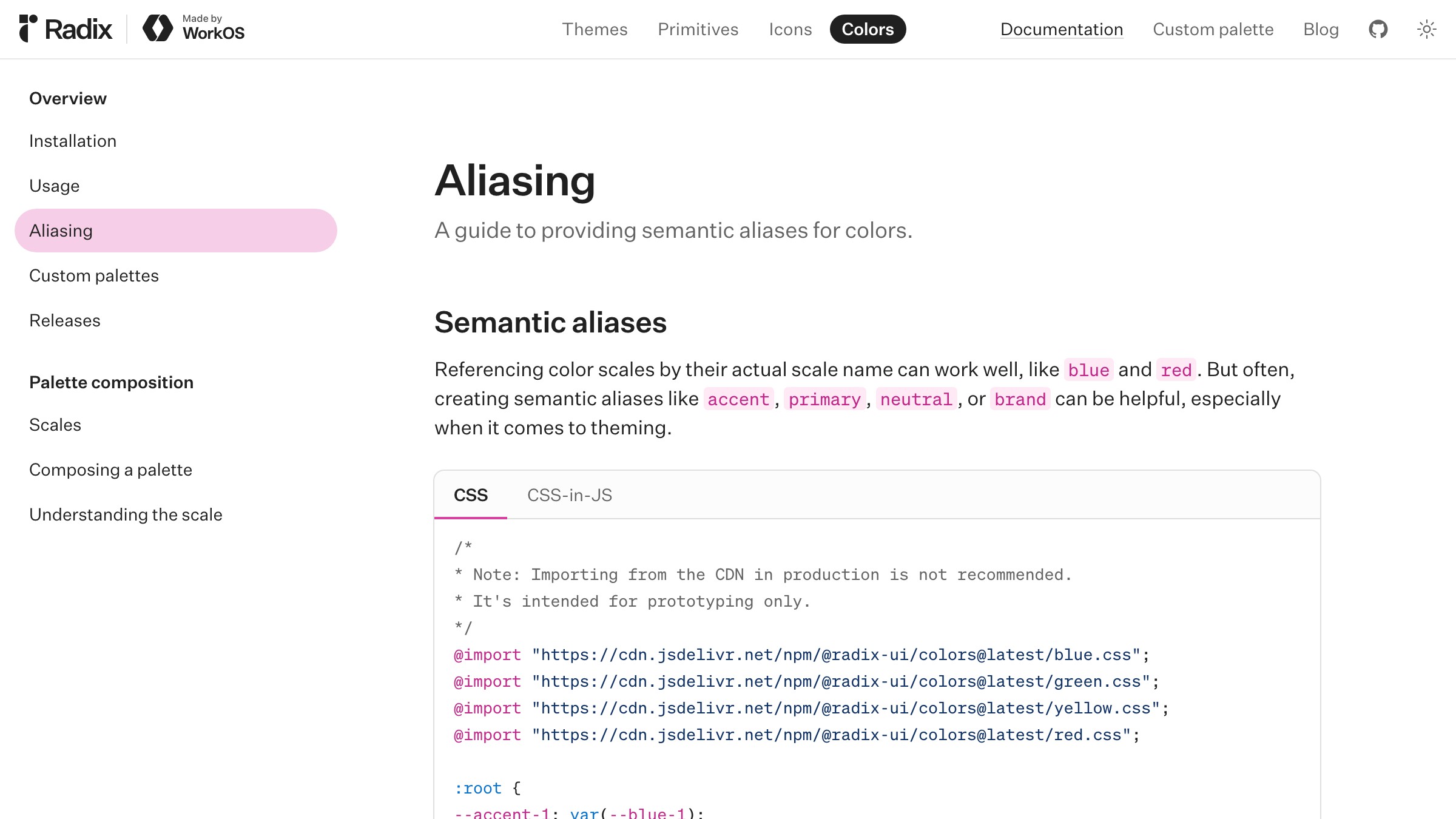
Sehen Sie es live auf radix-ui.com
Radix Colors bietet 12-stufige Farbskalen, wobei jeder Stufe eine Rolle zugeordnet ist. Die Stufen 11 und 12 sind die kontrastreichsten Stufen und erfüllen garantiert die WCAG-AA-Kriterien im Vergleich zu den niedrigeren Stufen. Dank der Rollenbezeichnungen (text, textContrast, solid, solidHover) müssen Designer kein Verhältnis berechnen, sondern wählen einfach eine Rolle.
Das Besondere: das nummerierte Kontrastmodell. Designer, die Stufe 11 wählen, wissen, dass diese Stufe den Anforderungen der helleren Stufen derselben Skala entspricht. Das Verhältnis ist in der Stufennummer selbst enthalten.
Material Design 3
Sehen Sie es live auf m3.material.io
Material 3 ordnet jeder Farbrolle ein on--Pendant (on-primary, on-surface, on-error) zu, das garantiert ein Seitenverhältnis von 4,5:1 zum übergeordneten Element aufweist. Die gepaarten Token bilden die Barrierefreiheitsebene, die direkt in das System integriert ist.
Was man sich abschauen kann: das on--Muster. Wenn ein Designer on-primary für Text verwendet, ist Barrierefreiheit automatisch gewährleistet. Es gibt keine Fehlentscheidungen.
Zwei weitere: Verhältnisse und Wahrnehmungssysteme
Radix und Material lösen Kontraste durch Rollenpaarung. Die nächsten beiden lösen ihn durch dokumentierte Verhältnisse und wahrnehmungsgetreue Skalen. Beide Ansätze funktionieren. Von beiden kann man sich inspirieren lassen.
GitHub Primer
Sehen Sie es live auf primer.style
Primer unterteilt Vordergrund-, Hintergrund- und Rahmen-Tokens in explizite Ebenen mit dokumentierten Kontrastverhältnissen. Die zugehörigen Codes fg.default und bg.default werden mit exakten Verhältnissen veröffentlicht, und jedes rollenbasierte semantische Token wird gleich behandelt.
Vorteil: Die Verhältnisse neben den Tokens veröffentlichen. Wenn der Kontrast jedes Tokens vor jedem relevanten Hintergrund dokumentiert ist, können Designer und Entwickler die Überprüfung komplett überspringen.
Adobe Spectrum
Sehen Sie es live auf spectrum.adobe.com
Spectrum verwendet wahrnehmungsmäßig einheitliche Farbskalen, sodass zwei Tokens mit derselben Stufennummer über verschiedene Farbtöne hinweg die gleiche visuelle Gewichtung haben. Das bedeutet, dass beim Austauschen von Farbtönen innerhalb eines Designs die Kontrastverhältnisse erhalten bleiben. Schluss mit „In Blau funktioniert es, in Orange nicht.“
Was wir uns abschauen können: einheitliche Wahrnehmung. Skalen, die auf Wahrnehmungsmodellen basieren (wie HSLuv, OKLCH oder Spectrums eigener Ansatz), ermöglichen barrierefreies Design für verschiedene Marken.
Wie Sie barrierefrei bleiben, ohne Ihre Markenidentität zu verlieren
Barrierefreiheit bedeutet nicht schwarze Schrift auf weißem Hintergrund und ein zurückhaltendes Branding. Die Teams, die die inklusivsten Produkte entwickeln, haben das erkannt.
Der Clou ist, wo die Barrierefreiheit im Designprozess verankert ist. Befindet sie sich auf der Ebene der Tokens, bleibt die Marke lebendig und Designer erhalten barrierefreie Ergebnisse. Wird sie erst in der Endphase geprüft, stellt jede Markenfarbe ein potenzielles Risiko dar, das bei einem Audit zum Scheitern führen kann.
Drei Techniken sorgen dafür, dass Persönlichkeit und Barrierefreiheit im selben Raum vereint werden:
-
Teilen Sie die Akzentfarbe in eine Markenfarbe und eine Farbe für barrierefreie Aktionen auf. Linear verwendet ein spezifisches Lila für Markenbotschaften und ein leicht abgewandeltes Lila für interaktive Elemente. Beide sind unverkennbar mit der Marke verbunden. Nur eine Farbe ist auf jeder Oberfläche garantiert.
-
Verwenden Sie wahrnehmungsmäßig einheitliche Skalen. OKLCH und HSLuv ordnen Farbwerte der wahrgenommenen Helligkeit zu, sodass Sie durch verschiedene Farbtöne rotieren können, ohne den Kontrast zu beeinträchtigen. Radix, Spectrum und Material 3 verwenden ähnliche Verfahren.
-
Bieten Sie den Dunkelmodus als eigenständiges Token-Set an, nicht als nachträgliche Ergänzung. Ein Token, das im Dunkelmodus nicht korrekt dargestellt wird, ist nicht für den Dunkelmodus geeignet. Wenn Ihr System
text-defaultin hellen und dunklen Bereichen unterschiedliche Farben auflöst, müssen beide Werte auf der zugehörigen Oberfläche korrekt dargestellt werden.
Das schlimmste Ergebnis ist der Kompromiss, den niemand wollte: eine abgeschwächte Marke, die dennoch nicht barrierefrei ist. Das passiert, wenn Teams auf Kontrast-Feedback reagieren, indem sie alle Farben entsättigen, anstatt die Farbkombinationen zu korrigieren. Entsättigung ist nicht dasselbe wie Barrierefreiheit. Beziehungen hingegen schon.
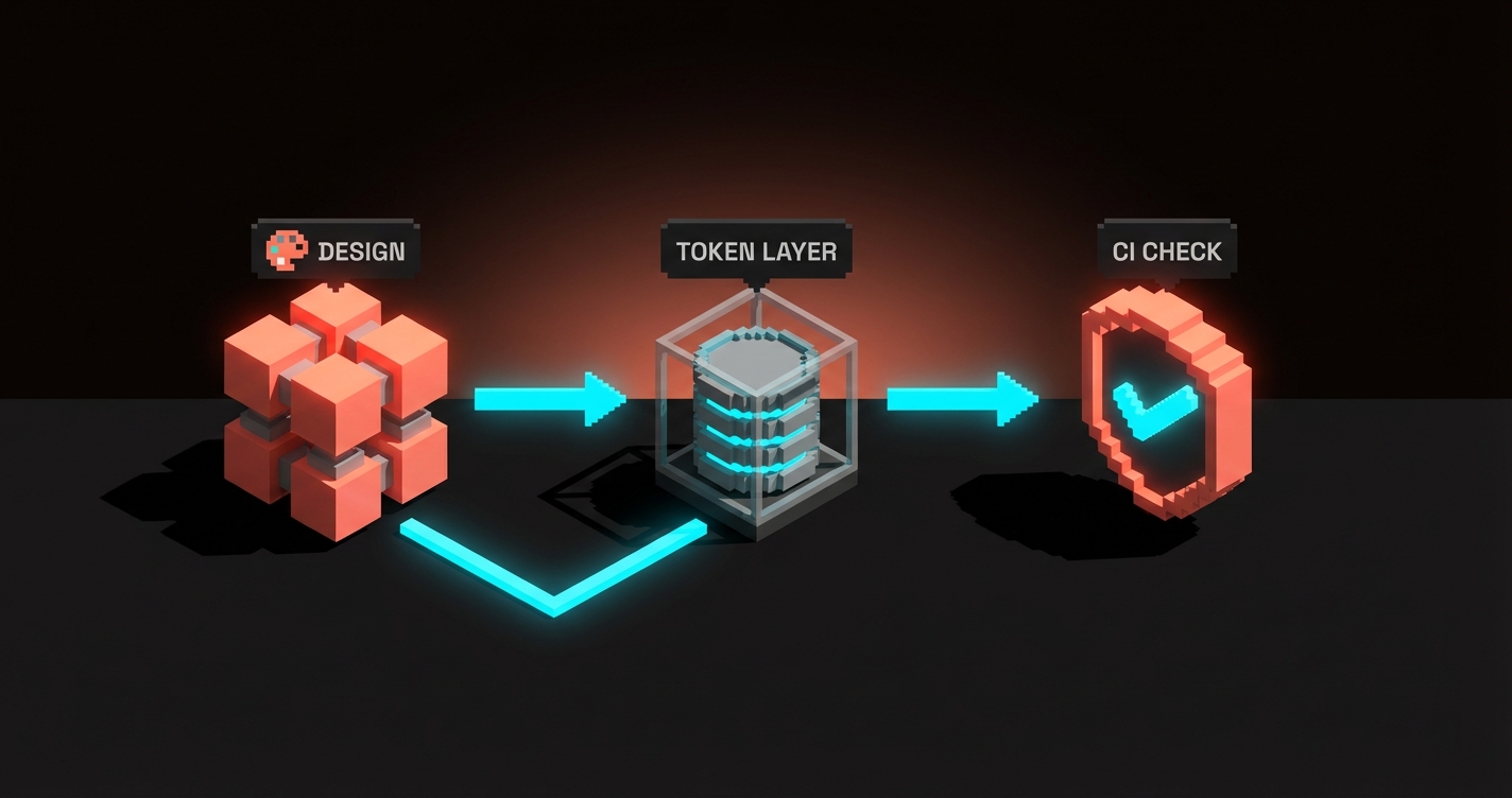
Der Workflow für Barrierefreiheitstests
Kontrasttests sind günstig, automatisiert und völlig sinnlos, wenn man sie bis zur Designprüfung aufschiebt.
Der funktionierende Workflow führt Kontrastprüfungen an vier Punkten durch, nicht nur an einem.
-
Bei der Token-Definition. Wenn ein Token erstellt wird, werden auch seine zulässigen Oberflächen definiert.
text-defaultist nur aufbg-default,bg-subtleundbg-raisedzulässig. Der Kontrast des Tokens wird einmalig geprüft und anschließend gesperrt. -
Beim Commit der Komponente. Storybook führt zusammen mit einer axe-core- oder pa11y-Integration im Rahmen der CI-Pipeline Barrierefreiheitsprüfungen für jede Komponentenvariante durch. Jede neue Variante, die den Test nicht besteht, wird vor dem Merge blockiert.
-
Bei der Übergabe der Designdatei. Plugins wie Stark oder die integrierte WCAG-Prüfung erkennen Probleme direkt im Designtool. Diese werden bereits im Designprozess und nicht erst bei der Überprüfung erkannt.
-
Auf Seitenebene. Lighthouse, axe DevTools oder pa11y werden auf Live-Seiten in der Staging- oder Produktionsumgebung ausgeführt. Dadurch werden reale Fehler (z. B. Einbettungen von Drittanbietern, nutzergenerierte Inhalte, dynamische Themes) erkannt, die bei Komponententests nicht auftreten.
Ziel ist es nicht, mehr Tools auszuführen, sondern die Prüfung vorzuziehen. Ein von der CI-Pipeline gefundener Kontrastfehler lässt sich in fünf Minuten beheben. Derselbe Fehler, der bei einem Audit vor dem Launch entdeckt wird, kostet das Team eine Woche.
Der strukturelle Grund, warum dieser mehrschichtige Ansatz funktioniert, wird in Leitfaden für Designsysteme erläutert, warum das Denken in Token-Ebenen so erfolgreich ist. Und der Artikel Die 60-30-10-Regel wurde verletzt. erklärt, warum rollenbasierte Farben (von denen Barrierefreiheit abhängt) das proportionale Denken abgelöst haben.
FAQ
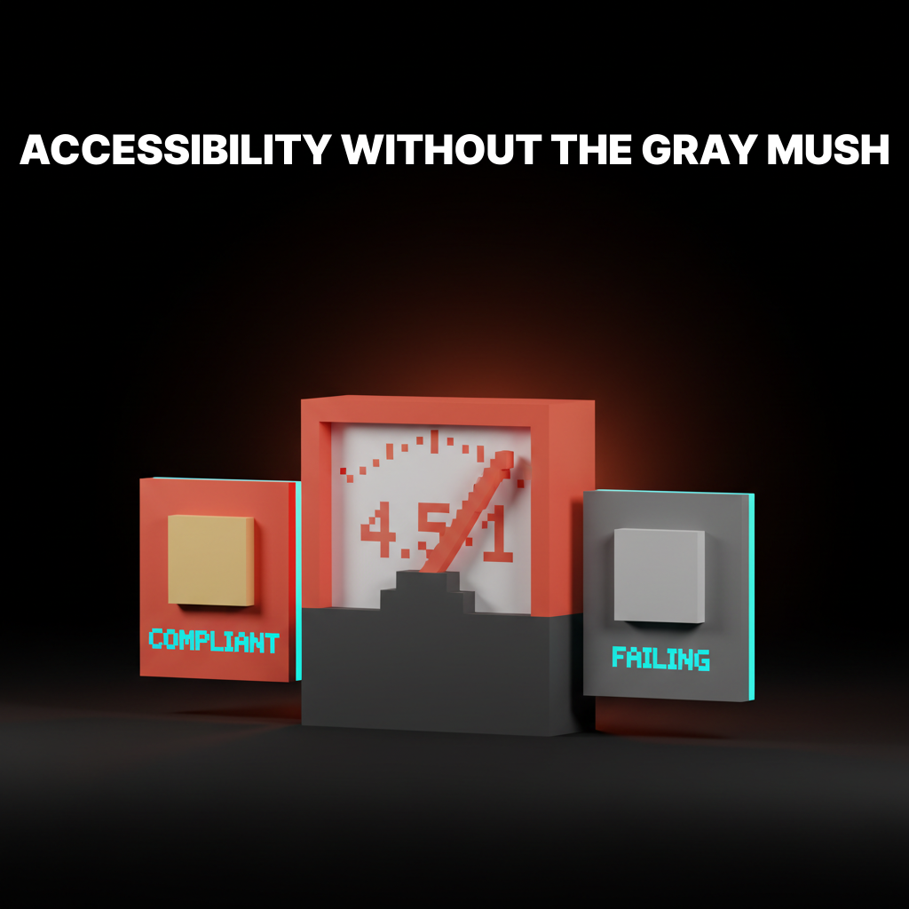
Reicht WCAG AA aus oder benötige ich AAA?
AA ist der Standard für die meisten kommerziellen Produkte und die meisten Gesetze zur Barrierefreiheit. AAA ist nur in bestimmten Bereichen (Behörden, Gesundheitswesen, Bildung) gesetzlich vorgeschrieben und ohne eine Reduzierung der Farbpalette kostspielig zu erreichen. Streben Sie AA als Mindeststandard und APCA als Höchststandard an.
Müssen alle Nicht-Text-Elemente ein bestimmtes Kontrastverhältnis aufweisen?
Nicht-Text-UI-Komponenten, die eine Bedeutung vermitteln, benötigen gemäß WCAG 2.2 ein Kontrastverhältnis von mindestens 3:1. Dies umfasst Schaltflächen, Formularrahmen, Fokusringe, aussagekräftige Symbole und grafische Elemente. Reine Dekoration (Hintergrundmuster, Umgebungsverläufe) ist ausgenommen. Beiläufiger Text (z. B. eine Bildunterschrift) ist ebenfalls ausgenommen.
Was ist der Unterschied zwischen WCAG und APCA?
WCAG 2 ist der aktuelle Rechtsstandard und basiert auf einer 30 Jahre alten Luminanzformel. APCA ist der im WCAG-3-Entwurf vorgeschlagene Ersatz und basiert auf der tatsächlichen Funktionsweise der menschlichen Wahrnehmung. APCA-Werte korrelieren besser mit der tatsächlichen Lesbarkeit, sind aber noch nicht gesetzlich vorgeschrieben. Produkte, die auf den Markt kommen, verwenden beide Standards: WCAG 2 für die Einhaltung der Vorschriften, APCA für die Qualität.
Barrierefreiheit in die Tokens integrieren
Barrierefreier Farbkontrast ist keine Stilfrage. Er ist eine Systemeigenschaft.
Die Teams, die die inklusivsten und markenorientiertesten Produkte entwickeln, sind diejenigen, die Barrierefreiheit nicht länger als Nebensache betrachten, sondern als integralen Bestandteil des Systems.
Tokens kodieren die Kontrastverhältnisse. Skalen kodieren die Farbpaare. Tests finden an vier Punkten im Workflow statt. Niemand hält vor dem Launch einen Kontrastmesser an den Bildschirm.
Wenn Ihr aktueller Prozess darin besteht, dass ein Designer eine Farbpalette visuell auf Lesbarkeit prüft, werden Sie bei einem Audit scheitern. Wenn Ihr Prozess ein Prüftool plus manuelle Überprüfungen beinhaltet, werden Sie im großen Maßstab scheitern. Wenn Ihr Prozess rollenbasierte Token verwendet, die Barrierefreiheit auf der Definitionsebene kodieren, werden Sie erfolgreich sein.
Erstellen Sie die Token. Veröffentlichen Sie die Verhältnisse. Automatisieren Sie die Prüfungen. Die Marke bleibt lebendig, die Benutzeroberfläche bleibt lesbar, und das Audit wird zur Formalität statt zu einer kompletten Überarbeitung.
Need a color system that hits WCAG without flattening the brand? Brainy builds token-layer accessibility into every palette.
Get Started