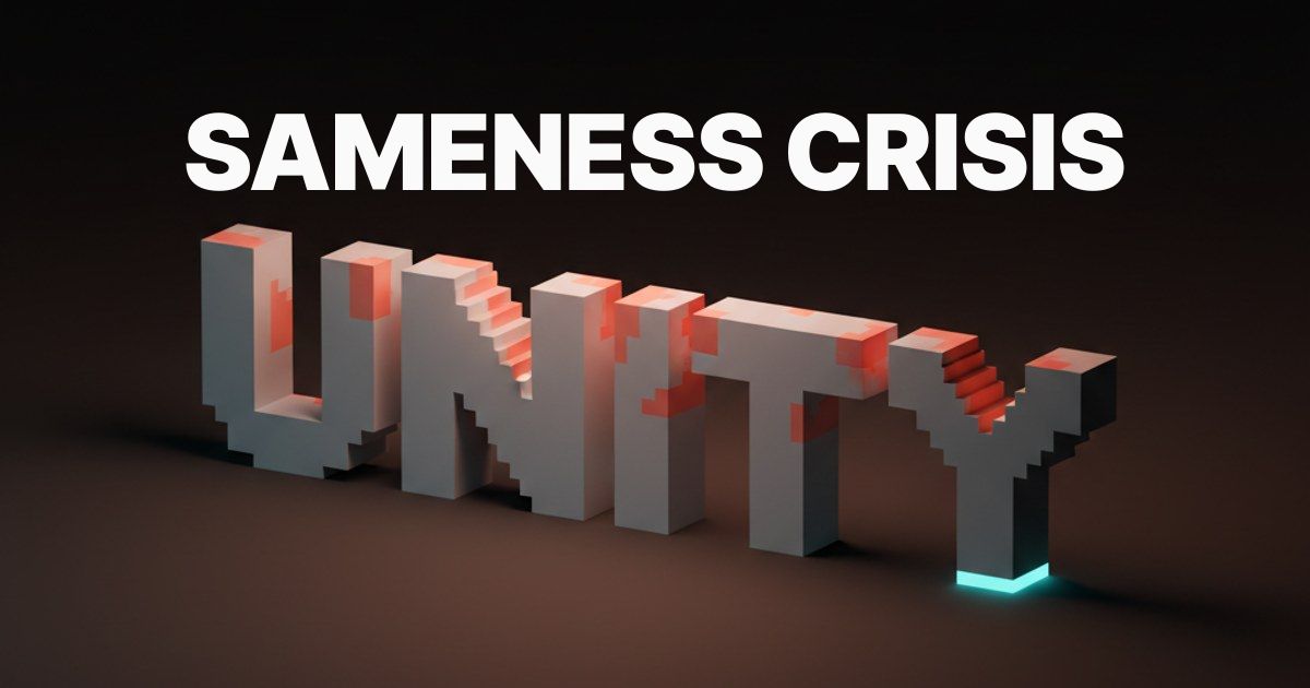
"The Sameness Crisis: Why Every Brand in 2026 Looks the Same (And the 6 That Don't)"
Every brand in 2026 is running the same playbook. Geometric humanist sans, monochrome palette, soft-corner radius, restrained illustration. It is not a trend, it is a collapse. Here is why it happened, why most brands cannot escape it, and the six that did.
Open forty Series A landing pages back to back and you will see one brand running forty paint jobs. Same geometric humanist sans, probably Inter, possibly GT Walsheim, occasionally Söhne if the founder went to art school. Same monochrome palette with one accent the team spent two weeks choosing. Same eight to sixteen pixel corner radius. Same faceless person holding a laptop. Same copy voice that splits the difference between Stripe and a journal entry.
This is not a trend, it is a collapse. Modern brand identity has flattened into a single aesthetic dialect, and the dialect is winning because the dialect is safe. Procurement signs off on it. Investors recognize it. The model produces it on the first try. Every incentive in the system pulls every brand toward the same blank cream face.
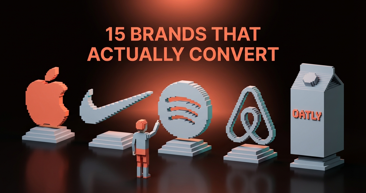
This piece names the dialect, traces the five forces compounding it, and profiles six brands actively refusing it. Aesop, Liquid Death, Cluely, Tracksmith, Linear, Anthropic. What they break. Why the breaks land. What you can steal.
Every brand in 2026 speaks the same dialect
The dialect was inherited from a decade of "blanding," the flattening of legacy brands into sans-serif minimalism between 2015 and 2022. Burberry, Saint Laurent, Balmain, Pinterest, Volkswagen, Warner Bros all collapsed into nearly identical wordmarks. The trade press named it and moved on. Nobody fixed it.
What followed is worse. The startup ecosystem inherited the flattening, AI tools regurgitated the median back into every new brief, and Figma templates filled in the rest. Seventy percent of YC W22 through W25 cohorts ship a homepage you could swap a logo on and not notice for an hour.
The dialect, named precisely
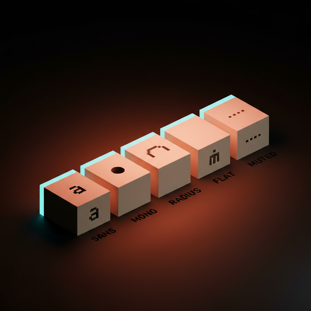
Five fixed elements.
Typeface. Geometric humanist sans, almost always Inter. Backups: GT Walsheim, Söhne, Aktiv Grotesk, ABC Diatype, Founders Grotesk. Variance one designer notices and zero customers do.
Palette. Monochrome with one accent. Off-white or near-black ground, gray ramp, one saturated accent the team treats like a personality. Mercury runs sage. Ramp runs orange. Brex runs slate. Vanta runs purple. Each accent does the same job, signal a feeling without committing to one.
Geometry. Soft-corner radius between eight and sixteen pixels on every container. Round enough to be approachable, sharp enough to be serious. The brand's emotional permission slip.
Illustration. Flat humanist. Faceless people, plant motifs, the same translucent gradient orbs the Stripe homepage has run since 2019. Adobe Stock with the saturation turned down.
Voice. The middle distance between a banking app and a Substack. Lead with a value prop, soften with a personal aside, end with a button that says Start free. Every brand ships the same warm-but-professional voice doc and the model treats them as identical input.
Five elements. One dialect. Forty thousand brands.
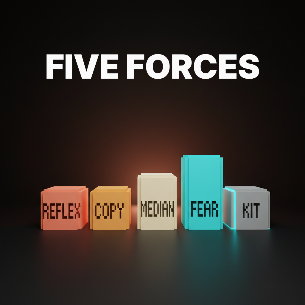
Five forces collapsed every brand into one
The dialect did not happen because designers stopped trying. Five forces compounded over a decade and every one of them rewards the median and punishes the edge.
Force one, the Helvetica reflex
Designers default to Inter the way 1970s designers defaulted to Helvetica. The safe choice is the one nobody gets fired for picking. Inter is free, technically excellent, neutral to the point of invisibility, and it ships with every Figma starter file. Choosing it on a deadline is a rational career decision.
Helvetica became a punchline by 1985 and Inter is on track for the same arc by 2028. The reflex is not Inter, it is the safe geometric humanist sans of the moment. Tomorrow it is a different file, same job. The reflex itself is the dialect.
Force two, Pentagram-tier imitation without the chops
Mid-tier studios spent the last decade copying the surface of tier-one work without inheriting the rigor. Pentagram does a stripped-down identity for a museum and a thousand mid-tier studios decide their fintech client deserves the same restraint. Collins ships a clean wordmark for a streaming brand and every D2C startup ships a clean wordmark on a cream ground the next quarter.
The original work earned the simplicity with a brand strategy under the wordmark, a typographic system, custom drawings of every glyph, and a thousand-page operating doc. The imitation has a wordmark in Inter Medium and a Notion page. Restraint without rigor is emptiness with better margins.
Force three, the AI median pull
Generative tools train on the entire visual corpus and every prompt regresses to the statistical center. Ask Midjourney for a fintech brand mark and you get Inter on a soft palette. Ask Claude or v0 for a SaaS landing page and you get a hero with three feature cards and a CTA that says Get started. The model does not have a position. It has a centroid.
AI tools are pitched as creativity multipliers. They are conformity multipliers. Ten thousand designers prompt the same model with similar briefs and ten thousand outputs land in the same cluster. The dialect was already winning. AI just floored the gas. Brand systems for AI generation covers the structural fix. Without machine-readable tokens and a real prompt pack, the AI produces the dialect on every render.
Force four, procurement and the agency fee dynamic
Bold work scares procurement, and the agency that proposes it loses the contract to the agency that proposes a softer sans on a calmer palette. Inside any company over four hundred people, brand identity clears procurement, a CMO with a six-month tenure, a CFO who does not care, and a board deck that needs to look defensible. The defensible move is the median move.
Agency fees and brand boldness move in opposite directions above a price point. Below fifty thousand dollars an engagement can be wild, the founder is the buyer and the user. Above two hundred thousand dollars the buyer is a committee, and the committee picks Inter. The breakouts later in this piece all share one trait. The buyer was the founder, or close enough. Procurement was not in the room.
Force five, the Figma-template effect
Every brand built from the same kits ends up with the same shape. The most-downloaded Figma community files are landing page templates, design systems, and component libraries. Those files share components. Those components share defaults. The defaults are the dialect.
Add Framer templates, Webflow showcases, Tailwind UI, Shadcn, and the same five Linear-inspired SaaS dashboards everyone forks, and the starter is the finisher. Look at any YC W24 demo day homepage gallery. The component-library DNA is visible from orbit.
If you want a brand that does not look like the next slot in that gallery, hire Brainy. BrandBrainy builds identity systems for brands willing to be disliked by procurement and remembered by everyone else.
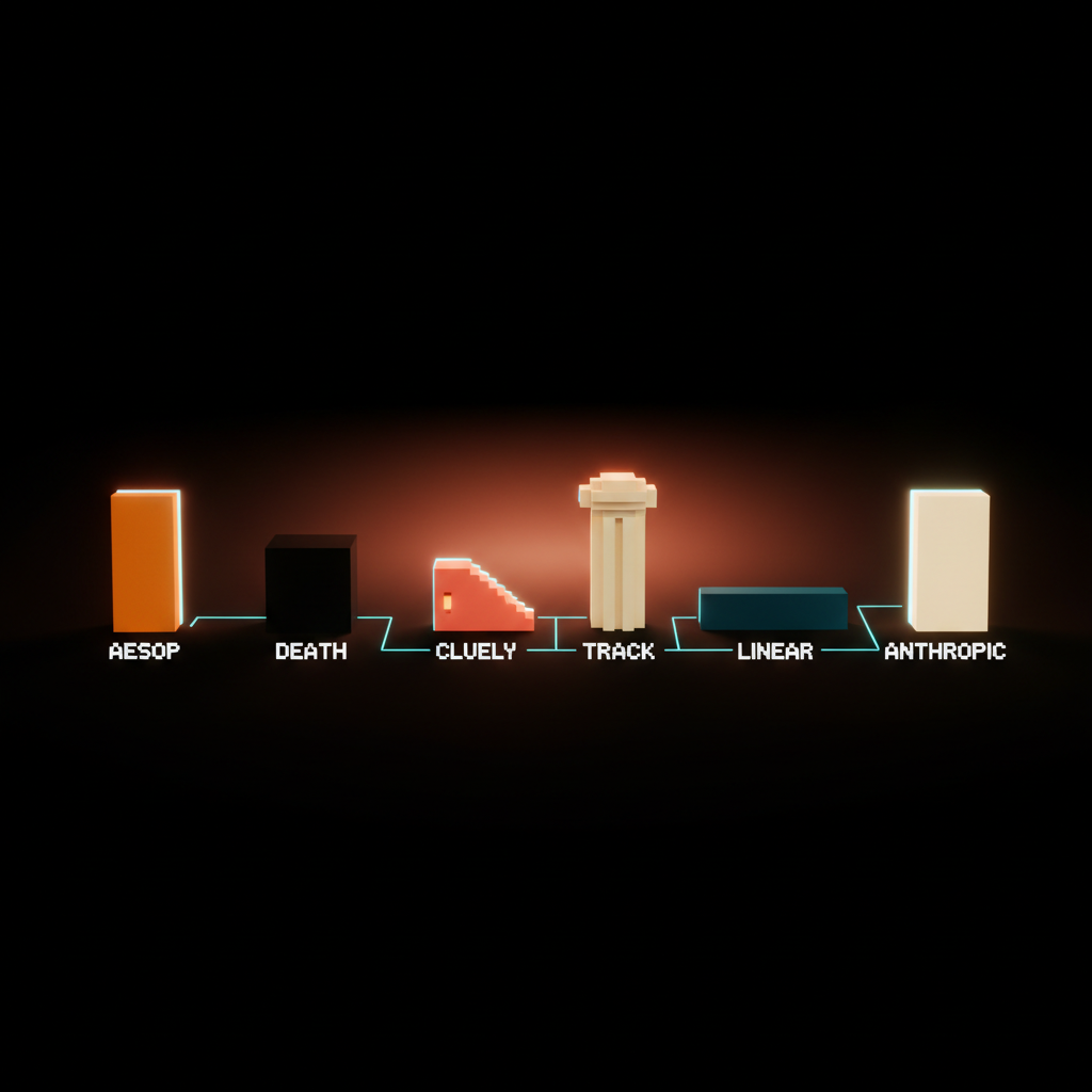
Six brands breaking the dialect, and what they break
Every breakout brand committed to a specific aesthetic position the dialect rejects, owns it across every surface, and accepts that it will be disliked by everyone outside the target. The breaks differ. The willingness is the same.
Aesop, vintage editorial restraint
Aesop runs amber apothecary bottles, restrained serifs, photography that looks scanned from a 1962 European travel journal, and copy that reads like a literary catalog. No flat humanist illustration. No Inter. No soft hero card.
Breaks the wellness rule of soft sans, soft palette, gentle copy. Aesop runs editorial typography and dense product copy with almost zero white space. Restraint that is editorial, not minimal.
It works because Aesop trusts the customer to read three paragraphs about a hand balm. The dialect does not trust the customer with two sentences. Trust reads as confidence and the confidence converts.
Steal: Pick a typographic system that signals craft, not safety. Use serifs where the dialect uses sans. Write product copy that earns attention instead of begging for it.
Liquid Death, anti-corporate punk
Liquid Death sells canned water with a death-metal wordmark, horror-movie illustration, ad campaigns that mock wellness culture in language a beverage brand is not supposed to use, and a YouTube channel closer to MTV than Coca-Cola. Every polite beverage rule is violated on purpose. Result: a billion-dollar valuation in five years.
Breaks the category convention of sage palettes, soft sans, and gentle copy. Liquid Death runs the opposite of every column on the wellness mood board.
It works because category contrast is brand jet fuel when it is committed to. Half-hearted contrast reads as a stunt. Full-throated contrast reads as a position.
Steal: Map every convention in your category. Pick the loudest one. Break it on purpose. Commit across every surface, not just the homepage.
Cluely, aggressive transparency
Cluely refuses every polite SaaS convention. The landing pages lead with provocations the competitors would not dare publish. Product copy sounds like a founder yelling about a deeply held belief after four cups of coffee. The brand commits to discomfort, and the discomfort converts into the kind of attention no Inter wordmark could buy.
Breaks the warm-but-professional SaaS voice. Cluely's voice is hot, opinionated, almost confrontational, and reads like a person, not a committee.
It works because in a category where every brand has the same voice, the brand with a different voice is the only brand readers remember. Politeness traded for memorability, math worked.
Steal: Read your last twenty pieces of marketing copy out loud. If they sound like a press release, they sound like everyone else. Push the voice toward the founder until the legal team gets nervous.
Tracksmith, heritage craft with a literary voice
Tracksmith built a running brand on a collegiate serif system, an oxblood and ivory palette, photo essays that read like New Yorker features, and product descriptions that quote Murakami without irony. It looks and reads like a small-circulation literary magazine that happens to sell singlets.
Breaks the athletic convention of aggressive sans, primary colors, action photography, and a coach-voice copy line. Tracksmith runs the opposite of every Nike or Under Armour move and earns a different, higher-paying customer.
It works because heritage craft signals to a specific runner, the one who reads Murakami's running memoir and listens to records. That customer pays more, churns less, tells friends.
Steal: Decide which kind of customer you want and design exclusively for them. The dialect designs for everyone, which is the same as designing for nobody.
Linear, technical and unapologetically nerdy
Linear runs a monospace-leaning, dark-mode-default, deeply technical brand surface. The marketing site looks like a developer tool because it is one. Documentation reads like an engineering memo. The hero is rarely a faceless person, more often a screenshot or a keyboard shortcut.
Breaks the approachable SaaS convention of light mode, soft palette, friendly illustration, and a hero line that softens the technical pitch. Linear refuses all of it.
It works because audience focus is the moat. Linear does not try to expand the brand to non-engineers, and the refusal is what makes the engineers feel seen. Every dollar of brand surface is spent talking to one person.
Steal: Pick the user. Design only for that user. Reject the temptation to soften the brand for the broader market that will never buy.
Anthropic, warm restraint among AI labs
Anthropic broke the AI lab default with a near-academic warmth. Cream and ink palette with restrained accents. Typography that reads like a university press, not a science fiction movie. Product surfaces using a serif where every competitor uses a geometric sans. No neon, no cyberpunk, no chrome, no AI iconography.
Breaks the category convention of cyberpunk gradients, robotic geometric sans, blue-purple cosmic palettes, and sci-fi visual language. Anthropic runs cream paper and a serif and trusts the model output to do the heavy lifting.
It works because restraint in a noisy category is amplification. Among OpenAI, Google DeepMind, xAI, Mistral, and a dozen others all running the same cyberpunk default, Anthropic looks like a research institution. Seriousness signaled without performing it.
Steal: If your category has a default visual language, the most distinct move is the one that looks like an adjacent category instead. Anthropic looks like academia. Aesop looks like apothecary. Tracksmith looks like literary magazine. The cross-category pull is the brand.
The pattern across all six breakouts
Three traits repeat, and the traits are stealable.
One. A specific aesthetic position the dialect rejects. Not a softer sans on a different color. A position the dialect would call wrong. Aesop's editorial serifs are wrong by dialect rules. Liquid Death's horror illustration is wrong. Cluely's voice is wrong. The wrongness is the strategy.
Two. Total commitment across every surface. Not a homepage hero, the email template, the product UI, the customer support voice, the packaging, the YouTube videos, the careers page. The dialect is consistent in its blandness. The breakouts are consistent in their refusal.
Three. Acceptance that the brand will be disliked by everyone outside the target. The breakouts are not for everyone, they are for a specific person who pays full price, comes back, and tells friends. The dialect tries to be liked by everyone and ends up forgettable to most.
The pattern is not aesthetic, it is positional. Pick a position. Commit to it. Be disliked by the wrong customers on purpose. This is also a taste problem, not just a process one. Refusing the dialect requires judgment that holds up against a room of people who all prefer the median.
A five-question audit for your own brand
One. Replace your wordmark with a competitor's wordmark on the homepage. Does the page still make sense? If yes, the brand is the dialect and the wordmark is doing nothing.
Two. Ask a stranger to describe the brand voice in one word that is not professional, modern, clean, or friendly. If the stranger cannot, the voice is the dialect average.
Three. Open three competitor homepages. List every shared element: typeface family, palette ratio, layout shape, hero photo style, copy structure. Share more than three of those, the brand is in the dialect.
Four. Show the brand to someone outside the target customer. Ask if they like it. If they say yes, the brand is too safe. The breakouts get hated by people outside the target. That is how you know they are working.
Five. Ask the team to name the position the brand is taking, in a sentence. If the answers differ, or the answers are "modern fintech" and "friendly enterprise," the brand has no position and the dialect is the position by default.
Fail on three or more and the brand is part of the sameness. The fix is not a refresh, it is a position the team is willing to defend in a procurement meeting. If you want help building one that survives that meeting, hire Brainy. BrandBrainy ships identity systems at the price points where the founder is still the buyer.
FAQ
Why do all brands in 2026 look the same?
Five forces. Designers default to safe geometric humanist sans. Mid-tier studios imitate Pentagram-tier work without the rigor. AI tools regress every brief to the statistical center. Procurement and committee buying punishes bold work. Figma and Framer templates mean every brand is built from the same lego pieces.
What is "blanding"?
The 2015-2022 trend of legacy brands flattening into nearly identical sans-serif wordmarks. Burberry, Saint Laurent, Balmain, Volkswagen, Warner Bros, Pinterest. The 2026 sameness crisis is the next phase. The startup ecosystem inherited the flattening and added a Figma-template body underneath the wordmark.
Which brands are breaking out in 2026?
Aesop runs vintage editorial restraint. Liquid Death runs anti-corporate punk. Cluely runs aggressive transparency. Tracksmith runs heritage craft with a literary voice. Linear runs unapologetically technical. Anthropic runs warm restraint among AI labs.
Is minimalism the same as sameness?
No. Minimalism is a discipline that earns restraint through conceptual rigor. Sameness is restraint without rigor, surface borrowed from tier-one studios without the strategy underneath. Real minimalism is rare. Sameness is dressed up to look like minimalism and is mostly emptiness with better margins.
How do I avoid making my brand part of the dialect?
Pick a specific aesthetic position the dialect rejects. Commit to it on every surface. Accept that the brand will be disliked by people outside the target customer. Run the five-question audit on every brand decision. If procurement is comfortable, you are in the dialect.
What to do about it
The sameness is a system, not a taste failure. Designers are not getting worse, the forces are getting stronger. AI median pull, procurement risk aversion, and the Figma-template effect compound on every brief.
The fix is not aesthetic, it is positional. Pick a position the dialect rejects and commit to it across every surface. Accept the people who will not get it. Build the brand for the customer who will. The breakouts in this piece all did the same three things, and you can do them on your next project if you are willing to defend the choice in a room full of people who will pull you back to the median.
If you want a brand built for that defense, hire Brainy. BrandBrainy is where designers go when they want to break out, not blend in. The dialect is winning because nobody is willing to fight it. The brands fighting it are winning everything else.
If you want a brand that does not blend into the dialect, BrandBrainy ships identity systems for brands ready to be disliked by procurement and remembered by everyone else.
Get Started