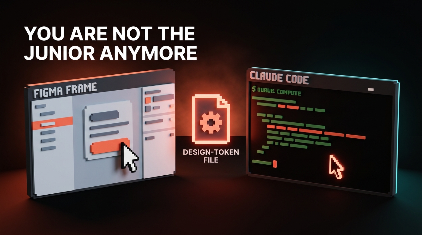
我在 Figma 里构建了一个跟随光标响应的交互式网站主视觉,以下是整个过程。
分步教程:用 Higgsfield Figma 插件生成电影感场景,转化为光标响应的视差主视觉,然后上线发布。附可直接复制的提示词。
我在 Figma 里构建了一个跟随光标响应的交互式网站主视觉,以下是整个过程。
大多数"AI 融入设计工作流"的演示都停在一张静态图片上。这个不一样,它会动。一个交互式网站主视觉,一幕电影感的科幻全景图,随光标倾斜响应,在 Figma 里完成,没有任何 3D 文件,也没有一行着色器代码。整个项目来自 Higgsfield 插件,就在我每天工作的画布里。
以下是最终的主视觉效果。加载器校准,场景揭幕,然后随光标向各个方向响应。
整个过程只有四步,每个提示词都在下面,可以直接复制:
- 将场景生成为一个电影感的定场镜头。
- 从四个微调后的镜头角度生成同一场景。
- 将这些角度片段转化为平面图像序列。
- 将序列与光标连接,装饰成真实页面。
这一切不需要 After Effects、3D 软件或工程师。一个插件加一条构建提示词就够了。
第一步:生成场景
在 Figma 内打开 Higgsfield 插件,生成一个电影感的定场镜头。关键在于要求清晰的景深,将前景、中景、背景设为明确分离的层面,因为这种分离正是后续视差效果能够成立的基础。画意感,不是照片感。
Soft hand-painted sci-fi concept art, cinematic and atmospheric. A lone armored hero on a dark rocky cliff in the near foreground, gazing out over a vast misty valley of floating islands and tall glowing spires fading into an aurora sky. Strong depth built from clearly separated planes: dark foreground cliff and hero, floating rocks in the midground, distant spires far behind, soft atmospheric haze between each layer. Moody purples and teals with warm light. Simple and clean, not busy, painterly brushwork, epic scale.
第二步:生成镜头角度
现在从四个微调后的镜头位置生成同一场景:上、下、左、右。这里的关键词是"轨道(orbit)",而不是"倾斜(tilt)"。
倾斜是将摄像机原地旋转,视差效果几乎为零。轨道是让摄像机在空间中移动,近处的峭壁大幅位移,而远处的尖塔几乎纹丝不动。这个差异就是整个视觉错觉的来源。角度保持小一些,约 12 度,锁定镜头,帧与帧之间不要有任何抖动。
Single-axis camera ORBIT UP only, about 12 degrees, locked-off and gimbal-smooth, no handheld, no camera shake, no wobble. Vertical axis only, no horizontal drift, no diagonal. The scene is completely frozen, nothing in it moves, only the camera. Slow, subtle, seamless. Strong parallax: near foreground shifts more than the distant background.
第三步:将片段转化为图像序列
将每个轨道片段导出为帧。你在这里不是在播放视频,而是在构建一本光标可以翻阅的翻页书。让效果成立还是崩溃的唯一法则:显示最接近光标位置的那一帧,绝不混合两帧。
这条法则来自我遇到并修复的三种失败模式,按顺序:
- 将相邻两帧混合以"平滑"运动,恰好会产生重影,也就是那种双影涂抹感。
- 实时寻帧一个真实视频文件,在 mousemove 时跳转播放头,会产生卡顿,因为视频寻帧不是逐帧精确的。
- 帧数太少会让动作感觉生硬廉价,像幻灯片一样。
三种问题的解决方案是一样的:大量帧,逐帧显示,最近帧匹配,零混合。每个方向导出足够多的帧,动作就会呈现出真实的景深感。
第四步:将序列与光标连接
最后一步是交互。将五个平面帧——上、下、左、右和中心帧——交给 Figma Make,配上下面的提示词。它将光标映射到正确的帧,加入缓动使运动流畅,添加校准加载器,并在顶层叠加完整界面,让 logo、菜单、标题和按钮与场景同处一个世界。
Build a full-screen interactive hero. I provided the flat frames of a scene captured from up, down, left and right camera angles, plus a center frame. Stack them on a canvas. On mousemove, show the single frame nearest to the cursor's dominant axis (horizontal vs vertical, whichever is larger), eased so it glides. No blending between frames except a brief 100ms dissolve when the axis switches. Start with a calibration loader: a centered crosshair that draws in, counts up, then locks and becomes the live cursor as the scene reveals. Over the scene, lay a full interface in the same minimal monospace HUD style: a wordmark logo top-left, a horizontal nav menu top-right, a centered headline with one line of subtext, and a primary plus a secondary button. Thin rules, small uppercase labels, so the chrome and the scene read as one system. Dark and minimal. Respect prefers-reduced-motion.
为什么这件事值得关注
重点不是那艘飞船,而是设计师现在可以直接在自己日常使用的工具里,发布一个曾经需要 3D 艺术家、渲染农场和 WebGL 工程师才能完成的动态作品。
看看实际生成了什么,而不是购买了什么。场景、四个镜头角度和完整的帧序列,全部都是生成的。组装工作,将帧映射到光标并装饰页面,只用了一条构建提示词。总成本是一个下午和一个插件,而不是制作预算和三个承包商。
这才是值得关注的转变。"电影感且交互式"曾经意味着需要一个团队,现在只需要一条提示词,加上一点愿意纠结细节的耐心,而这恰恰是设计师本来就擅长的事。
如果你做出来了,记得 @ Brainy,我们想看看你的作品。
Brainy creators get briefs, tools, and an audience of 2M+ designers. If you are building with AI like this, come build with us.
Get Started