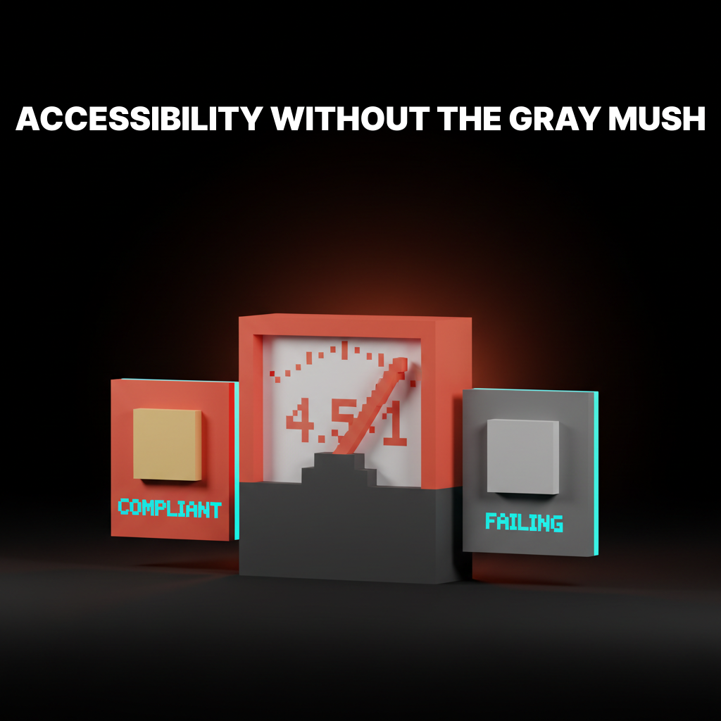
सुलभ रंग कंट्रास्ट: WCAG बिना धुंधलेपन के
अपने ब्रांड को नीरस बनाए बिना WCAG 2.2 कंट्रास्ट के लिए डिज़ाइन कैसे करें। अनुपात, APCA, वास्तविक डिज़ाइन सिस्टम के उदाहरण और एक टोकनाइज़्ड टेस्टिंग वर्कफ़्लो।
This translation is temporarily unavailable.
We’re cleaning up a formatting issue. Please check back shortly, or read the English version of this article.
Need a color system that hits WCAG without flattening the brand? Brainy builds token-layer accessibility into every palette.
Get Started