"What Linear Got Right (And Why You Can't Just Copy It)"
Linear is the most-copied product company in design-led SaaS for the second year running. Most copies fail. Here is what Linear actually got right under the surface, why screenshot-level copies miss the point, and what designers should learn from the company instead of from its UI.
Open any B2B SaaS demo day in 2026 and you will see five startups shipping a Linear skin. Dark canvas. Inter Display on the marketing site. Cmd-K everywhere. Soft cyan CTA. Four of those five feel like Jira in a costume.
Second year running that Linear has been the most-imitated product company in design-led SaaS, second year running the imitations shipped a worse version of the same idea. Linear's moat is not the interface, it is the stack of decisions under it, and the interface is the part that is cheap to copy.
This is the teardown. Seven decisions Karri Saarinen, Tuomas Artman, and Jori Lallo shipped on day one and refused to walk back. Five named knockoffs that copied the surface and missed the rest. Why surface copies fail. What is portable and what is not.
Linear is the most-copied product company in 2026
Plane ships a Linear surface on an open-source tracker. Shortcut renamed itself from Clubhouse and rebuilt the UI closer to Linear. ZenHub redrew its app with the same dark canvas and Cmd-K. Tability ships a planning product with a strikingly similar register. Height got acquired and the rebuild leaned harder into Linear's vocabulary.
None of those teams are stupid. They picked the most respected product surface in their category and tried to inherit some credibility. The credibility was earned by things you cannot see, and copying what you can see ships a knockoff with the same shape and a different soul.
The moat is the decisions, not the screenshots
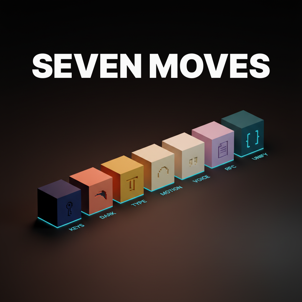
Seven decisions made early and held against a decade of pressure to soften them. Keyboard-first interaction. Dark canvas as identity, not a setting. Typography as a tool. Spring-physics motion. Technical and warm writing. RFCs as product artifacts. Engineering and design shipping with no wall.
Each is portable in theory and brutal in practice. Most companies cannot ship one, let alone seven. Copying screenshots is cheap. Copying convictions is the work.
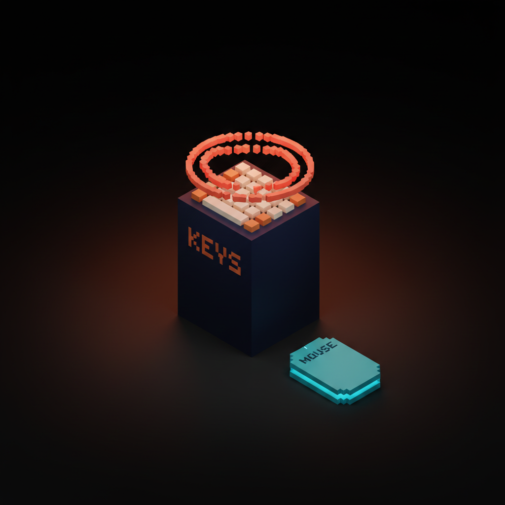
Decision one, keyboard-first is the product
Linear is keyboard-first, not mouse-first with shortcuts bolted on. Hit C, new issue. Hit Cmd-K, command bar. Every common action has a single key or two-key combo, designed as a coherent vocabulary, not a cheat sheet appended after launch.
Mouse-first products feel different in a way users register without naming. Click targets sized for fingers. Shortcuts for power users, the rest designed for clicking. Linear inverts that. Clicks for new users, the rest designed for keys. Engineered for the people who actually live in it.
Plane and Shortcut both ship Cmd-K menus. Neither is keyboard-first. Hit Cmd-K and the menu opens onto a UI that still expects a mouse. The skin transferred. The interaction model did not.
Decision two, the dark canvas is identity, not a setting
Linear ships a dark canvas as the brand. Not a toggle. Marketing site, docs, desktop app, all dark by default. The choice carries a position. Linear is for people who live in dark editors and dark terminals, not the marketing director who wants a light theme to match the corporate suite.
Most copycats ship dark mode as a setting next to light mode. The hedge looks like inclusion and reads as indecision. A product that runs both equally well has no opinion on who it is for, the brand-level sameness crisis most B2B tools are stuck inside.
The dark canvas is also a typography and motion decision. Contrast ratios shift. Elasticity reads differently on dark than on light. Linear designed the whole surface for the dark default. Competitors flipped that and the surface suffers in both modes.
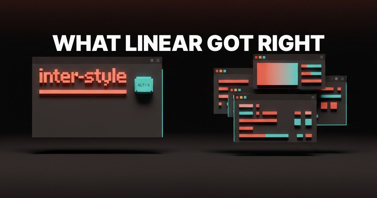
Decision three, typography is a tool, not decoration
Linear's typography stack is engineered. Inter Display by Rasmus Andersson on the marketing site, tight tracking, hard hierarchy. Inter for body. A monospace sibling for accents where you read identifiers, IDs, hashes. The sans says product. The mono says technical surface.
Tight tracking is the giveaway. Most B2B sites set headings at default tracking, which reads comfortable but generic. Linear sets them tight enough they look engineered, not designed. Hierarchy is sharp. Spacing is mathematical. Typography doing real work, not decorating space.
Knockoffs ship Inter Display because it is the obvious lift. Most set it at default tracking on a soft-background column, the opposite of Linear's discipline. Font is the cheap part. System around it is the work.
Decision four, motion is fast and physical
Linear's motion vocabulary is spring physics, subtle elasticity, and frame rates that respect the reader. Issues slide in with a bounce that has weight. Modals do not fade up over half a second, they snap with a tiny overshoot. Closer to a native macOS app than a webapp.
Spring physics is hard to fake with default ease curves. Most copycats ship CSS transitions on default cubic-bezier and the result feels like a website with the chrome removed. Linear's motion is built with libraries like Framer Motion tuned per interaction. Rauno Freiberg's public work has been pulled apart by every design engineer trying to figure out the springs. Reference is free. Discipline across every interaction is not.
Fast not slow is the other half. Slow motion reads luxurious in a portfolio and reads as friction in a tool. Linear is a tool first. Competitors who copy the spring vocabulary often slow it down and end up with software that feels heavy.
Decision five, writing voice is technical and warm
Linear writes like an engineer who likes to read. Product copy is technical without being dry, warm without being marketing slop, specific without being long. The changelog reads like a journal entry from a small team excited about the work. The docs read like internal engineering memos you wish your last company had.
Compare the average B2B SaaS landing page. Hero says transform your team's velocity. Subhead promises ten times faster shipping. Three feature cards with friendly emoji and a CTA that says Start free. Linear refuses the dialect on every surface. The voice is consistent across changelog, docs, product, support, and public RFCs.
This is the move that travels worst. Voice is downstream of taste, and most companies hire founders who write like LinkedIn and expect designers to clean it up. Linear's writing voice is the founders' voice. Voice is upstream of the surface, not downstream.
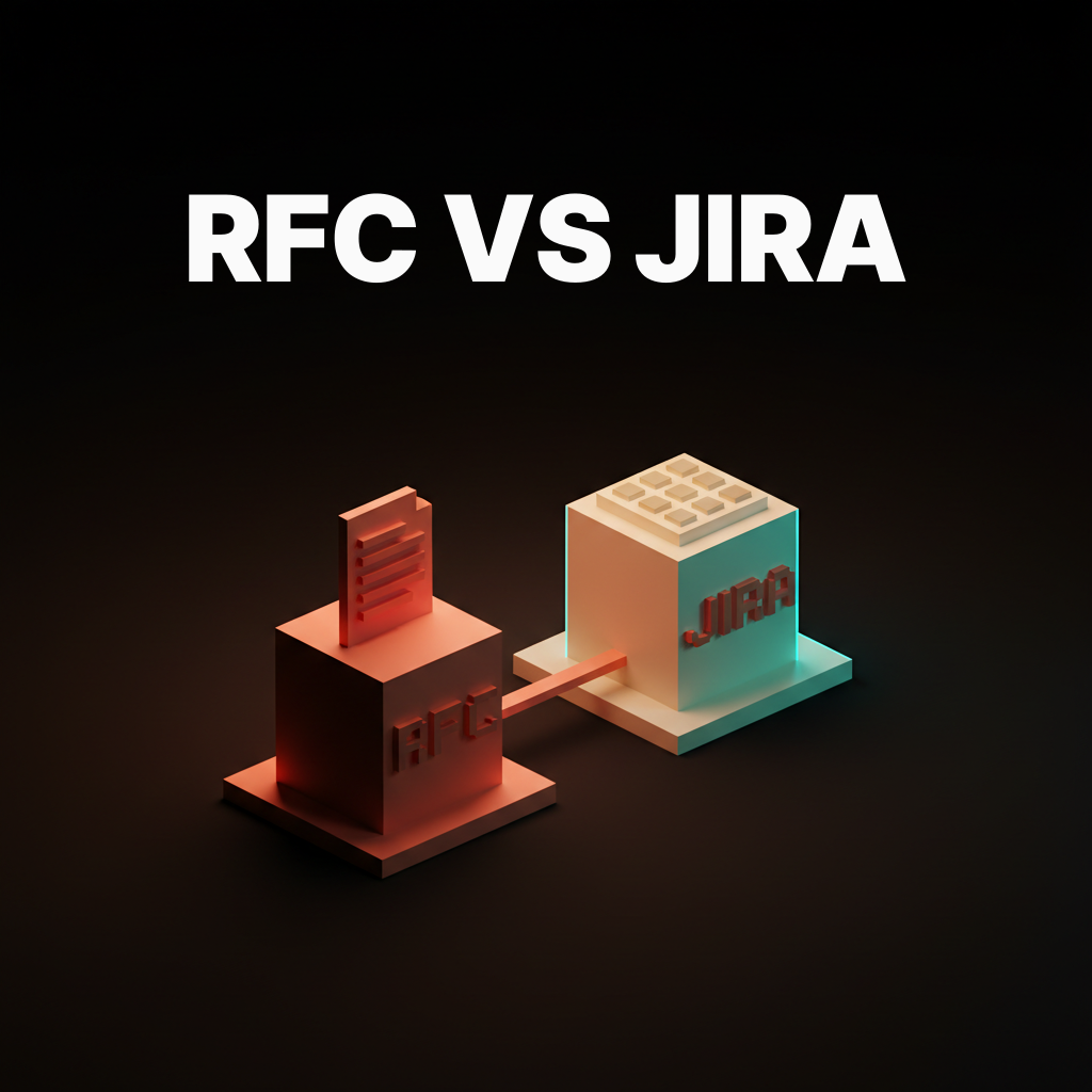
Decision six, RFCs are product artifacts
Linear publishes Request-For-Comments documents the way most companies publish blog posts. The RFC on cycles, on triage, on the project model. They are not marketing. They are the artifact the product is built from, made public so customers, candidates, and the design community read the thinking before the feature ships.
Most companies treat internal product memos as proprietary. Linear treats them as a hiring funnel and a community move. Read a Linear RFC and you understand what the team values and what the product will look like in a quarter. That transparency creates trust no testimonial wall can buy.
If you want product surfaces and brand systems that read as conviction instead of imitation, hire Brainy. BrandBrainy ships brand systems for products willing to take a position. AppBrainy ships product surfaces for teams that treat the codebase as the source of truth.
Decision seven, engineering and design ship together
Linear runs no design-versus-engineering wall. Designers ship in code. Engineers carry taste. This is the design engineering wave Linear ran two years before the rest of the industry hired for it, and the part most teams cannot import without rebuilding the org chart.
The wall costs a week per surface in a normal company. Mocks in Figma, hand off, engineer rebuilds, ten round trips on spacing, ship at eighty percent. Linear collapses the wall. Designer ships the diff. Engineer pushes back on motion. Surface ships at one hundred because nobody handed it off.
Plane, Shortcut, and ZenHub run handoff cultures. The visual register matches Linear, the iteration speed does not. Linear ships small improvements weekly. Copies ship feature drops quarterly. The cadence is the giveaway, and the cadence is the result of the unification.
The five knockoffs and what they missed
Plane copied the dark canvas, the Cmd-K, and the issue list, and kept SCRUM rituals, sprint ceremonies, and a project management model that maps one-to-one onto Jira. Skin ships. Mind is unchanged.
Shortcut rebuilt the UI closer to Linear and kept a story-driven workflow from the Clubhouse era, with sprints, points, and velocity charts that fight keyboard-first speed. Linear chose a model that suits speed. Shortcut chose one that suits estimation.
ZenHub ships a dark canvas and pulls data from GitHub Issues, so the object model is GitHub's, with labels and milestones doing the work cycles do in Linear. Interaction model constrained by a foreign data shape.
Tability ships a planning product that visually echoes Linear and runs an OKR-driven object model. Quarterly objectives and key results is a different problem with different ergonomics. The Linear vocabulary fights the OKR data, the product feels caught between two ideas.
Height rebuilt after acquisition and leaned harder into Linear's visual language while preserving the original Height workflow. The result reads inconsistent. The seam is visible to anyone who lives in the product.
Five share one thing. The visual layer changed. The decisions underneath did not. Skin transplant on a foreign mind.
A Linear skin over a Jira mind
The clearest tell of a knockoff is the shape of the work underneath the dark canvas. SCRUM rituals. Sprint planning. Story points. Velocity charts. Approval gates. None of that is wrong as methodology. All of it fights Linear's interaction model.
Linear was built on cycles, not sprints. Triage, not prioritization meetings. A flat issue list with status, not a Kanban board with stages. The model assumes a small team that ships often, writes well, and trusts itself. Drop that into a company running SCRUM with a release manager and the surface fights the work every day.
This is why screenshots fail. The dark canvas, the Cmd-K, the spring motion, the Inter Display, all of it was designed for a specific way of working. Strip the way of working and you get the visual register without the speed. A worse Jira with a better paint job is still a worse Jira.
What is transferable, and what is not
Portable first. Keyboard-first ports if you commit to it as primary input and design every screen for it. Most teams ship Cmd-K and call it done. The work is the information architecture, not the menu.
Spring-physics motion ports. Libraries are public, Rauno Freiberg's notes on tuning are public. The work is applying the discipline across every interaction.
Technical and warm writing ports if the founders write that way. Not portable if they write like LinkedIn. Voice is a hiring decision before it is a copy decision.
RFCs port. Pick one product decision a month, write the thinking up, ship it publicly. The hard part is publishing thinking in progress instead of thinking already done.
Not portable. Engineering-design unification is a culture move. It requires designers who ship in code and engineers who carry taste, a hiring filter most companies cannot apply. Importing the surface without the people gives you a slower handoff with prettier mocks.
Dark canvas as identity does not port to a product whose users live in light mode. Pick a direction the audience already lives in. Do not adopt Linear's choice because it looks cool.
Refusing features is the least portable move. Most product companies are run by founders or boards optimizing for revenue, and revenue argues for adding. Linear takes a position on what the product will and will not be. Closer to a religious vow than a process.
FAQ
What is the best part of Linear's design?
Keyboard-first interaction. Every other decision flows from making the keyboard the primary input, and the unified motion, typography, and information architecture all follow.
Why do Linear copies fail?
The visual layer is the cheap part. Keyboard-first, engineering-design unification, writing voice, RFC culture, and willingness to ship sharp opinions are decisions copycats cannot import without changing how their company works.
Is Linear better than Jira?
For small teams that ship often, communicate in writing, and trust each other, yes. For large enterprises with release managers and sprint ceremonies, Linear fights the workflow.
Who designed Linear?
Karri Saarinen led design and brand. Tuomas Artman ran engineering. Jori Lallo co-founded the company. Rauno Freiberg is one of the most public design engineers shaping the product surface.
What can I steal from Linear's design?
Keyboard-first interaction, spring-physics motion, the Inter Display plus monospace pairing, technical-and-warm writing, and publishing RFCs as product artifacts. All five port if your team will commit across every surface.
Steal what is portable. Build what is not.
Linear got specific things right. Keyboard-first as primary input. Dark canvas as identity. Typography as a tool. Spring physics, fast not slow. Technical and warm writing. RFCs as product artifacts. Engineering and design in the same loop. Seven decisions, ten years of conviction, one of the most respected product surfaces in software.
The screenshot is the cheap part. The convictions are the work. Pick the moves that port and commit across every surface. Skip the ones that need a culture transplant your company is not ready for. A good Linear-influenced product is honest about which decisions it is borrowing. A bad one ships a Linear skin over a Jira mind and wonders why customers feel the seam.
If you want a product surface that signals craft instead of imitation, hire Brainy. BrandBrainy ships brand systems for products willing to commit to a position. AppBrainy ships surfaces for teams that treat the codebase as the source of truth. Convictions are still rare. Linear is one of the rare ones, and the part worth stealing is the part hardest to see.
If you want a product surface that signals craft instead of imitation, BrandBrainy ships brand systems for products willing to commit to a position, and AppBrainy ships shipped product surfaces for teams that treat the codebase as the source of truth.
Get Started