UX Designer Resume Tips: 6 Fixes That Stop It Looking Junior
Six UX designer resume tips with before and after lines you can copy: results over duties, no skill bars, one column on one page, a real portfolio link, a headline instead of an objective, and the scale of your work.
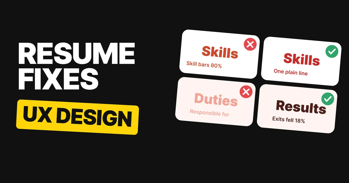
A resume looks junior for the same reason a screen does: the content is fine, the decisions behind it are not. Duties instead of results, bars instead of words, two columns, a dead link. Here are six fixes, each with a before and an after you can copy.
All the names, numbers and addresses below are invented examples. Swap in your own, and only claim what is true.
1. Results, not duties
Junior
Product Designer
Ledgerly · 2022 to now• Responsible for designing screens• Worked with engineers on features• Took part in design reviews
✕ Junior: what the job description says
Senior
Product Designer
Ledgerly · 2022 to now• Redesigned checkout. Exits fell 18%.• Built a design system for 6 teams.• Cut support tickets by a third.
✓ Senior: what changed because you were there
Every designer on the left was "responsible for" something. That tells the reader the seat existed, not what you did in it. The right side says what moved, in one short sentence: the verb, the thing, the result.
Use this pattern for each bullet: did what, and what happened. If you do not have a number, say the outcome in plain words ("Removed two steps from onboarding"). If you have neither, cut the bullet.
2. Cut the skill bars
Junior
Skills
Figma ████████░░Research ██████░░░░Prototyping █████░░░░░Design systems ███████░░░
✕ Junior: bars that rate you against nothing
Senior
Skills
Figma, research, prototyping, design systems
✓ Senior: one line of plain words
A bar claims a measurement, but nothing is being measured. Is 70% in Figma good? Out of what? The bar also hands the reader a reason to doubt you: why is research only 60%?
One line of skills says everything the bars did, takes one line instead of four, and survives being pasted into any form or tracking system as plain text.
3. One column, one page
Junior
Two columns, two pages
Sidebar: Skills, Contact, LisbonMain: Experience, EducationPage 1 of 2
✕ Junior: the eye has to zigzag
Senior
One column, one page
Alex RiveraExperienceEducationSkillsPage 1 of 1
✓ Senior: one path from top to bottom
A resume gets read quickly, top to bottom. One column gives the reader a single path: name, experience, education, skills. Two columns make them decide where to look first, and a sidebar usually fills with the least important things.
One page forces the editing that makes the rest good. If a role from years ago needs five bullets to justify itself, it needs one. The "Jake's Resume" template on Overleaf is a useful model: one column, a rule under each section heading, bold role, short bullets.
4. Link your best work
Junior
Portfolio
Portfolio available on requestReferences available on request
✕ Junior: makes the reader ask
Senior
Portfolio
alexrivera.design/sudsCheckout redesign, exits down 18%
✓ Senior: one real address, one line of why
"Available on request" asks a busy person to send an email before they can judge you. Put the address in the resume and make it one project, not a homepage: the best piece for the job you want, with a few words on the result.
Check that the link opens without a login and that the first thing on the page is the work. Our guide to building a design portfolio covers what to put behind it.
5. Drop the objective
Junior
Alex Rivera
ObjectiveSeeking a challenging role in a dynamic company where I can grow my skills.
✕ Junior: says what you want, not what you are
Senior
Alex Rivera
Product designer. 4 years in fintech.
✓ Senior: a headline the reader can use
An objective describes what you want from the company. The company already knows it is hiring. A headline says who you are and where you have done it, in the length of a job title.
The formula is short: role, years, domain. "Product designer. 4 years in fintech." Two sentences are the limit.
6. Say the scale
Junior
Product Designer
Ledgerly · 2022 to nowWorked on a mobile app.
✕ Junior: no size, no reach
Senior
Product Designer
Ledgerly · 2022 to nowiOS app, 2M users, team of 6.
✓ Senior: size, reach, team
"A mobile app" could be a weekend project or a product used by millions. The scale line tells the reader which one it was, in five words: the platform, the users, the team.
If you cannot share numbers because of an NDA, give ranges or relative terms ("a top-three app in its category") and let the portfolio carry the detail.
The six fixes on one table
| Junior | Senior | Copy this |
|---|---|---|
| Duties | Results | "Redesigned checkout. Exits fell 18%." |
| Skill bars | One line of skills | "Figma, research, prototyping, design systems" |
| Two columns, two pages | One column, one page | Name, Experience, Education, Skills |
| "Portfolio on request" | A real link | "alexrivera.design/suds" |
| Objective | Headline | "Product designer. 4 years in fintech." |
| "Worked on an app" | The scale | "iOS app, 2M users, team of 6." |
FAQ
How long should a UX designer resume be?
One page for most designers. Cut older roles down to a line each before you add a second page.
Should a designer resume have skill bars?
No. Bars rate you against nothing and invite doubt. One line of plain skills says the same in less space.
Should I put an objective on my resume?
No. Replace it with a one-line headline: role, years and domain, for example "Product designer. 4 years in fintech."
What should I put in resume bullet points?
What you did and what changed because of it: "Redesigned checkout. Exits fell 18%." If you have no number, state the outcome in plain words.
Should I link my portfolio on my resume?
Yes, with a real address that opens without a login, ideally to the one project that best fits the job. Avoid "available on request".
Should a designer resume be one column or two?
One column. It gives the reader a single top-to-bottom path and keeps the page easy to scan.
Sources
- Layout reference: Jake's Resume on Overleaf, a one-column template with a rule under each section heading.
- The name Alex Rivera, Ledgerly, the addresses, 18%, 4 years, 6 teams, "a third" and 2M users are invented examples. The six notes are editorial advice, not measured figures.
- First published as a carousel on UX Brainy.
Want your product to look as senior as your resume should? Our team designs UI that holds up in every state.
Get StartedGet new papers by email
New Brainy papers in your inbox. Confirm once, unsubscribe anytime.