Separation Solution
The brief
A laboratory's discipline, a film still's drama
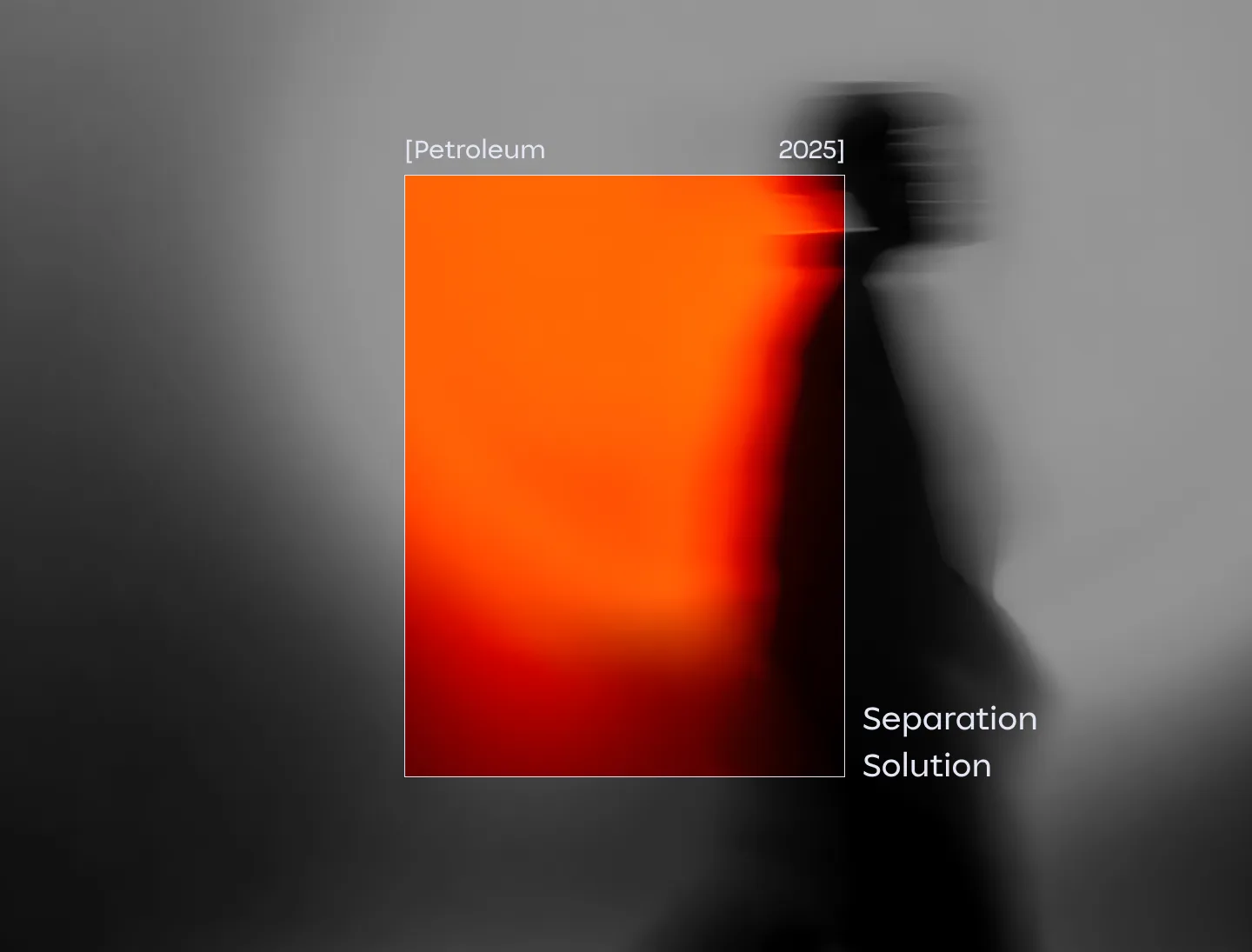
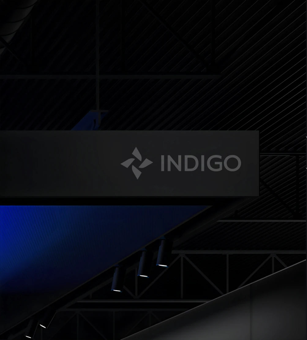
Indigo is a petroleum separation technology company, and the identity treats energy work like classified research. Monochrome cinematic photography puts people first, bracketed indices file every artifact, and one geometric sans does all the talking. Color is held back for exactly two moments, an electric ultramarine and a burning orange that fill entire panels instead of decorating them.
Turn it. Monochrome, people first, filed under one index.
The programme
- Step [01]Beyond conventional energyVision
- Step [02]Engineered for progressPerformance
- Step [03]Powering tomorrow's energyInnovation
- Step [04]Fueling modern industryReliability
- Step [05]Built for tomorrowSustainability
The mark
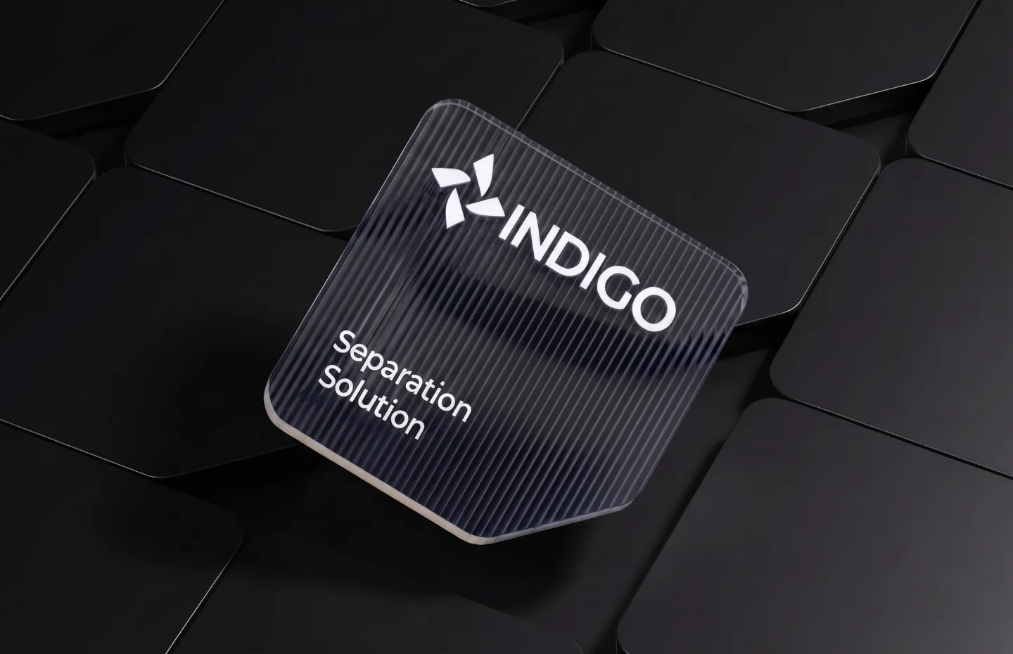
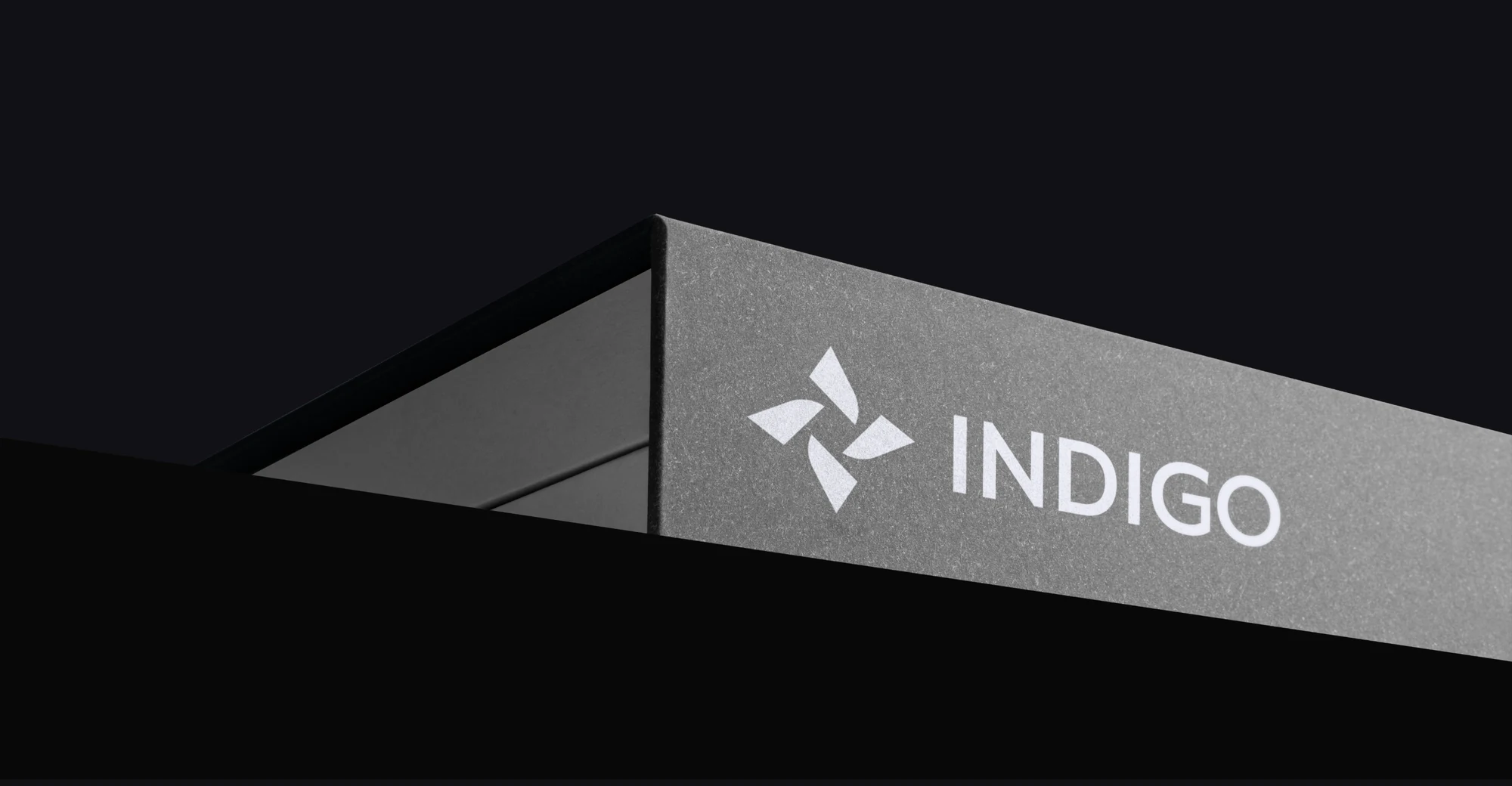
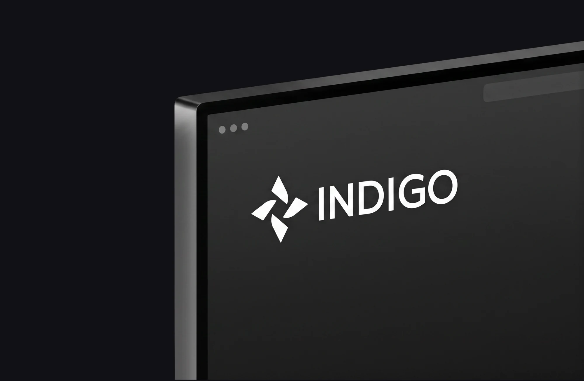
The wordmark is drawn, not set: even stems, flat terminals, and tracking opened just far enough that the letters read as instruments on a panel. Everything else in the identity is filed underneath it.
The typeface
Unitea Sans
Geometric sans, drawn light and set open. Two weights carry the whole system.
- 300 Light
- The running index, captions, and every bracketed designation
- 400 Regular
- Headlines, signage, and anything that holds a panel on its own
ABCDEFGHIJKLMNOPQRSTUVWXYZabcdefghijklmnopqrstuvwxyz0123456789 [ ] ( ) / . , : ·Set in the house mono: the Unitea alphabet is not licensed for the web.
 The photograph
 The poster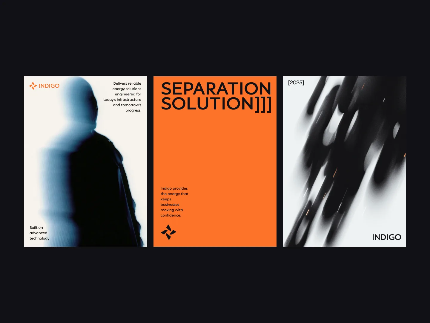
The archive
Filed, worn, archived
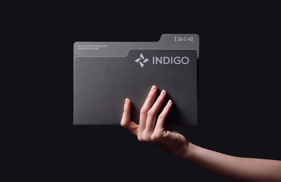
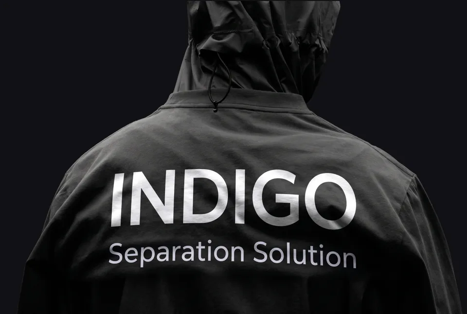
The archival layer becomes physical. A tabbed folder indexed like a records office, a technical jacket printed in metallic white. One voice at every scale, from screen to fabric.

Built for tomorrow
Colour is held back for exactly two moments, an electric ultramarine and a burning orange, and both fill whole panels instead of decorating them.