Luma

The brief
Hello, ordinary day
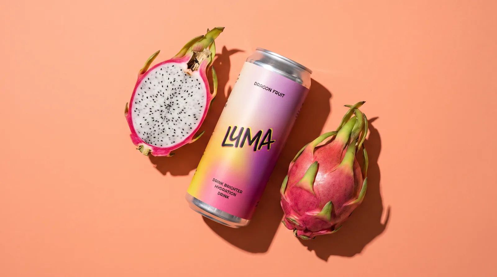
It’s sparkling dragon fruit, for days when nothing much happens. So nothing here rushes: one cream, one aurora gradient, a wordmark somebody drew by hand, and an orange character to do the moving.
The mark
It gets printed four times to look like once
Three neon plates, then the black one on top. The fan between them is drawn into the artwork rather than added by the page, so the name wobbles the same amount on a can, on a phone and on a poster.
- Rise
- +19.4°, drawn in
- Ink box
- 524 × 357, 1.47 : 1
- Passes
- Orange, magenta, chartreuse, ink
- Drawn
- By hand, then traced to vector
Six colours, blurred until you can’t find an edge. It’s all cut out of this.
The character
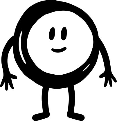
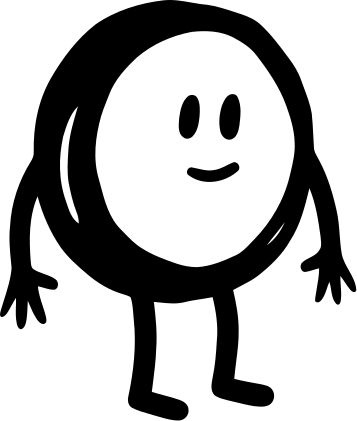
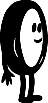
One shape, drawn from every side
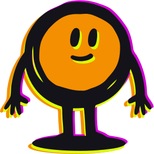
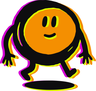
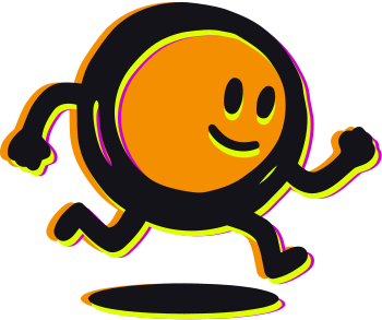
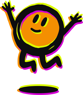
He is a circle with a face and four lines. That is the whole rule, and it is what lets him turn around, run, sit down and still be obviously the same little guy.




Type system
Two fonts live here
One yells the name across a shop. The other handles everything you actually read. Nobody else got invited.
Drink Brighter
Comfortaa
Text / 400, 500, 700Righteous does the yelling
Headlines, never a paragraph. It stands next to the hand drawn wordmark without elbowing it. Only it gets the double vision.
Comfortaa does the talking
Round the way the can is round, so the small print sounds like a friend reading it out. 400 prose, 500 facts, 700 panel heads.
The scale
role / face / size / leadingThe wraparound
Turn the can around
A why panel, three mascot moments, badges, serving facts, and a QR that traces the pulse. One dieline, ready to print.
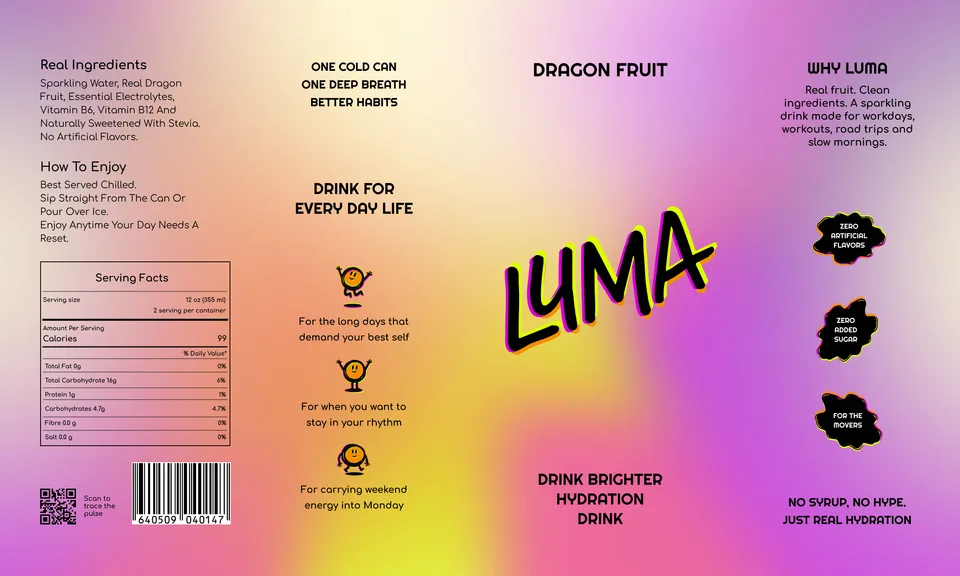
Swipe. It keeps going.
On the shelf
Cold, held, and lined up
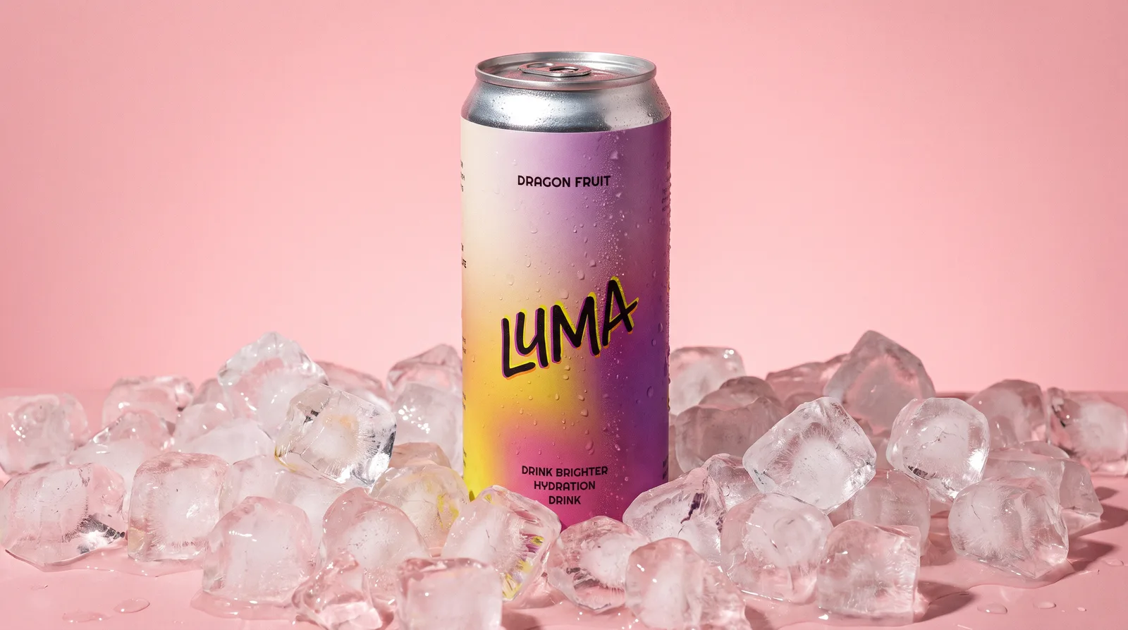
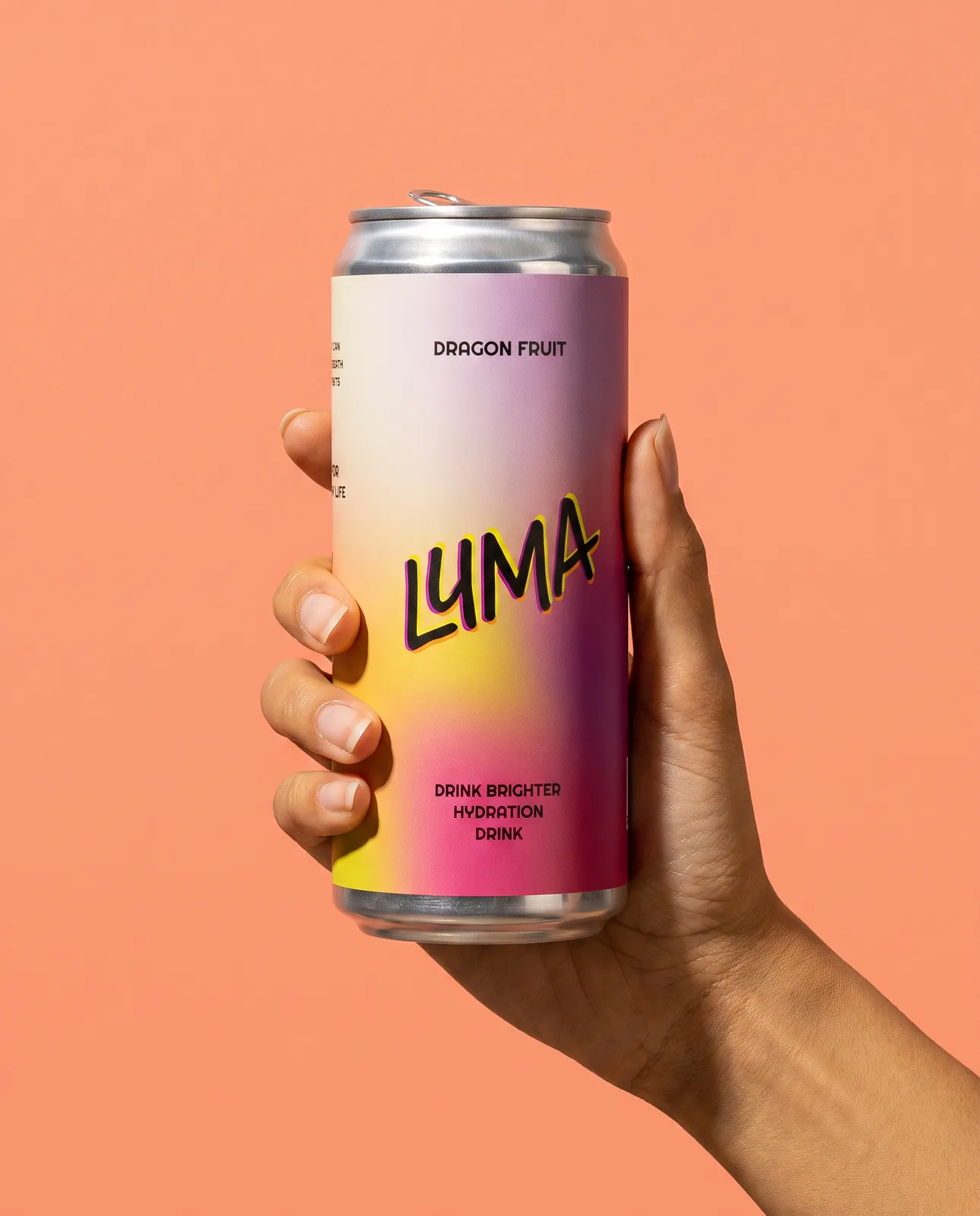
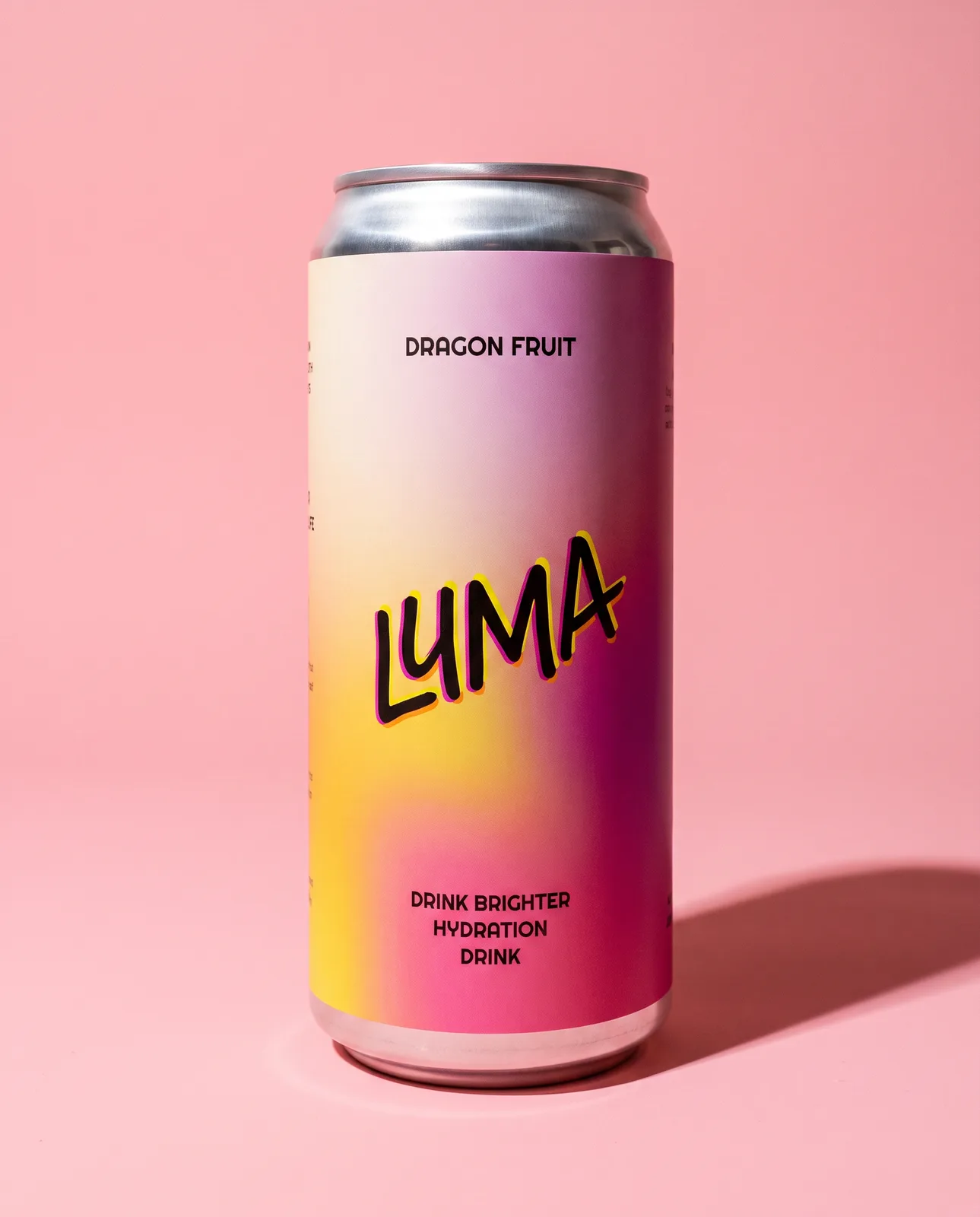
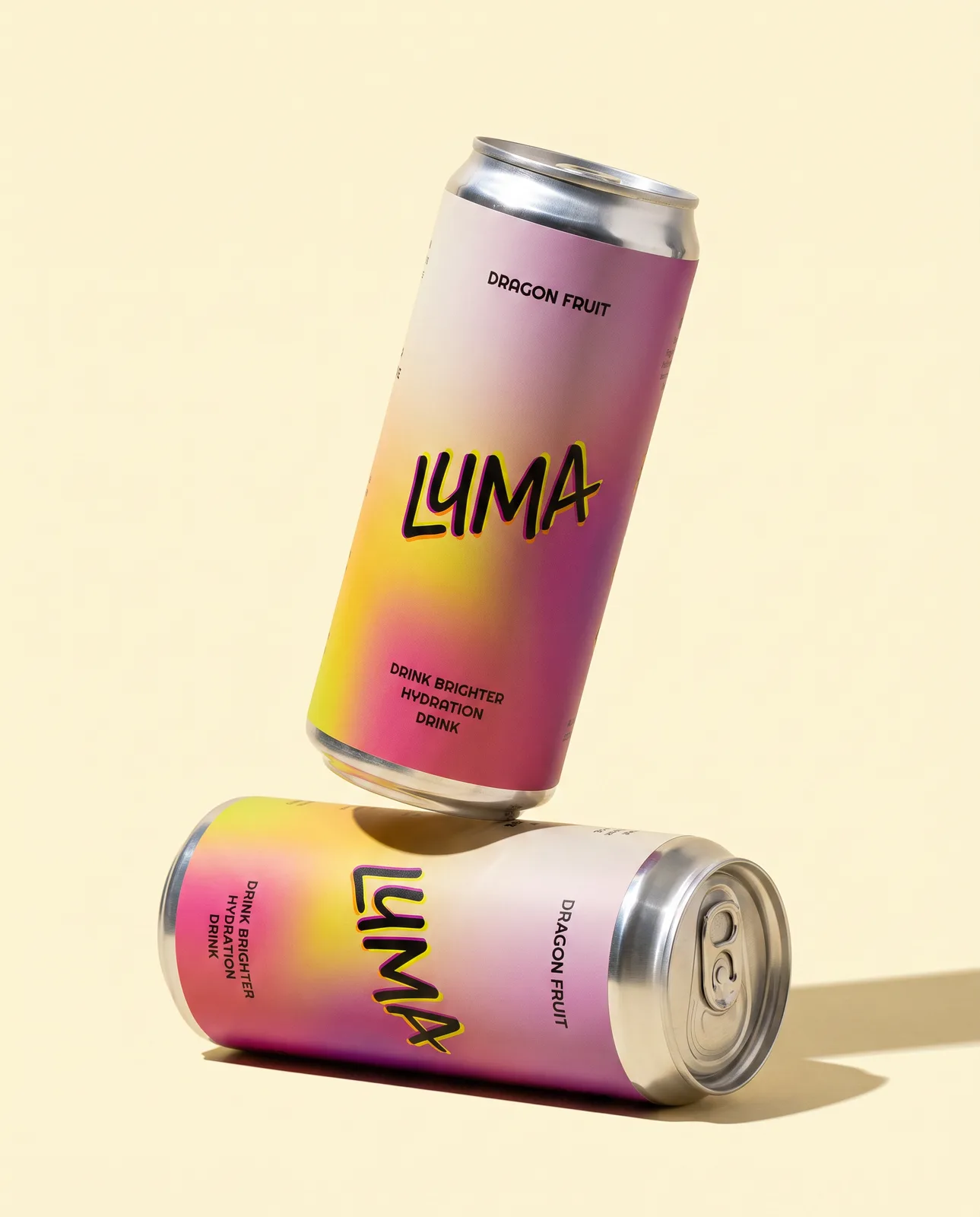
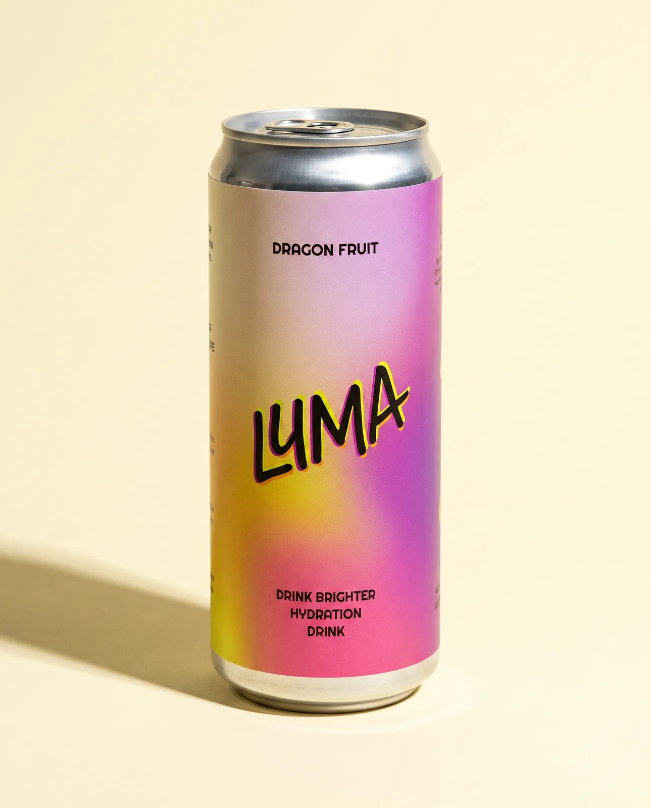
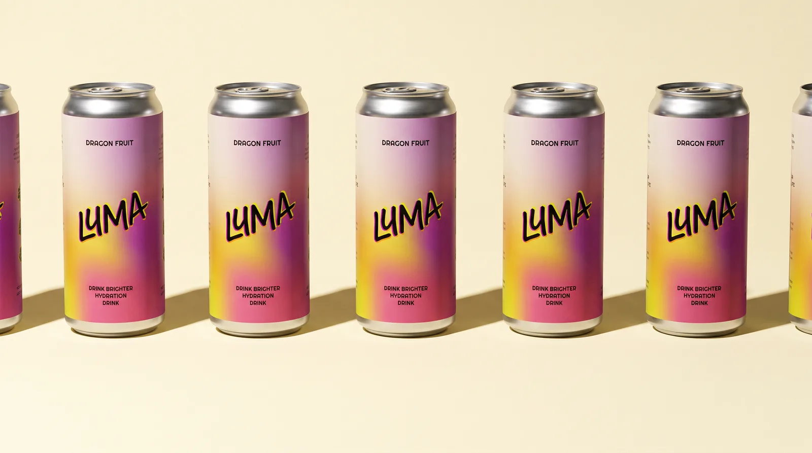
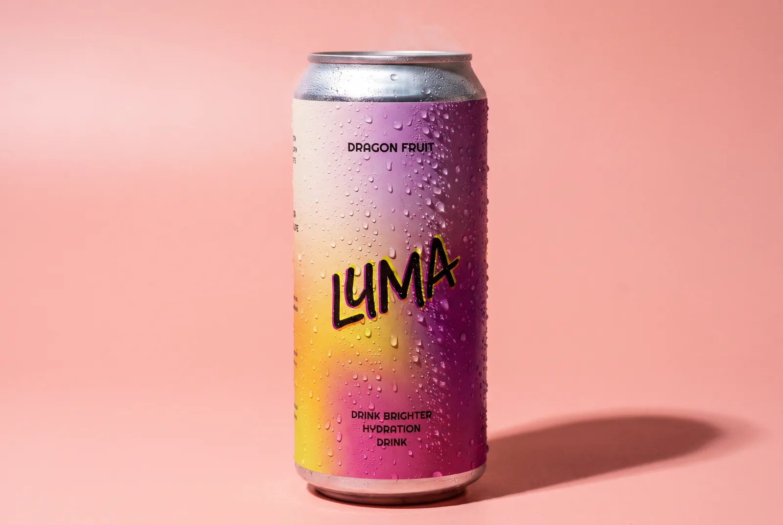
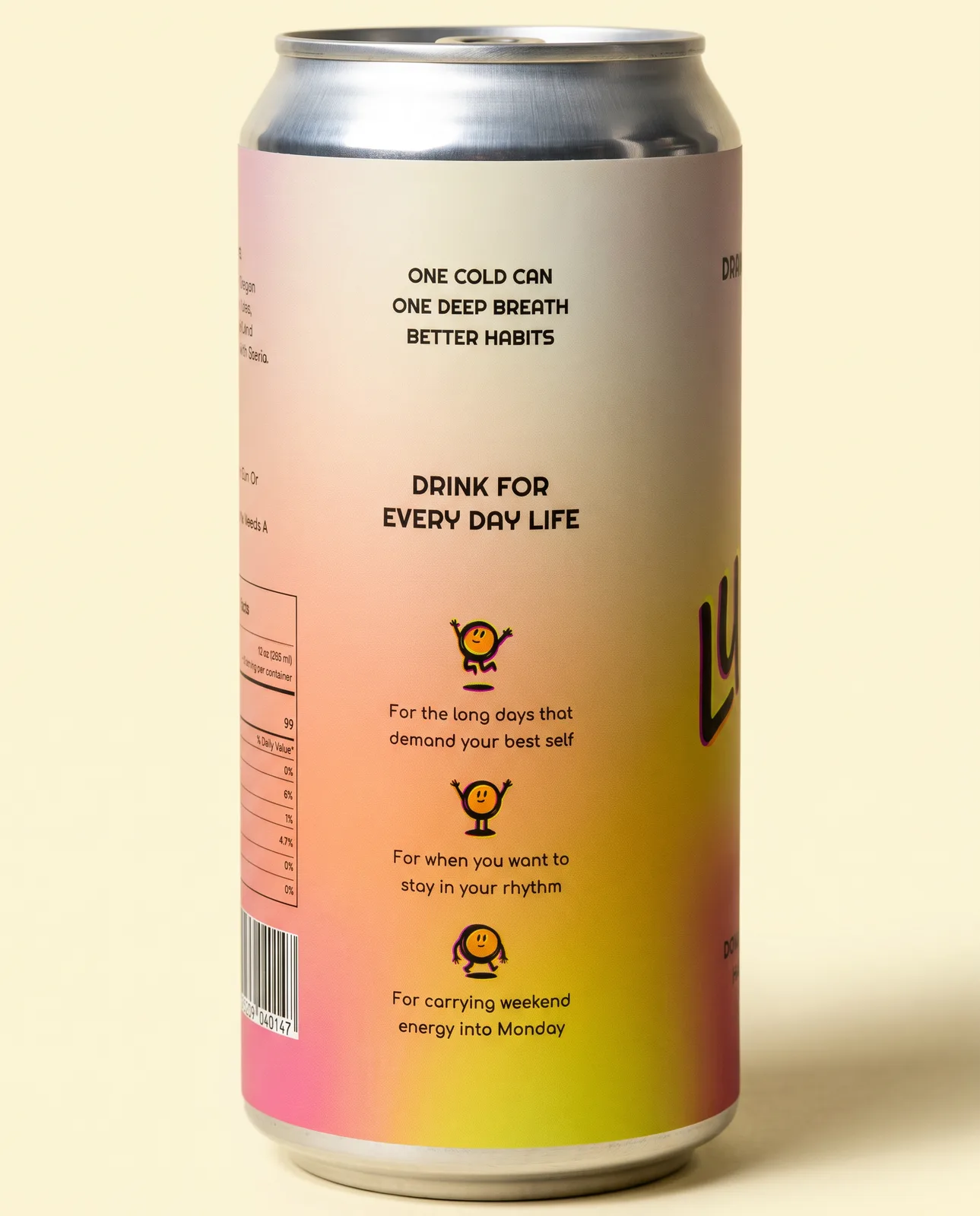
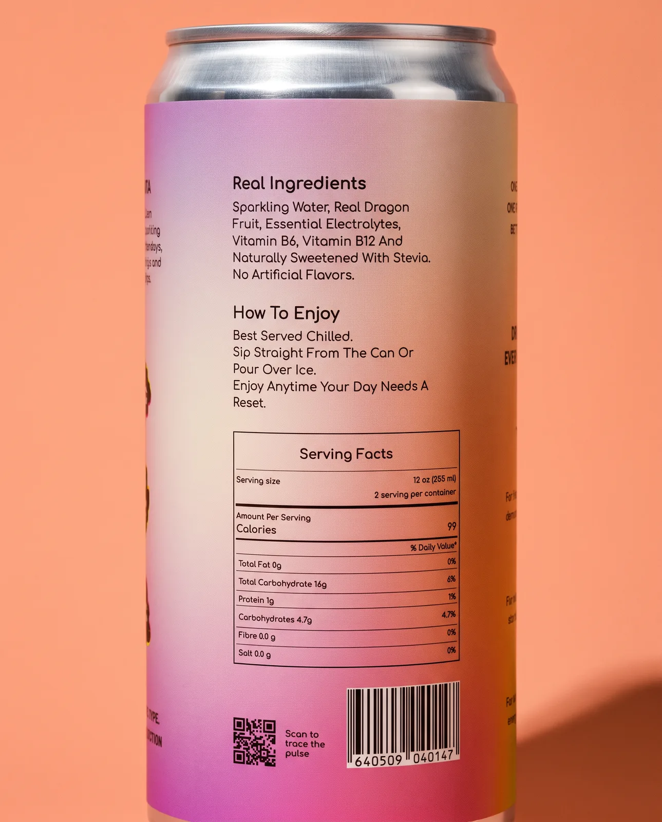
Everything a shopper needs is on the back, in the small friendly face, where it is easy to read at arm’s length.
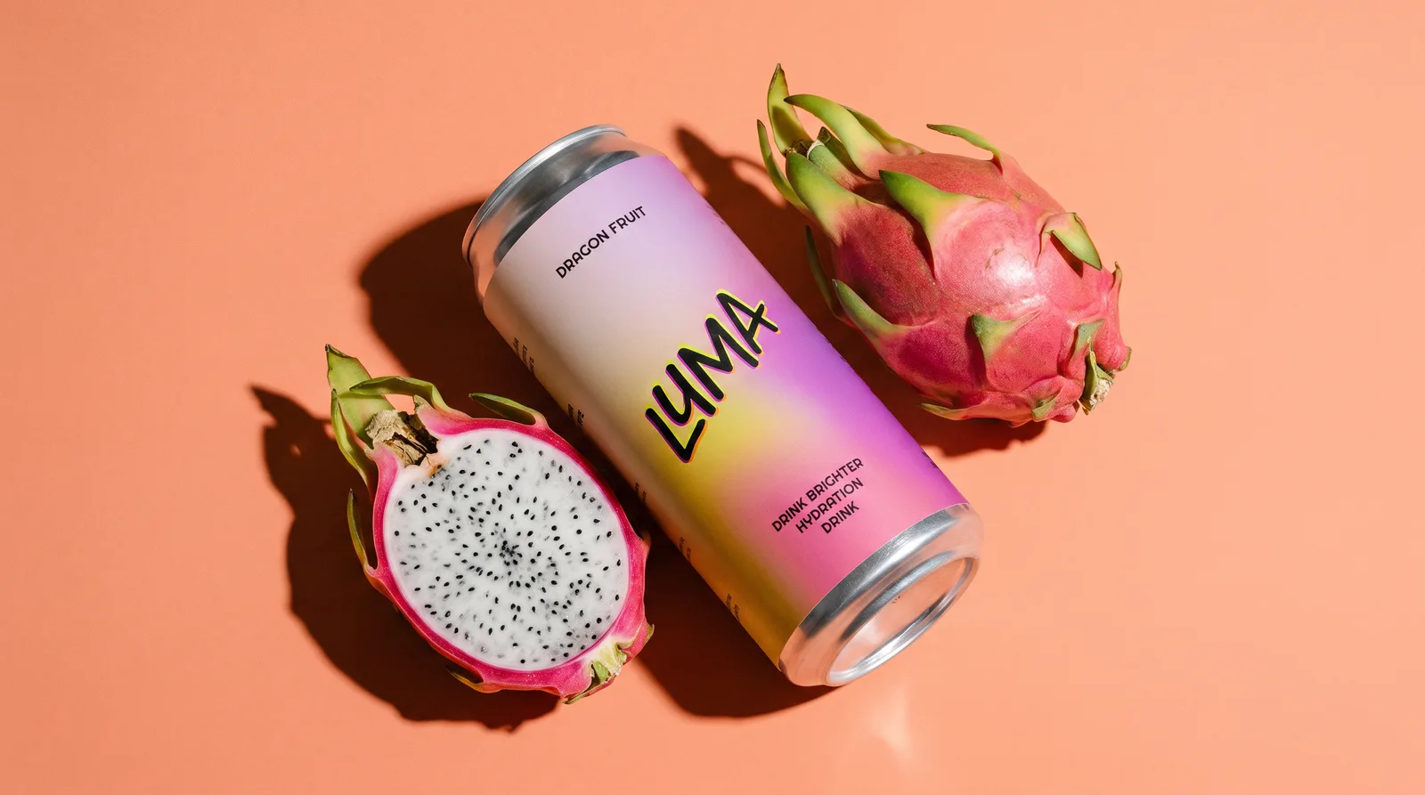
“Real fruit. Clean ingredients. No syrup, no hype.”
Have an ordinary day