



Value wasn’t easy to understand
Binex aimed to help startups define their position and build communities, but without a clear brand strategy or visual identity, its message felt vague.
Binex · Brand identity by Brainy Studio
Future-focused tech that helps startups and businesses strategically define their position, grow their audience, and build connected communities.
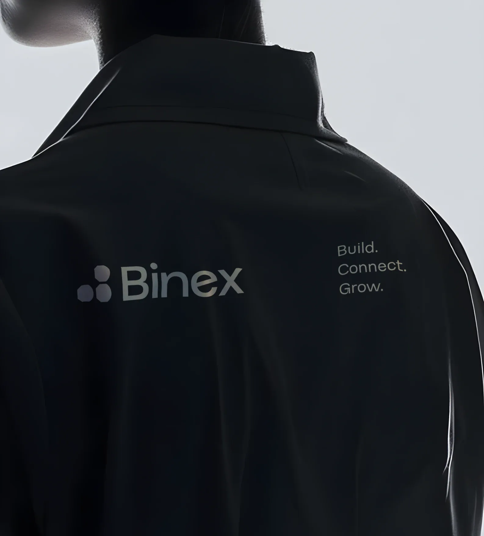
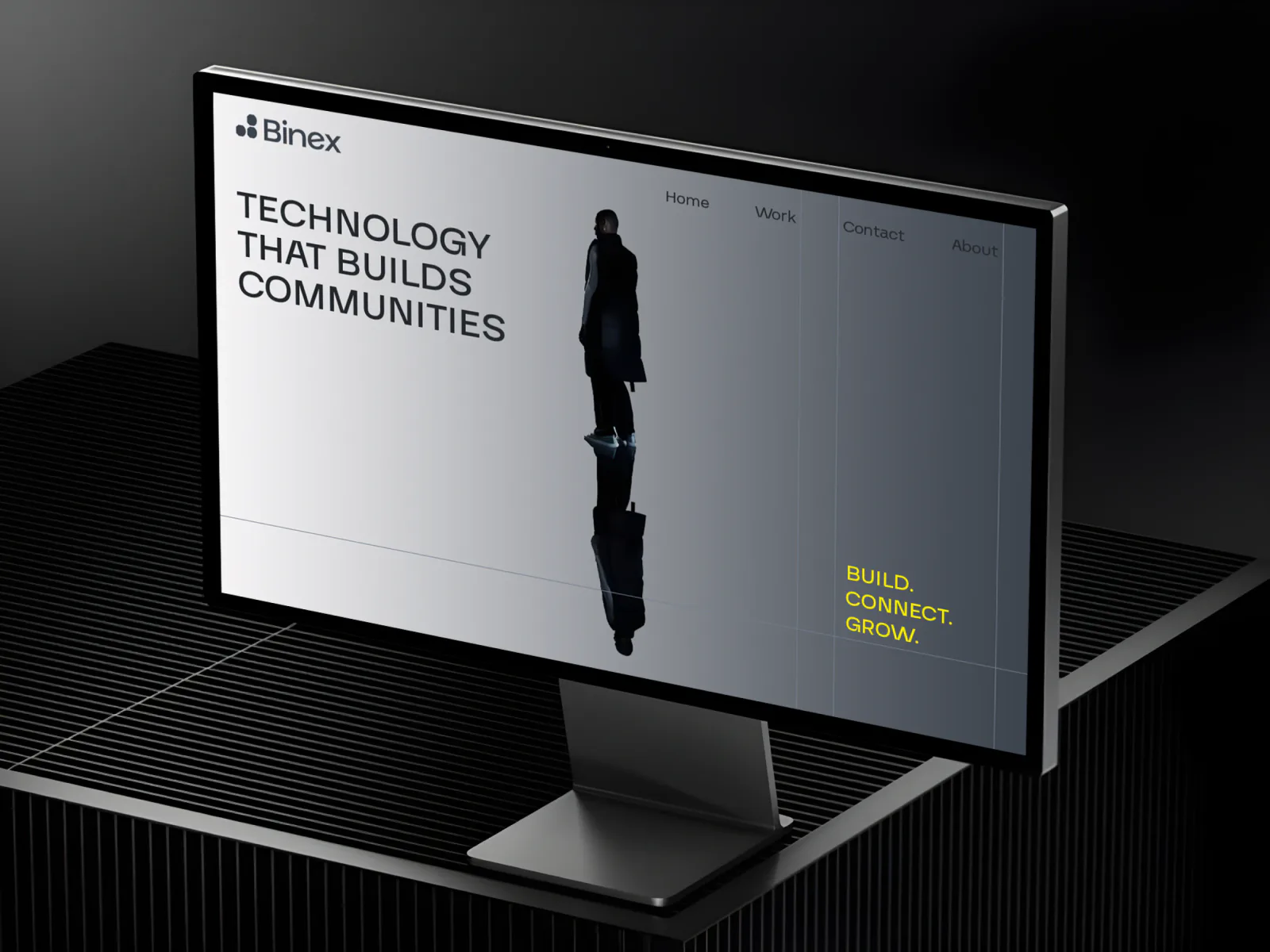
Build.
Connect.
Grow.
03 · The brief
Binex aimed to help startups define their position and build communities, but without a clear brand strategy or visual identity, its message felt vague.
We clarified Binex’s core offerings and values, then built a messaging system around “Build. Connect. Grow.” This gave the brand a strong strategic direction that clearly communicates its role.
Binex had no logo, color palette, or typographic standards, making it hard to create a consistent, professional image. Without a scalable identity, it couldn’t compete in the tech space or build user trust.
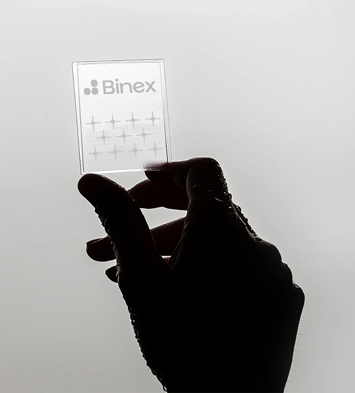
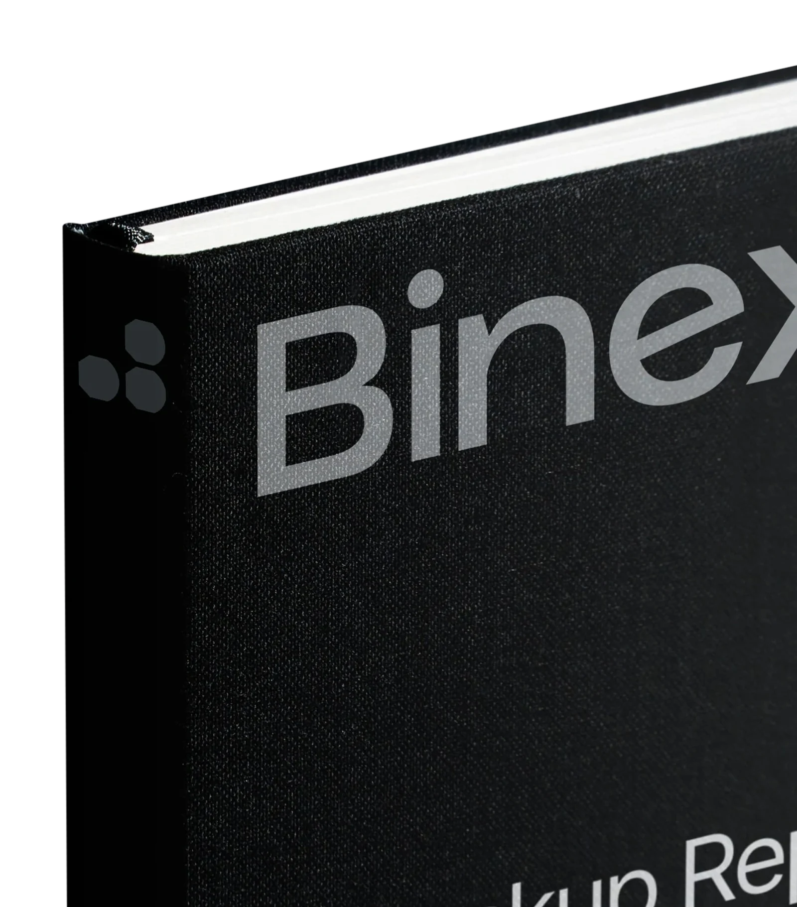
We created a sleek logotype reflecting growth, completeness, and community, supported by a modern color palette and flexible design assets.
Binex aimed to help startups define their position and build communities, but without a clear brand strategy or visual identity, its message felt vague.
We clarified Binex’s core offerings and values, then built a messaging system around “Build. Connect. Grow.” This gave the brand a strong strategic direction that clearly communicates its role.
Binex had no logo, color palette, or typographic standards, making it hard to create a consistent, professional image. Without a scalable identity, it couldn’t compete in the tech space or build user trust.
We created a sleek logotype reflecting growth, completeness, and community, supported by a modern color palette and flexible design assets.
04 · The mark
A mark that grows and connects over time, symbolizing completeness, movement, and community.
05 · The grid
06 · Type and colour
07 · The story
Binex was created with one purpose:
To bridge the gap between great ideas and real-world impact.
Its founders saw how many visionary startups struggled, not due to lack of passion, but because they lacked the tools to build structured systems, understand their market, and create a lasting community.
Binex stepped in to offer that structure.
It guides brands from chaos to clarity, from potential to position.
Over time, the brands it supports become complete, connected, and ready for the future.
The Binex logo reflects this:
A mark that grows and connects over time, symbolizing completeness, movement, and community.
Innovation hubsAcceleratorsBusiness networks
08 · The offer
Scalable tools, APIs, cloud architecture, and platforms.
Data-driven user segmentation and targeting.
09 · The product
10 · Posters
To bridge
the gap
Between
great
ideas
18-
And real
world
impact
Tools for loyalty, engagement, and advocacy.
Helping brands define their space and future goals.
Blends tech infrastructure, market positioning, and community-building tools into a unified solution for the next generation of startups and mid-size businesses.
11 · In use
12 · The site
13 · Where it stands
Build. Connect. Grow.
Binex, a brand identity by Brainy Studio.
Made by