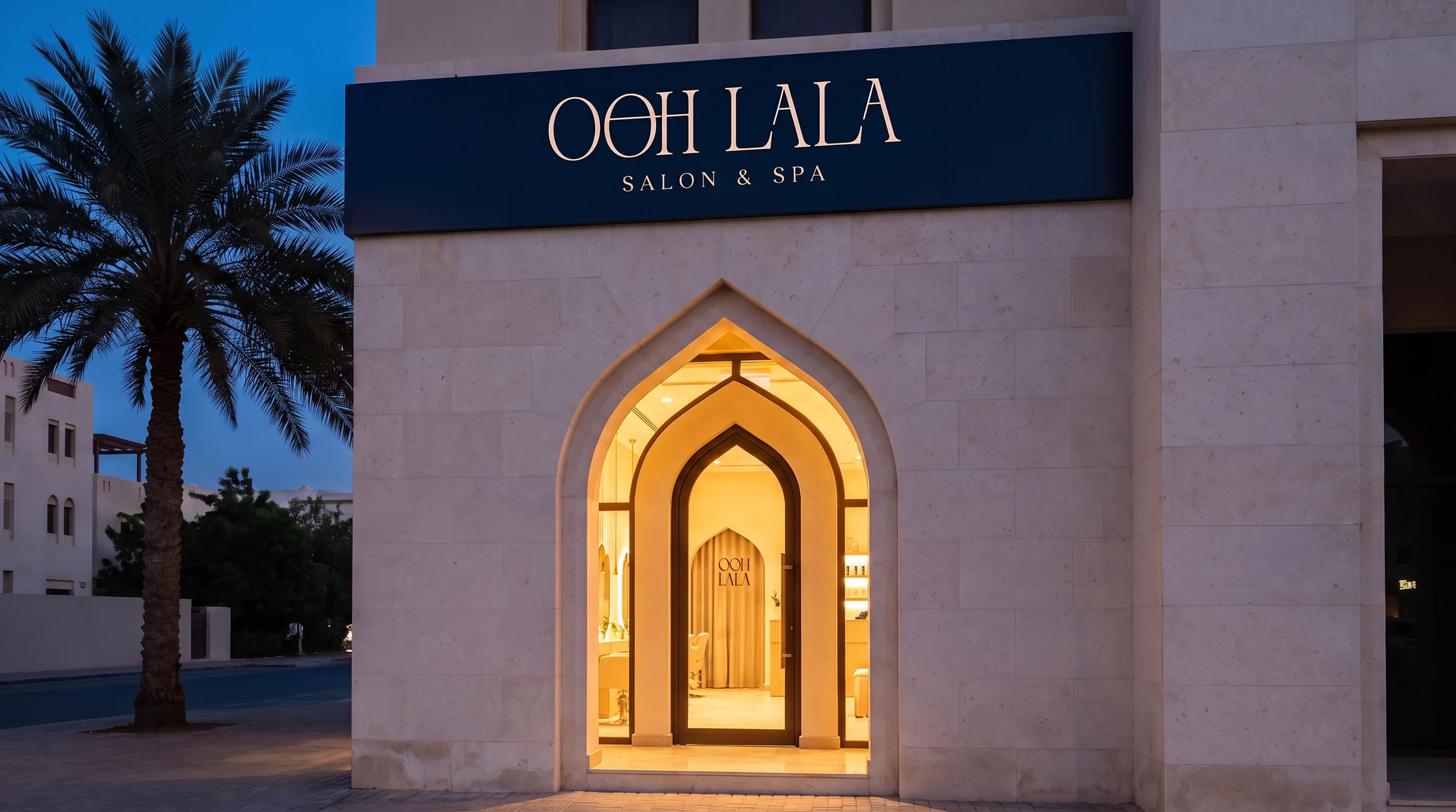
One line
holds the word
together.
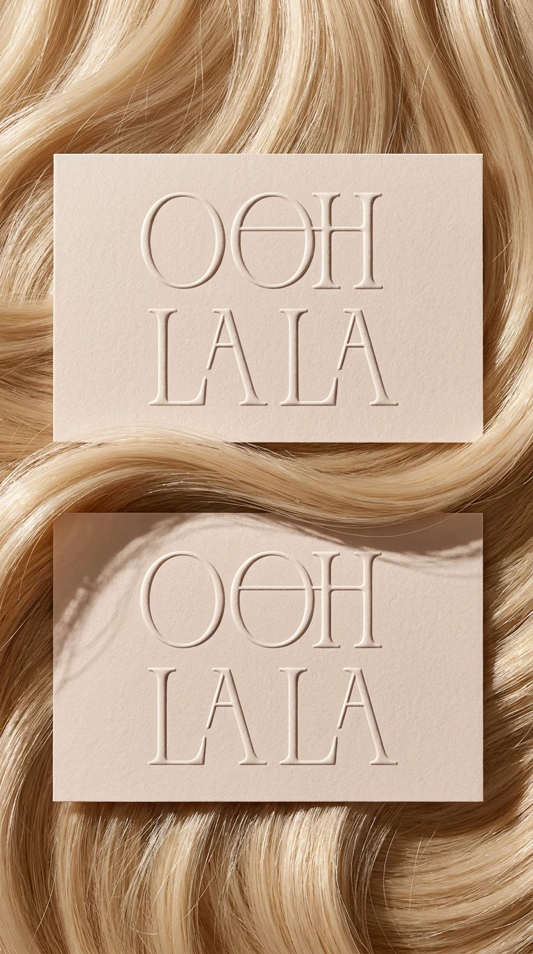
The second O and the H share a crossbar. It runs straight through both, so OOH stops being three letters standing near each other and becomes one connected gesture. Nothing else in the mark is unusual, and nothing else needs to be.
The bar spans 55% of the lockup and sits at a constant height, so it can be drawn as a single unbroken stroke. That is the whole construction, and it is also the salon's own promise.
A cut that holds its shape.
printed on the navy hang tag
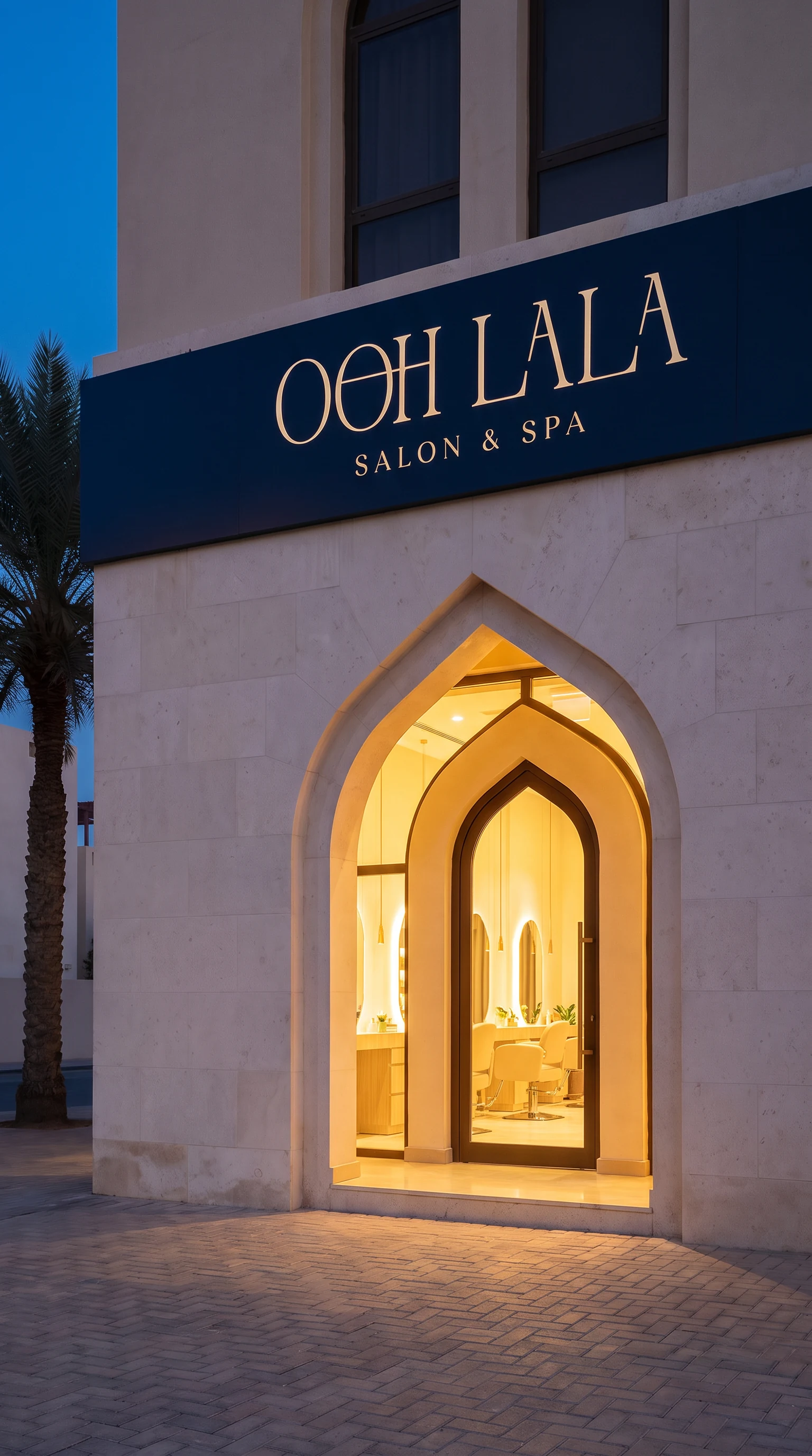
The monogram
is the doorway.
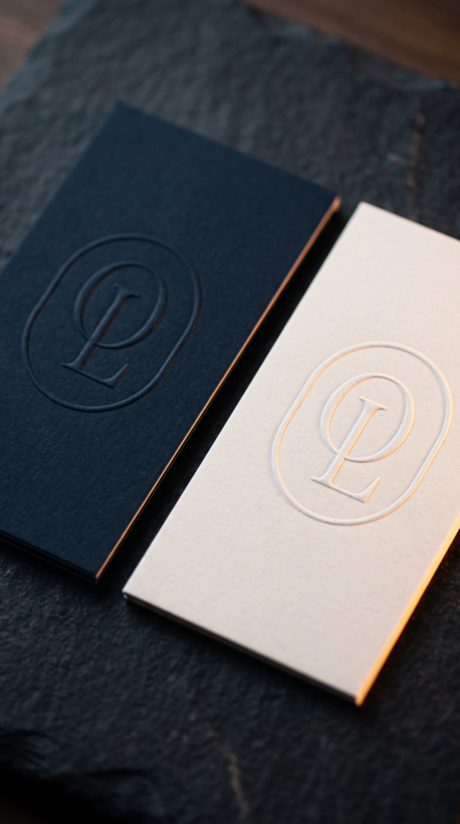
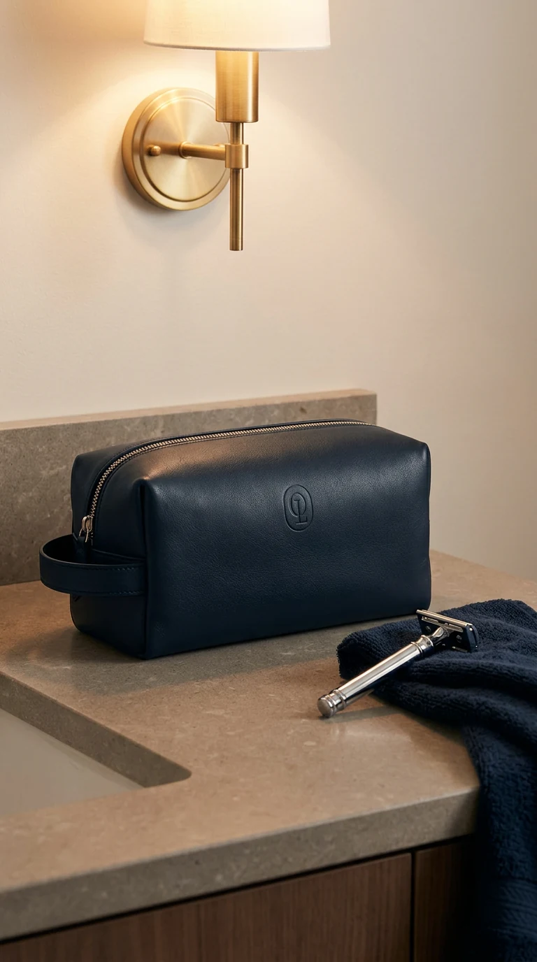
O and L nested inside a double-lined frame whose corner radius is exactly half its width. That is not a rounded rectangle, it is an arch, and it is the one the building is cut into.
- Frame
- 650 × 858, r325
- Inner rule
- offset 17.3, half weight
- Letters
- O and L, overlapped
- Ratio
- exactly 2r wide
Two pairs,
and nothing else.
Navy and paper carry the identity. Rose and blush carry the room. Neither pair is an accent on top of the other, so a surface commits to one and the mark comes with it.
The identity
navy
#0F1E2E
paper
#F6F1EA
The room
rose
#B56B79
blush
#F2E0D6
Every panel is live. Hover or focus one to swap the monogram for the wordmark: each pairing exists as both.
The seal,
on the diagonal.
Wordmark arched above, monogram in its frame, descriptor arched below, a rule either side. Set at twenty degrees on a 760 by 1120 tile so nothing in it ever lines up with an edge.
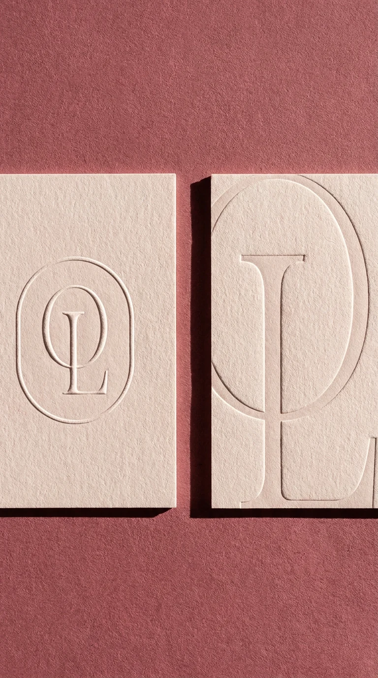
On board, the seal stops being a texture and becomes a deboss. Blush stock, pressed deep enough that the mark is only there in raking light.
And the same tile the other way round: navy on paper, for wrapping, liners and anything the room is not already wearing.
Pressed,
not printed.
Every printed piece is a blind emboss on stock in one of the brand's own colours. The mark appears in raking light and disappears in flat light, which is the point: it is a texture you find rather than a logo you are shown.
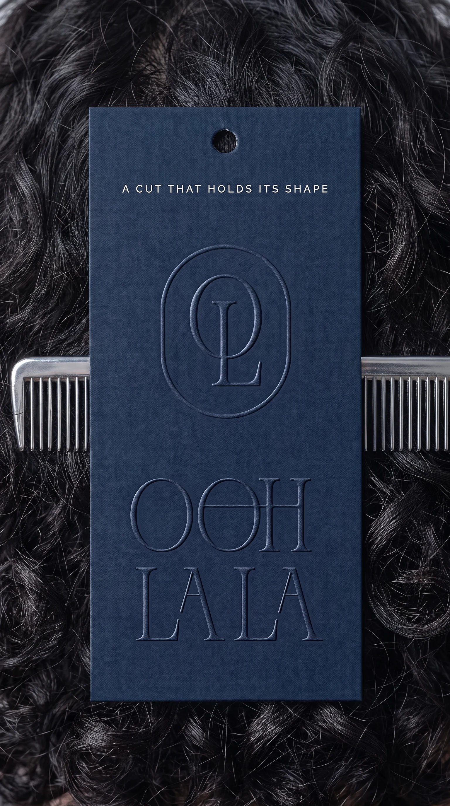
A cut that holds its shape.
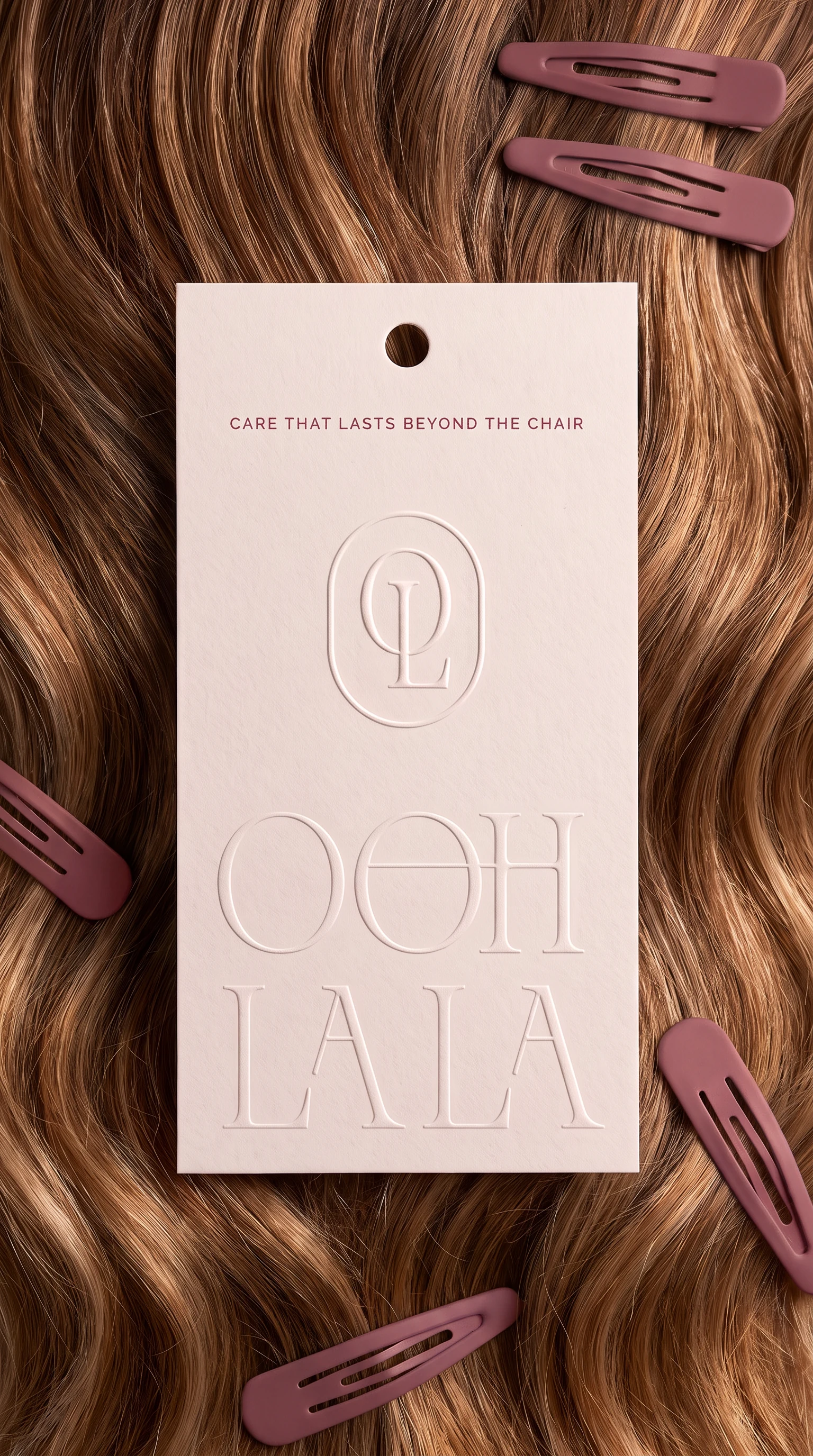
Care that lasts beyond the chair.
Navy by night.
Rose by evening.
The horizontal lockup, single line, centred, with SALON & SPA tracked out underneath. Both colourways were drawn on the same board, so the shop can change without the mark changing. Drag the handle: it is one camera on two evenings, and only the sign moves.
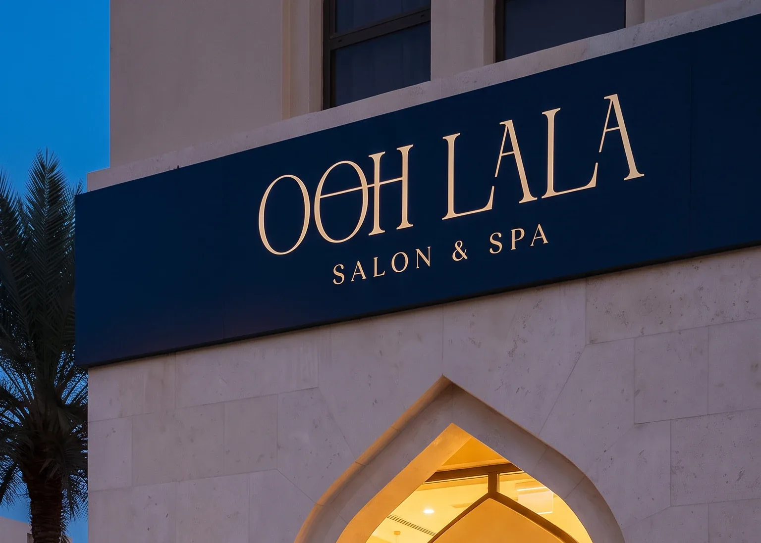 Navy
Navy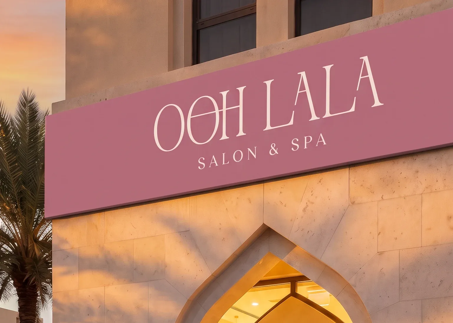 Rose
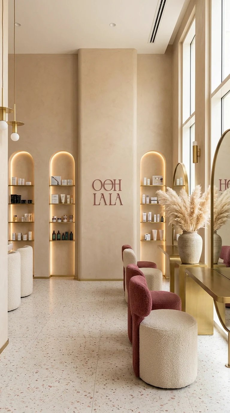
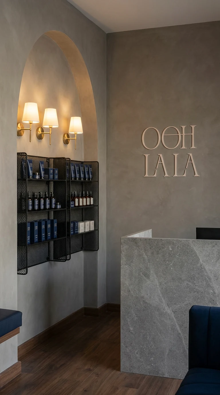
RoseThe arch again,
at furniture scale.
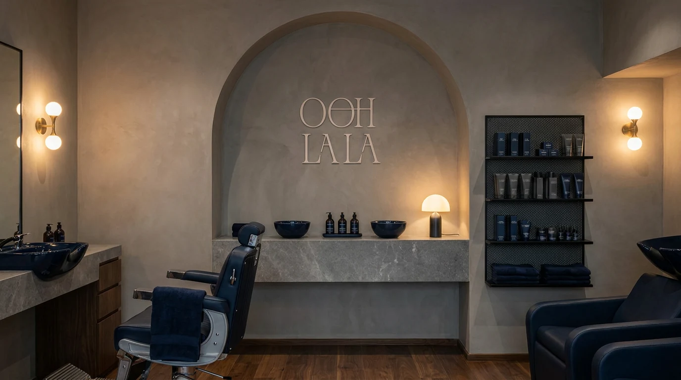
Every niche, mirror and alcove is the monogram's frame at a different size. The identity is not applied to the room, it is the room's plan.
The parts a guest
actually touches.
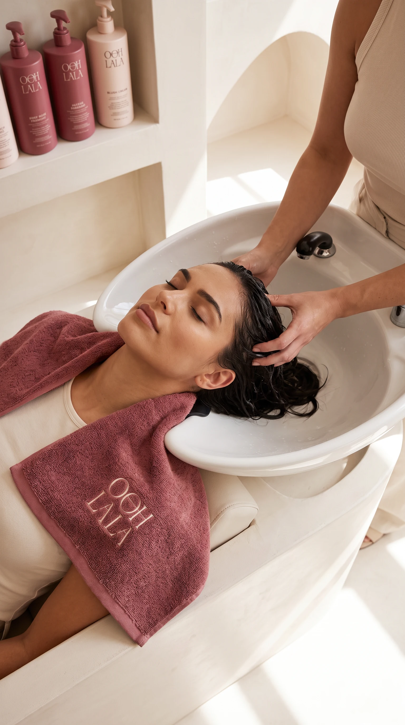
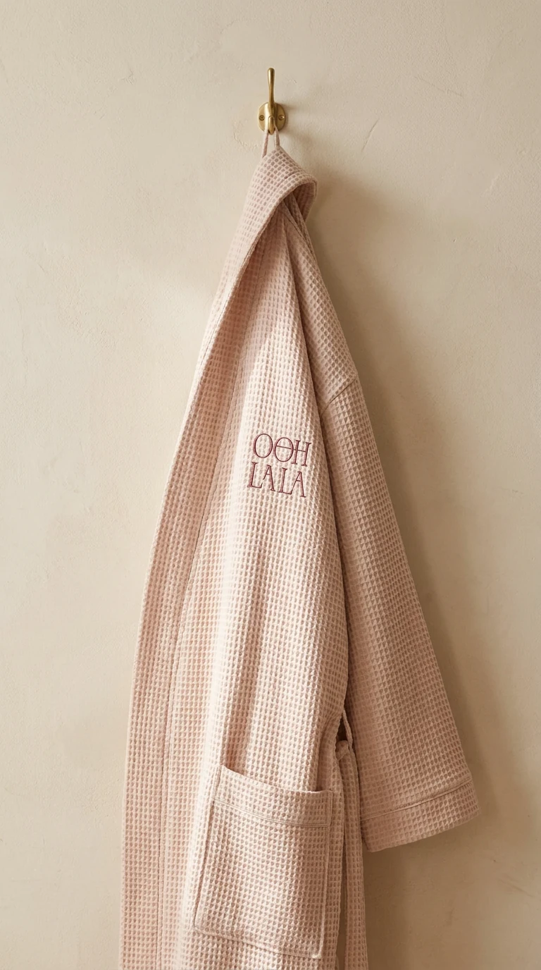
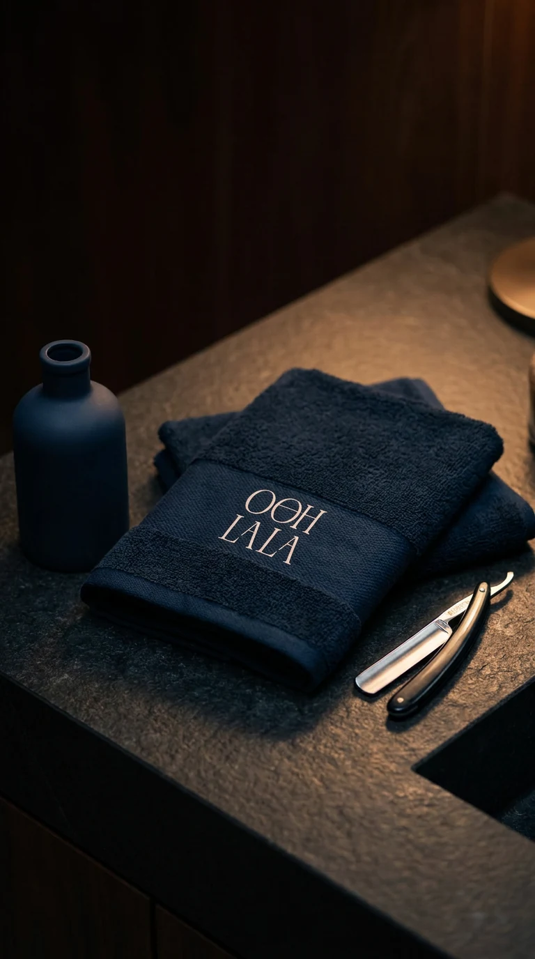
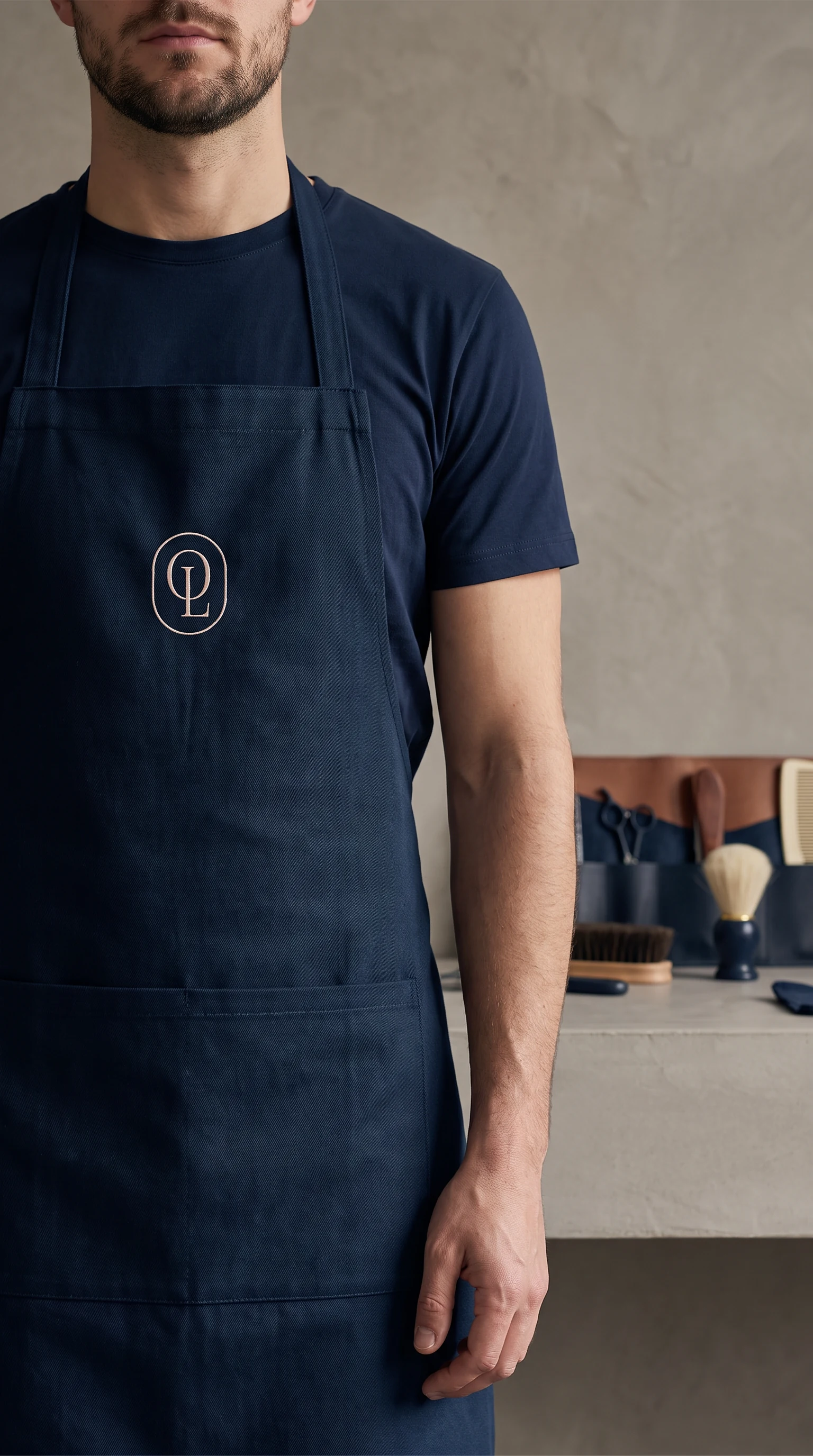
Towels, robes and aprons carry the mark embroidered rather than printed, always in the pair the room is not wearing. It reads at arm's length and vanishes at three metres, which is the correct amount of branding to put on a towel.
- Towels
- wordmark, rose on blush
- Robes
- wordmark, tonal on blush
- Aprons
- monogram only, blush on navy
- Method
- embroidered, never printed
Navy glass,
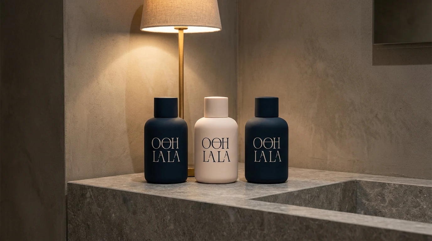
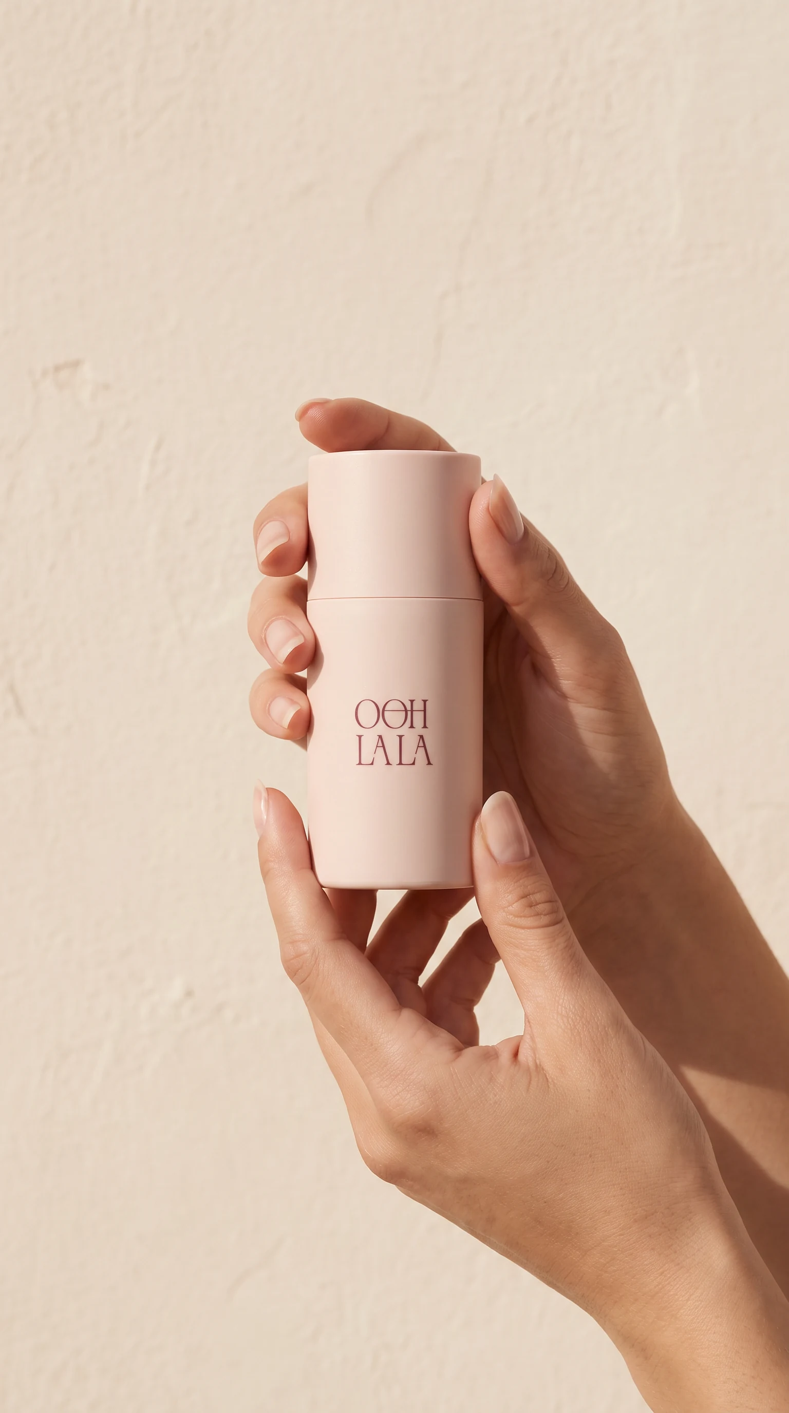
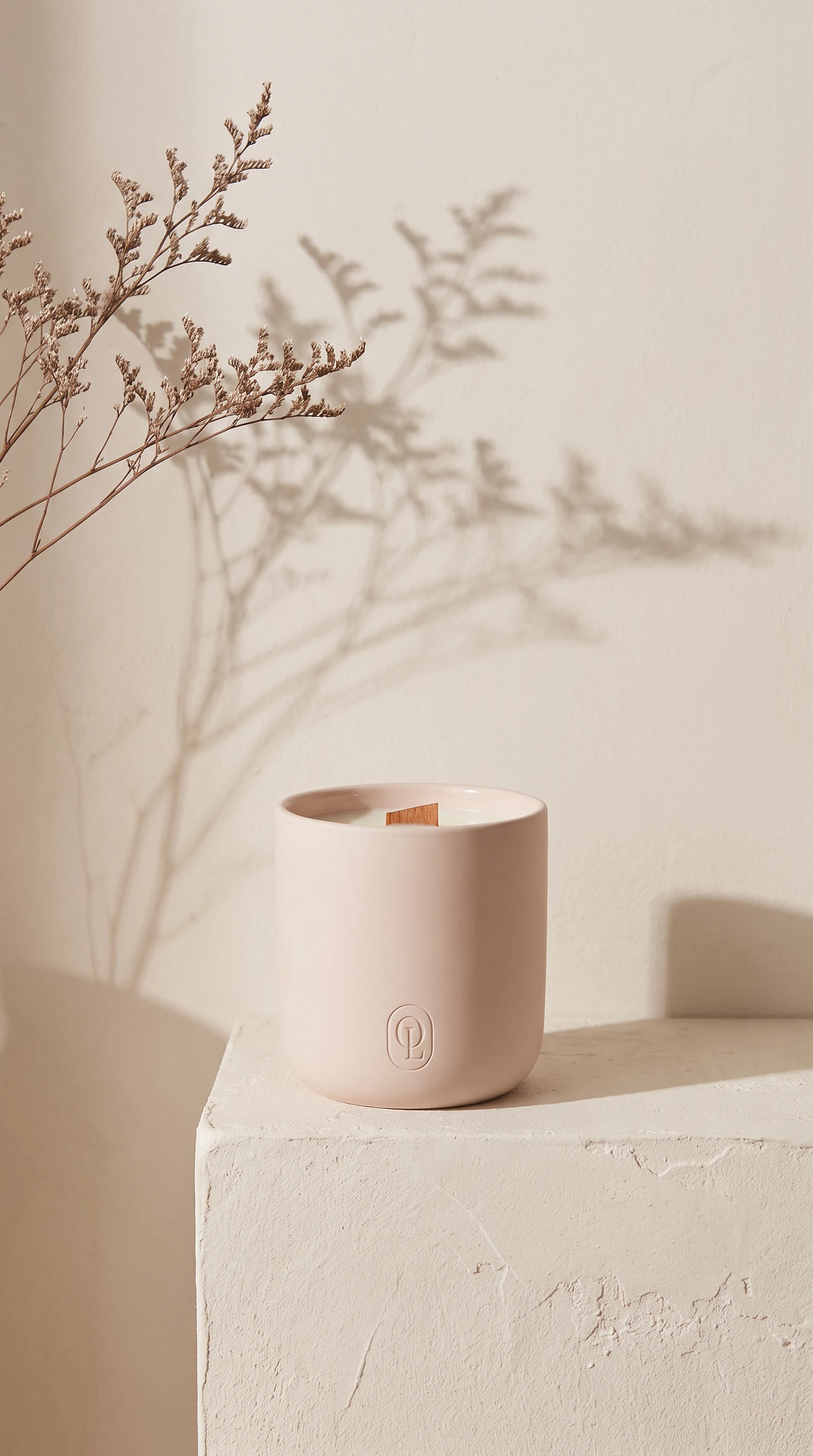
blush ceramic.
The retail line splits the palette the same way the signage does: the monogram alone on the small formats, the full lockup only where there is room for the descriptor under it.
One line, and a door you can see from the road.