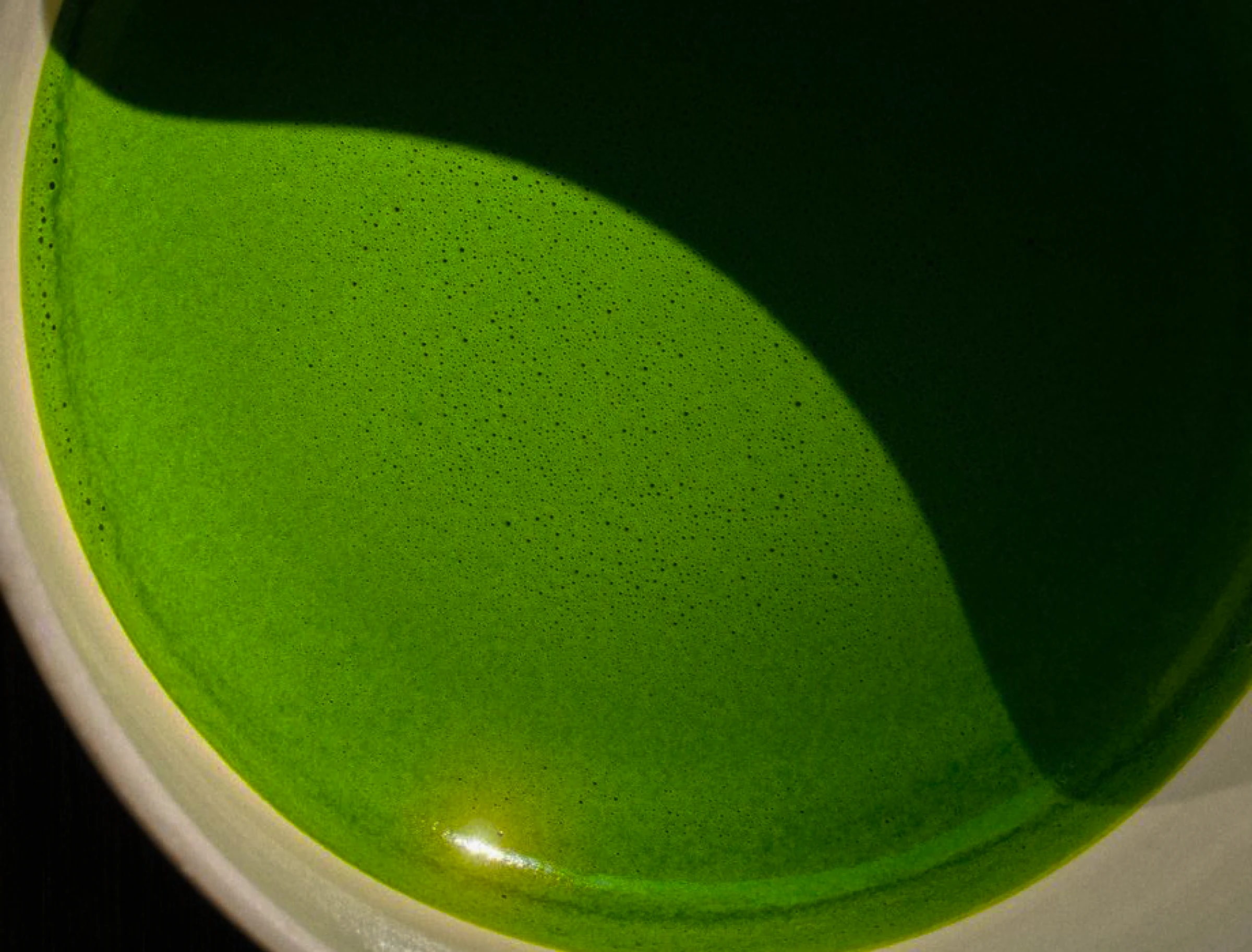
Matcha and Tea
A modern tea ritual, priced like one.
Atiya reimagines the ritual of matcha through a refined, minimal identity. Balance, craftsmanship and intentional simplicity, down to the tin.
- Client
- Atiya
- Year
- 2026
- Sector
- Café and beverage
- Scope
- Identity, packaging, art direction
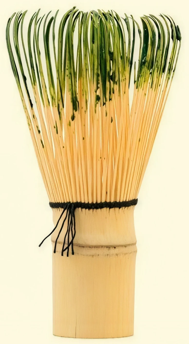
Born from the bamboo whisk.
The logo reflects it.
Five tines spreading from one carved base, drawn at the moment the whisk opens. That is the only moment in the ritual where the tool changes shape.
3 curves · 24 anchors · 1 gesture
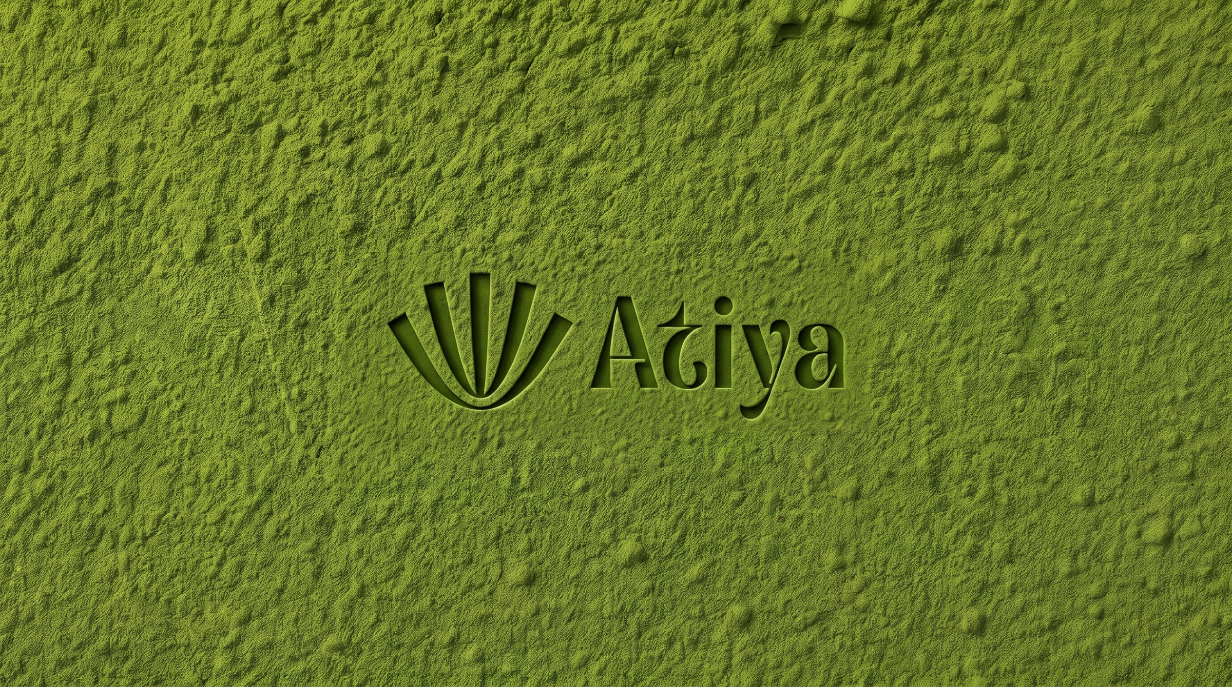
Ground stone, bright green.
Six colours and no more. Two greens, one warm brown for the bamboo, two near-whites and a single near-black. A café brand lives on printed cups, so every extra tint is one more thing a supplier can get wrong.

#6B814A
#844F2D
#4B5131
#FCFFF6
#1C1C1C
#FEFAE0
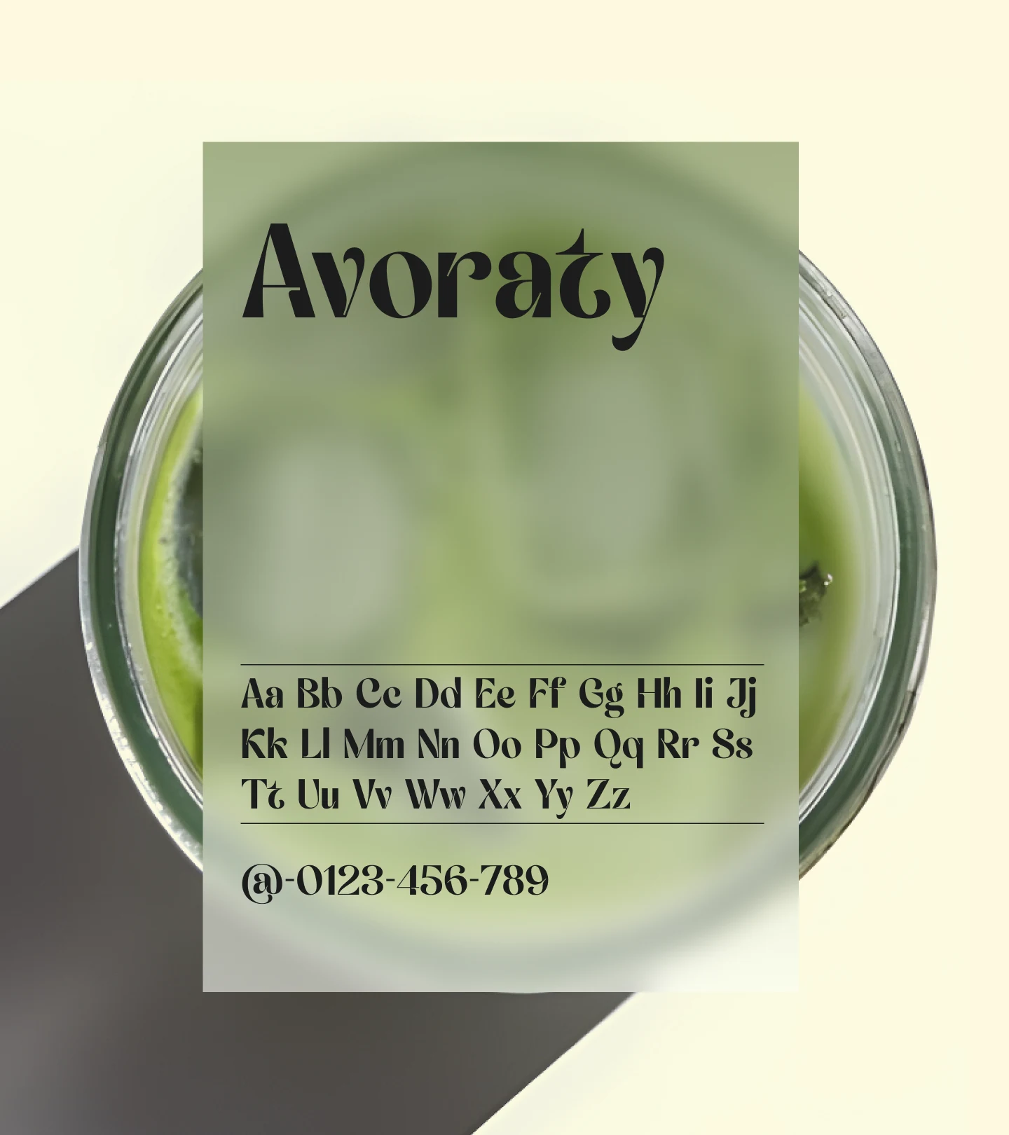
Avoraty, and nothing beside it.
One display serif does the wordmark, the menu, the tin and the price board. A second face would be a second decision every time somebody writes a sign.
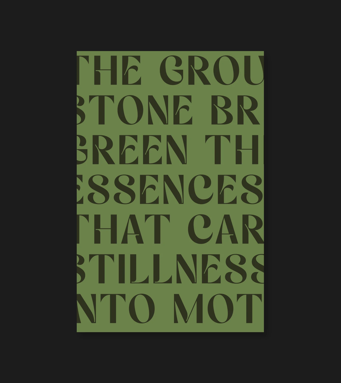
The ground stone bright green, the essence that carries stillness into motion.
From the Atiya brand book
A sanctuary in a cup. Matcha crafted for clarity and calm.
Atiya brings the ritual of matcha into modern life, offering serenity, balance, and indulgence in every refined sip.
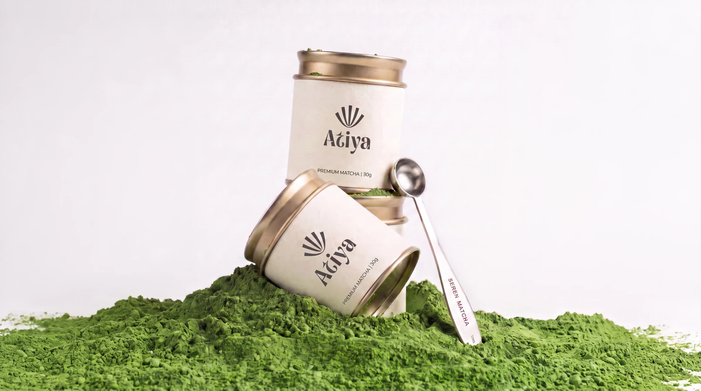
The thing they keep.
- Cream body, brushed gold lid, no varnish
- Symbol above wordmark, always centred
- One line of copy on the face, never two
- Ceremonial grade, thirty grams
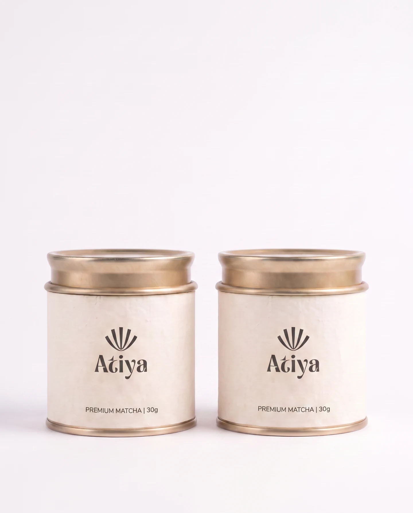
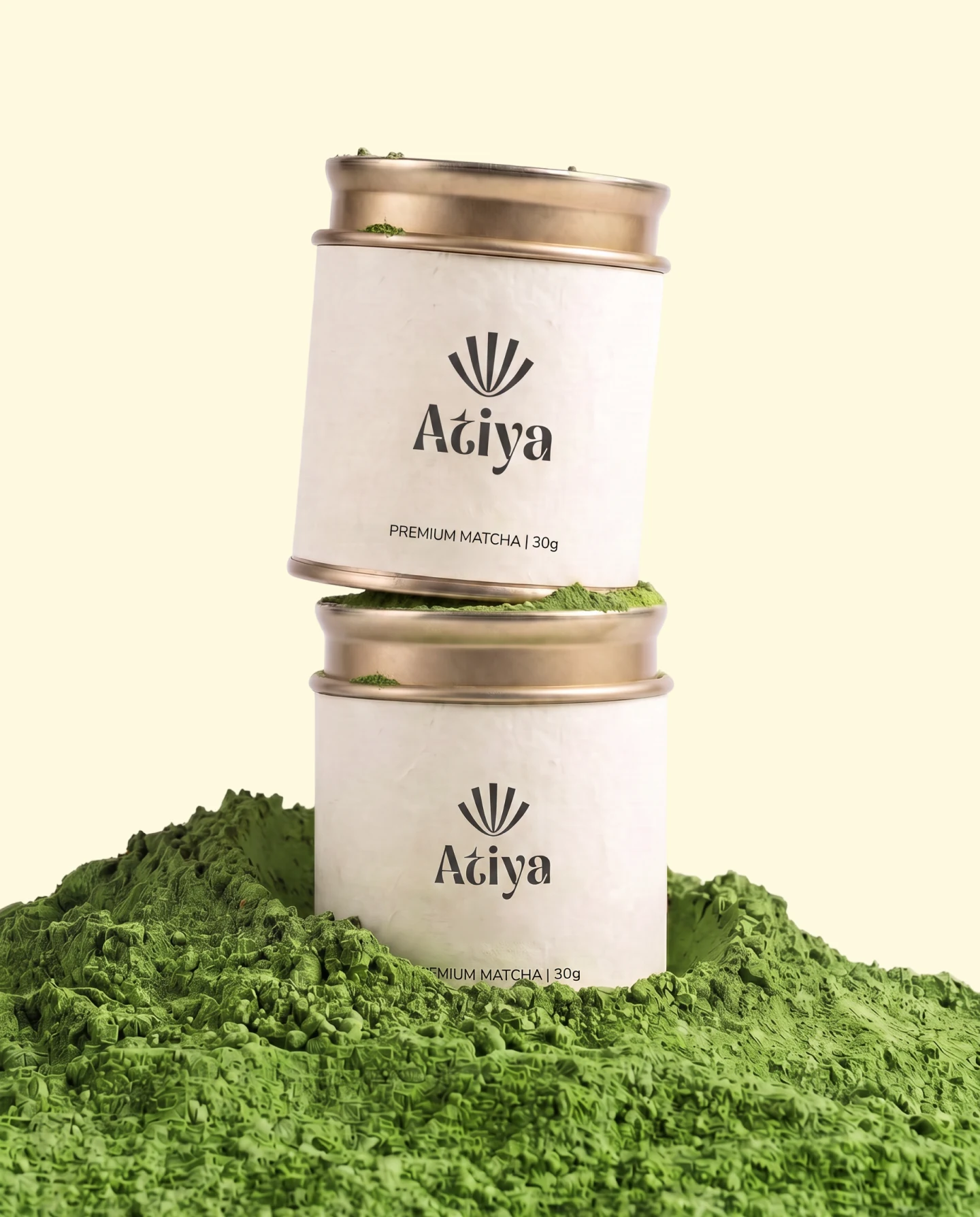
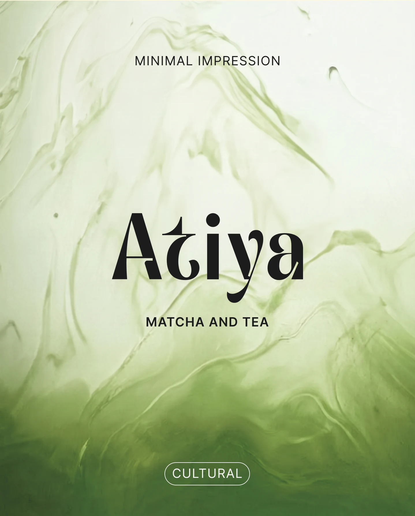
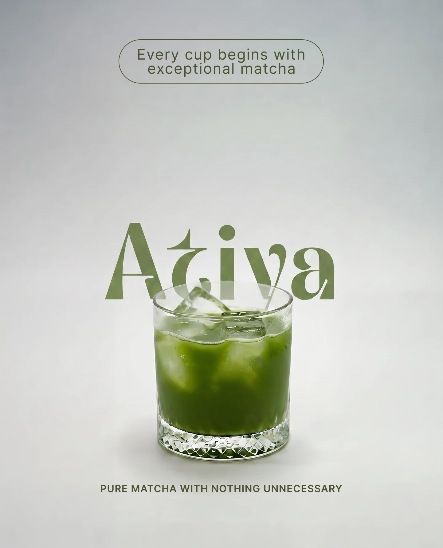
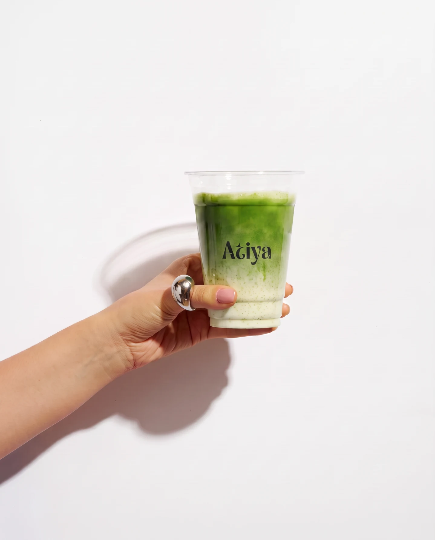
Pure matcha, with nothing unnecessary.
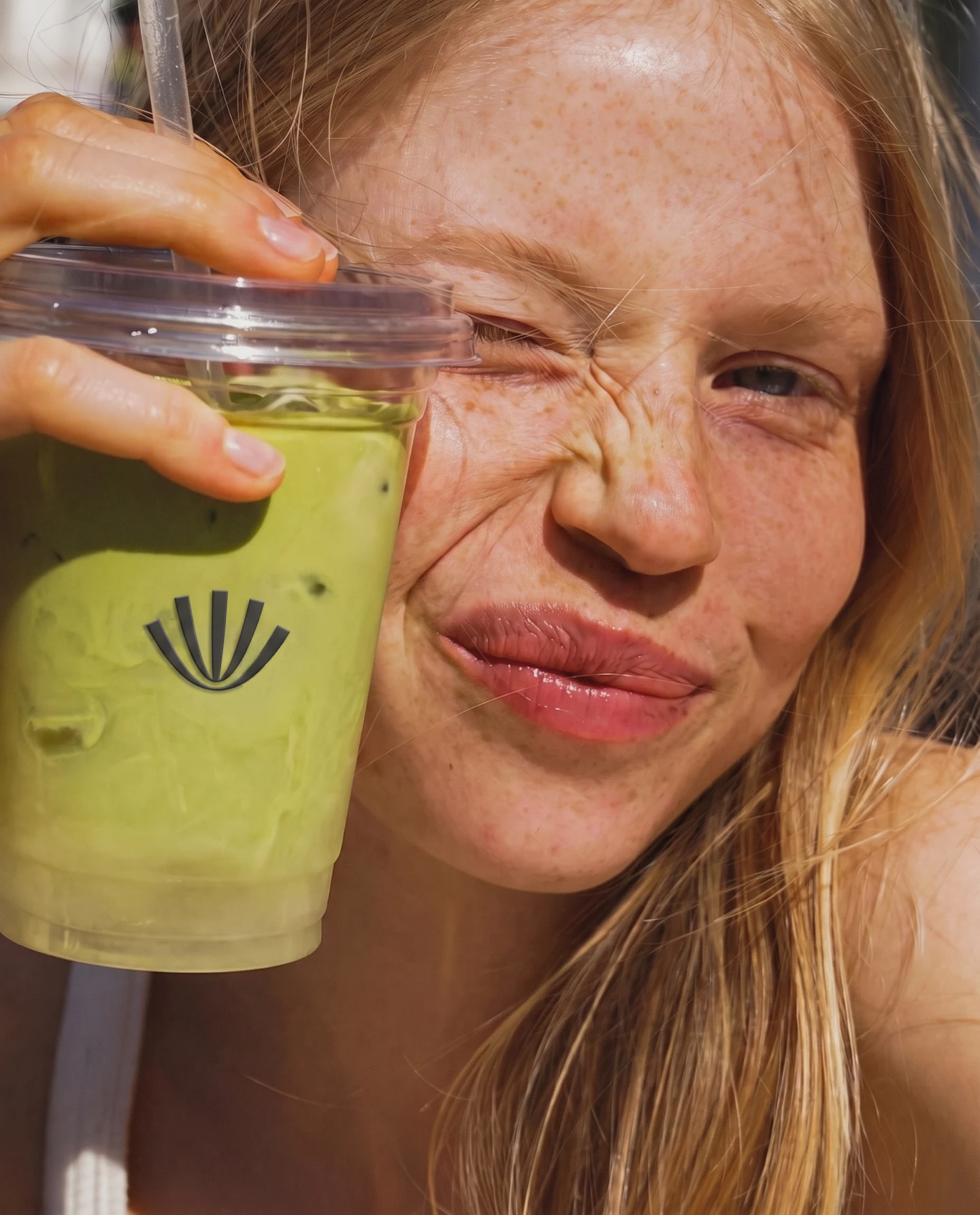
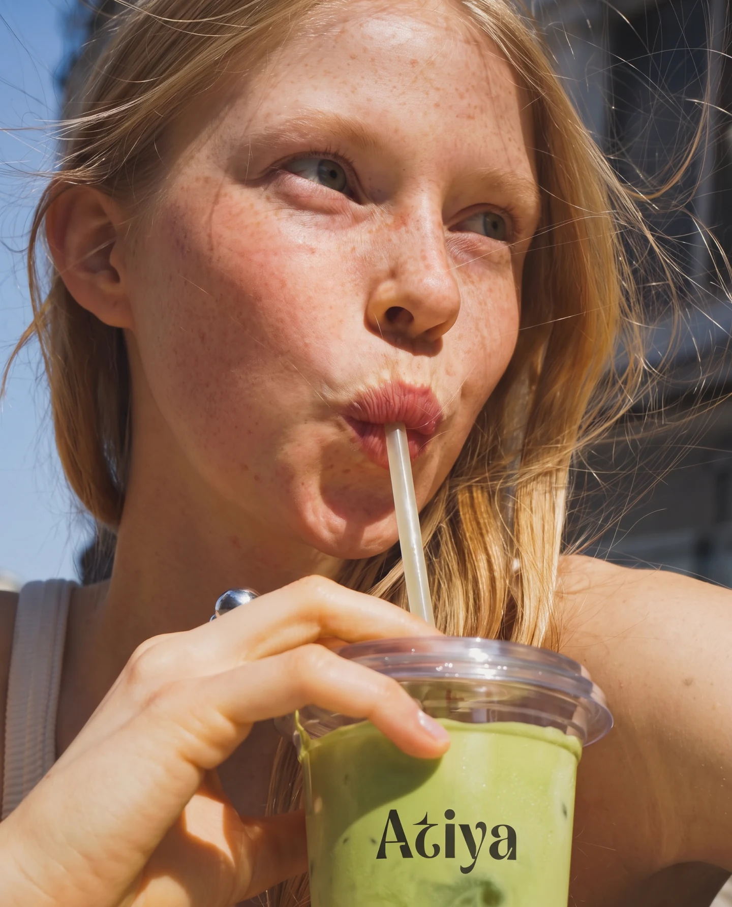
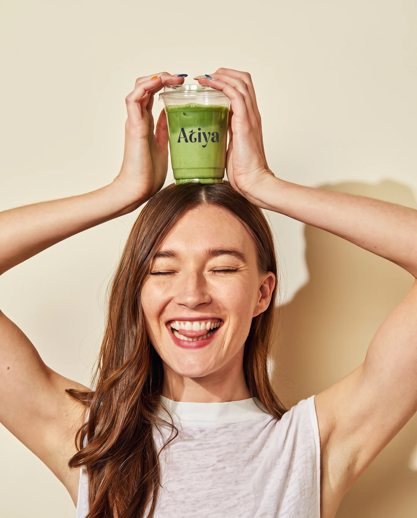
Held, carried, drunk from.
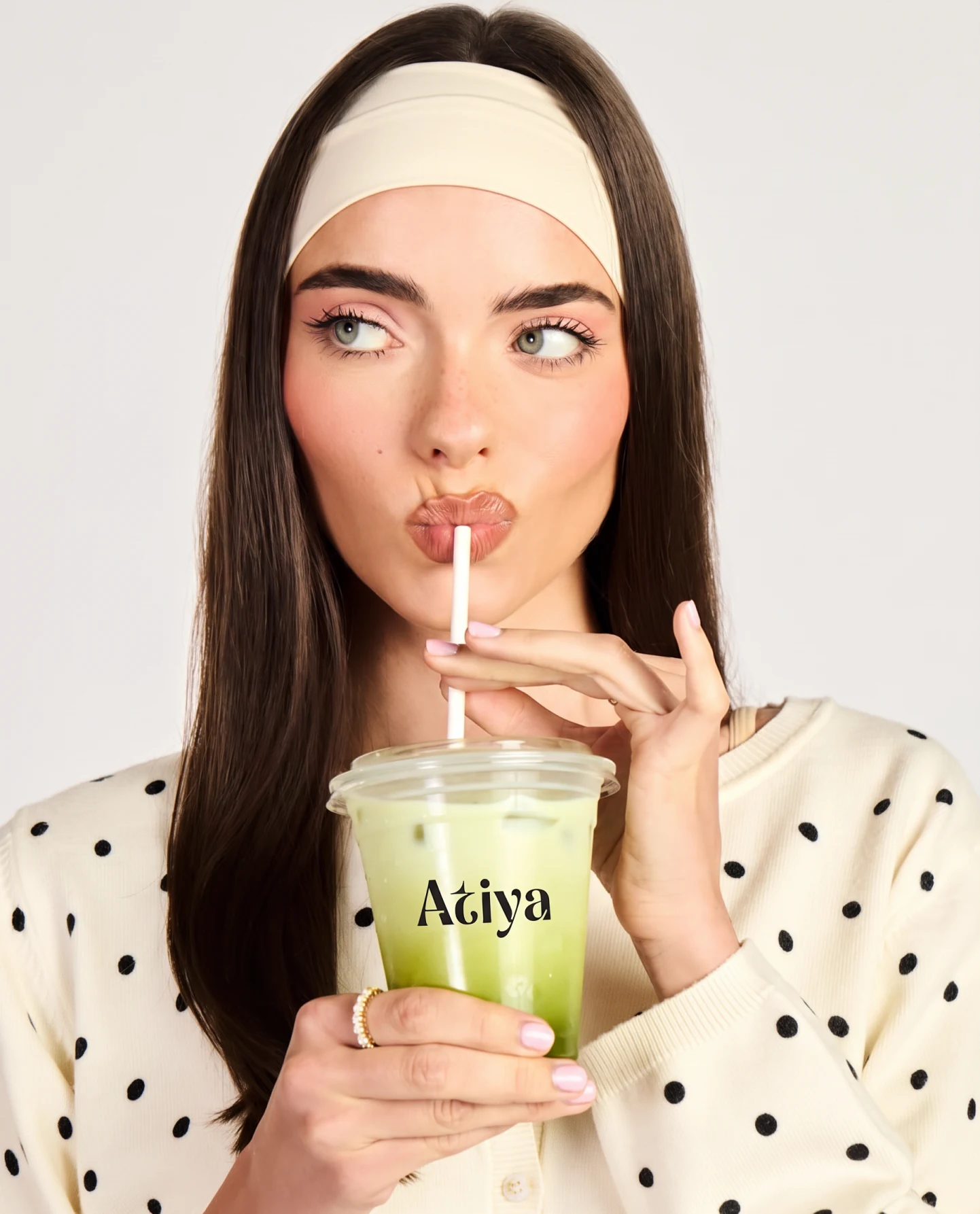
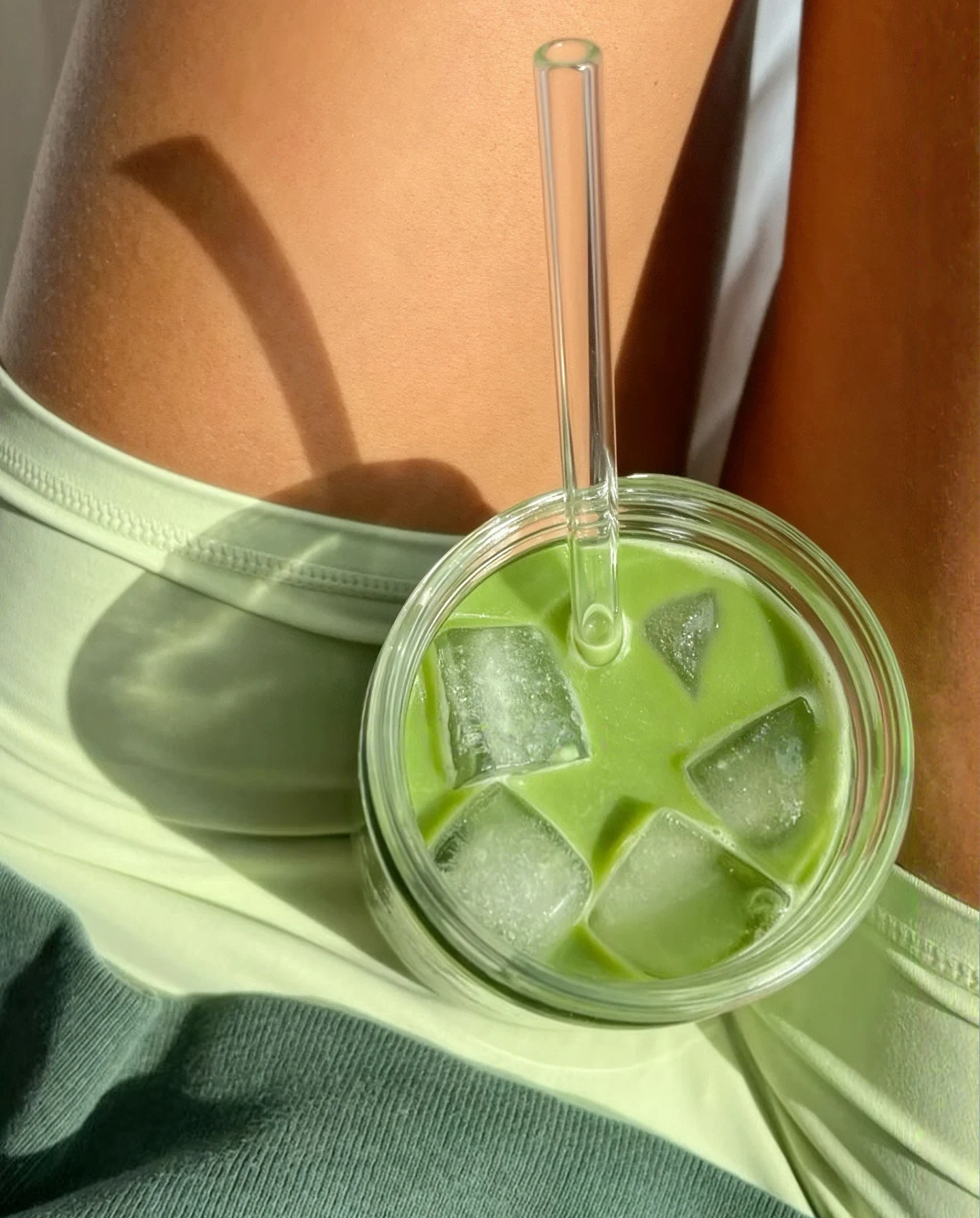
Shot in real hands in real daylight, not on a seamless. It is the difference between premium in a deck and premium on a table outside.
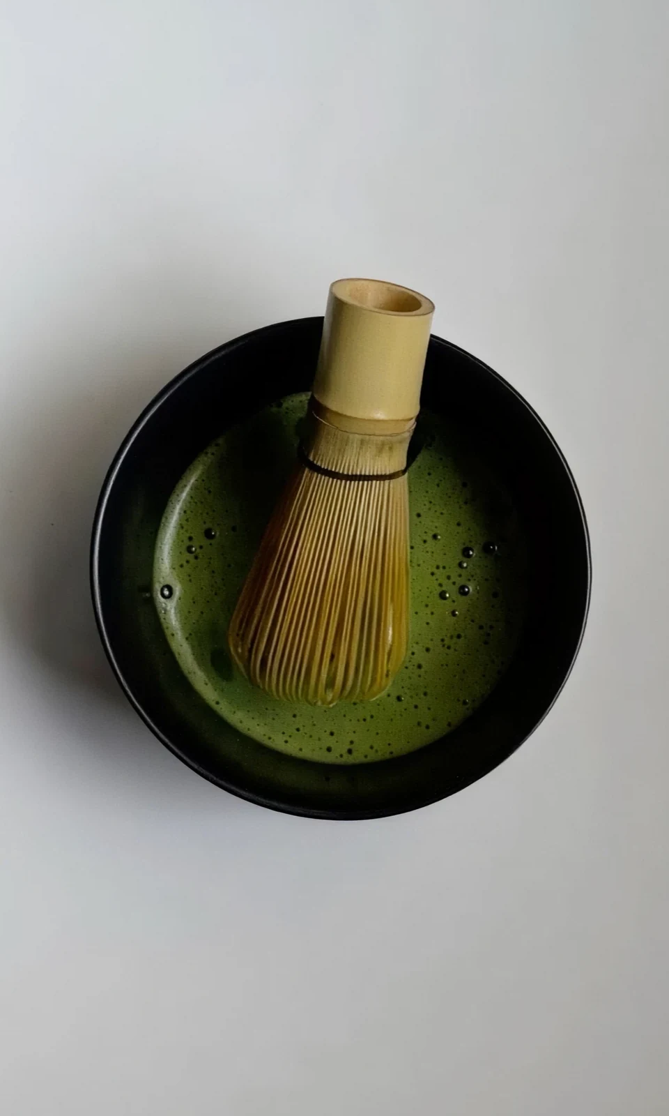
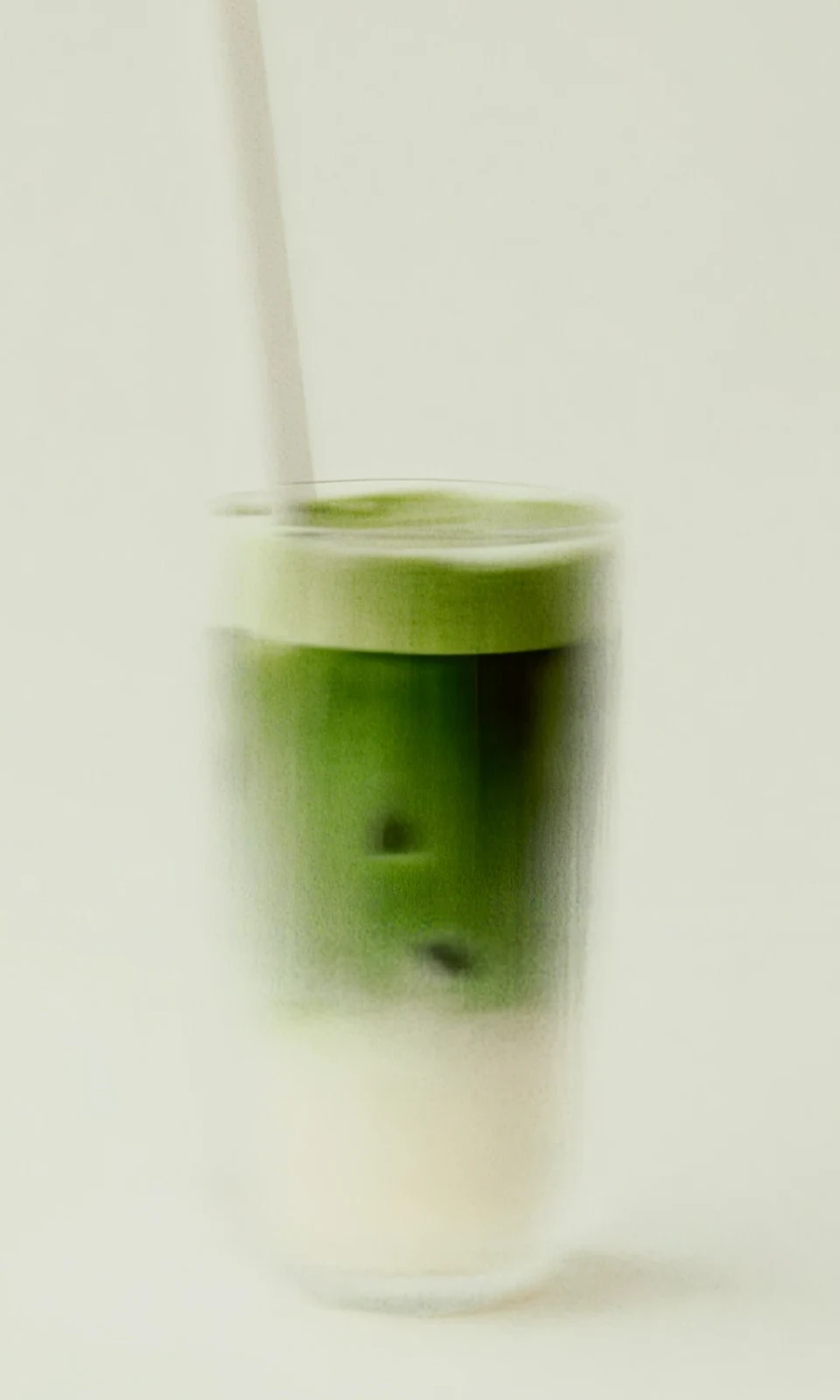
Two grams. Sixty millilitres. A W.
The method is on the tin, on the card and in the feed, unchanged. The consistency of the instruction is part of what is being sold.
2 g ceremonial matcha · 60 ml hot water
- 01Sift the matcha into a bowl.
- 02Add the hot water.
- 03Whisk in a "W" motion until smooth and frothy.
- 04Enjoy immediately.
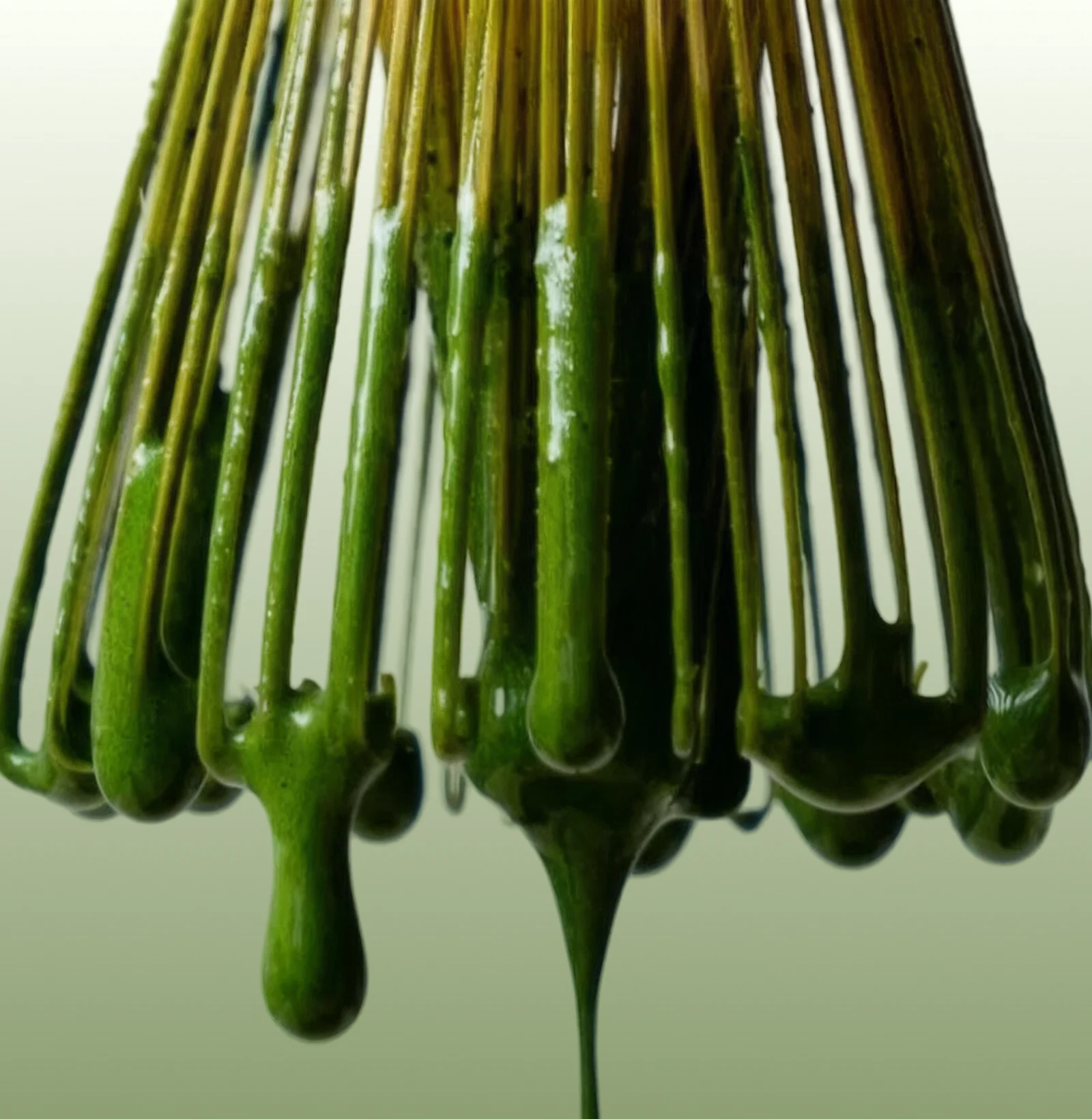
Every cup begins with exceptional matcha.
Identity, packaging and art direction, 2026

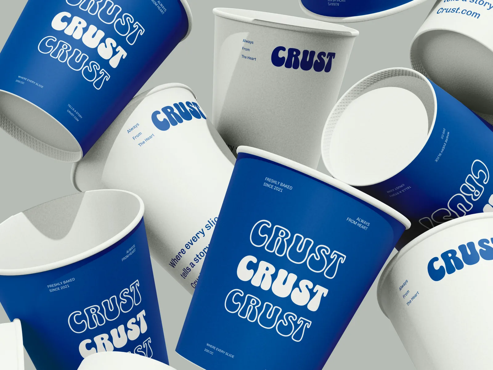
Three cards, one grammar.
Symbol top left, name beside it, picture takes the rest. Recipe, customer, product: a stranger scrolling past four posts in a week sees one brand rather than four.