Primary60
Medium Teal Blue
- Hex
- 0053A9
- RGB
- 0 / 83 / 169
9080706050
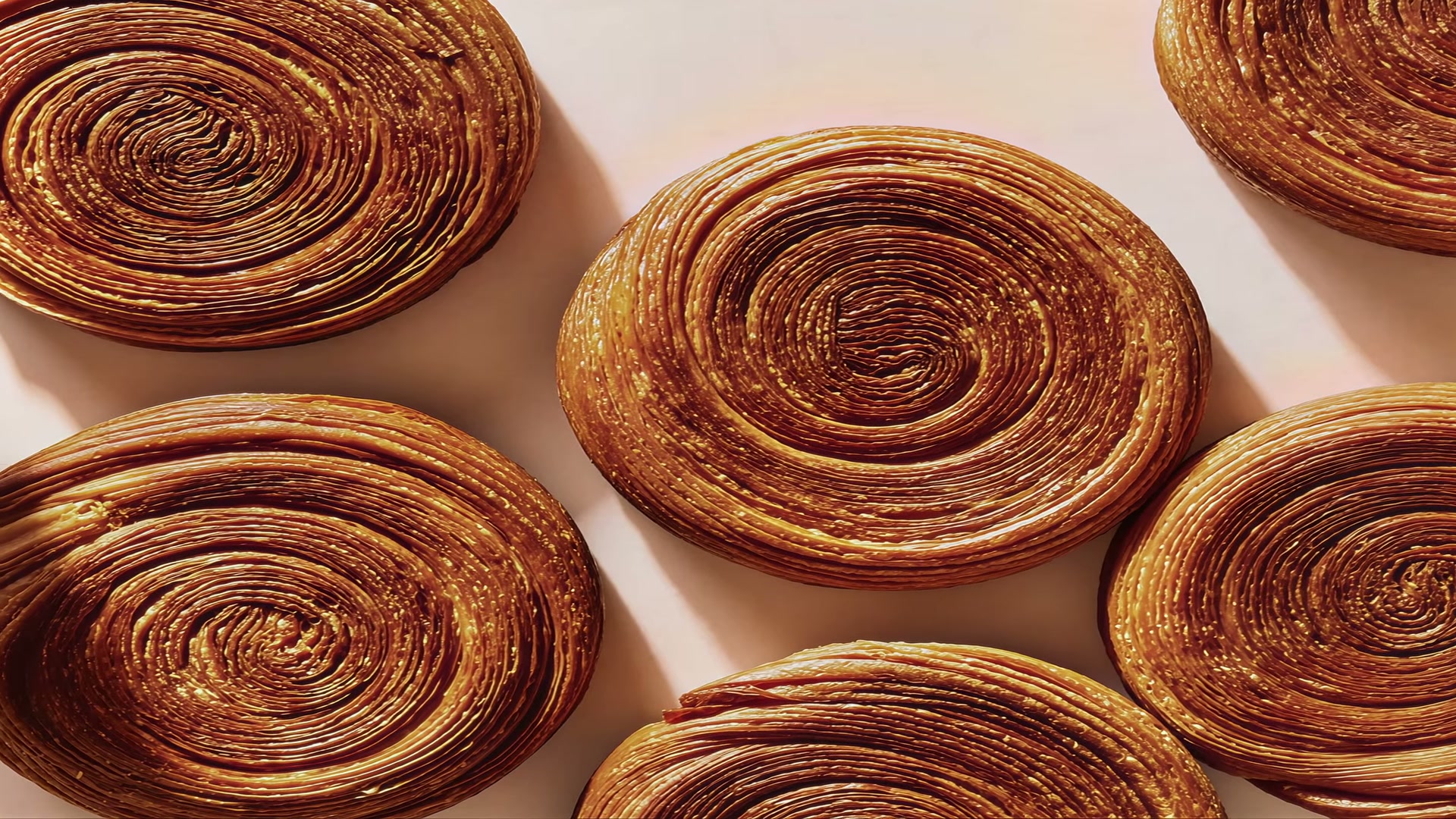
Slow made. Well loved.
A neighbourhood café bakery in San Francisco, built one flat sheet at a time.
The brief
Almost all of it had to be printed. A wordmark that survives a cup wrap, a bag fold and a shopfront is a different brief from a logo that only ever has to live on a screen.
The mark
Soft, fat, slightly overproofed letterforms, drawn rather than set. The lockup repeats itself and hollows out, so one mark fills a cup wrap without ever being redrawn.

Colour
One blue does the work. The dark and the off-white stay out of its way, and the ratio is printed on the cards so nobody has to guess how much of each.
How it was made
Bleed is what the printer trims off. Trim is the cut. Fold is where the sheet learns to be a box. Get one of the three wrong and the wordmark lands on a crease.
240 × 122 mm · 3 mm bleed · 200 cc
One flat rectangle, so the wordmark had to survive being rolled into a cone. The lockup sits off centre, above the seam.

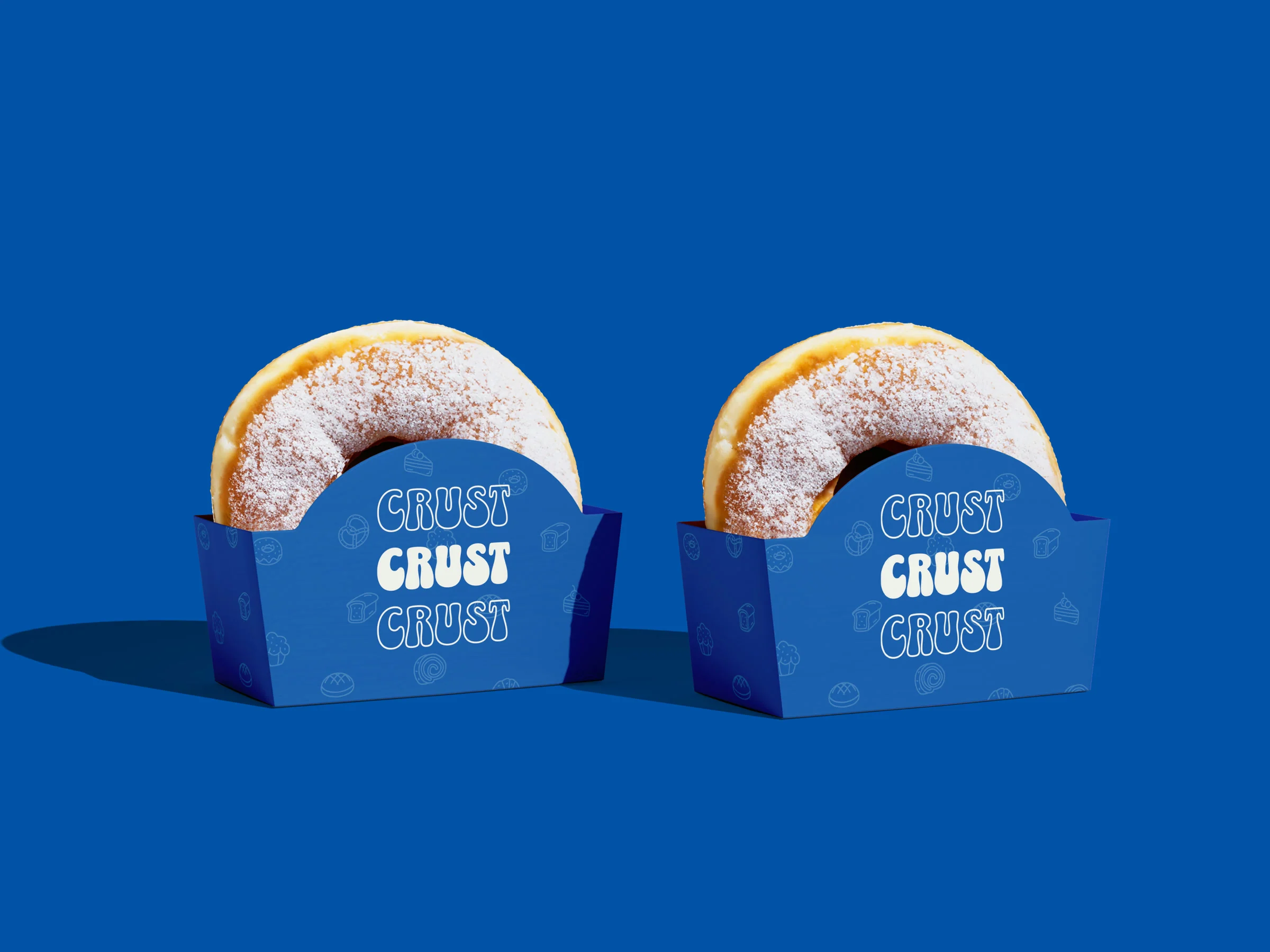
130 × 65 × 105 mm · arched face
The arch is not decoration. It is cut low enough that a doughnut shows above the rim, so the product becomes the label.
350 × 120 × 530 mm · flat handle
Four panels and a gusset from one sheet. The message runs across the fold so it reads whichever way the bag is carried.

In the world
The identity had to work at arm’s length, on a bag someone is already carrying.


The site
Menu, hours, reservations, and the same lettering, moving. This is the real thing, running, not a picture of it.
Slow made. Well loved. Your favourite café bakery.