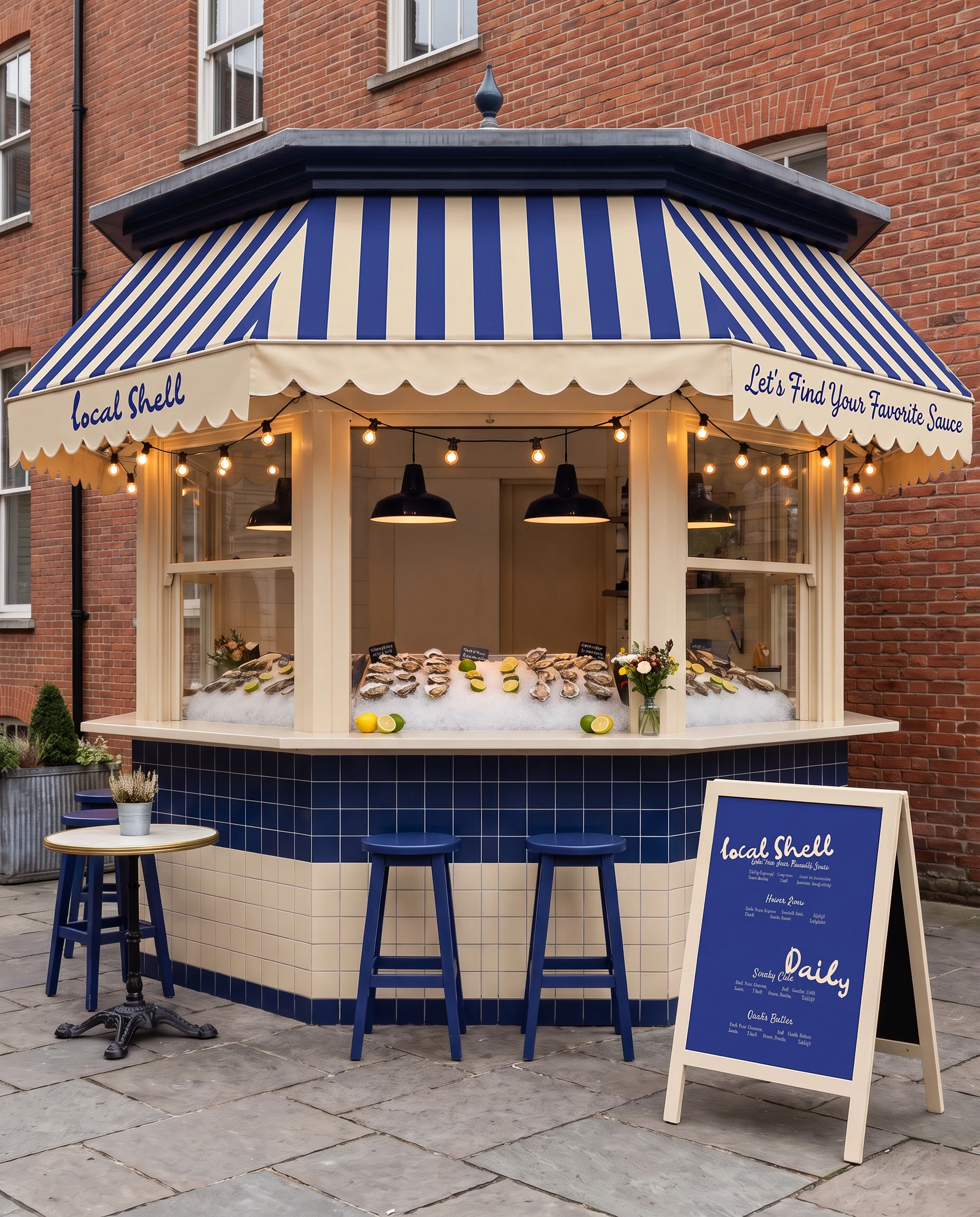
A raw bar built around one question, asked on the awning before you reach the counter. Three sauces, three colours, and an identity that is a different one depending on which you answer.
The question
So which one
are you?
Pick a sauce. The whole section repaints around the answer, because on the awning, on the board and on the sticker that closes your bag, that is exactly what it does.
Drawn,
not built.
An open oyster and a lemon wedge, inked in fifty-three strokes and never redrawn straight. The wobble is the point: everything else in the identity is flat colour and quiet type, so the mark is the only place a hand shows.
- Strokes
- fifty-three
- Weights
- one
- Colours
- one, on one ground
- Wordmark
- Morning Brew
Three colours,
four ways round.
Cream, blue and maroon, and the mark is drawn in each of them on each of the others. There is no accent and no fifth colour to reach for, so every surface commits to one pairing and the mark comes with it.
The coasters are live. One mask file, four grounds, and the pairings go round every couple of seconds.
Four coasters, one for each pairing: cream on blue, blue on cream, maroon on cream, cream on maroon.
The mark,
over and over.
Oyster, wordmark, oyster, wordmark, every other row nudged half a cell across. Blue on cream at full strength, because it wraps the boxes and lines the trays: it is a surface in its own right and never a texture behind something else.
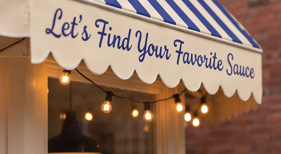
The question,
before the menu.
The line is lettered across the scallop of the awning and lit from underneath, so it is answered on the pavement rather than at the counter. Everything after this is the same sentence, printed smaller.
Three sauces,
and a way to say it.
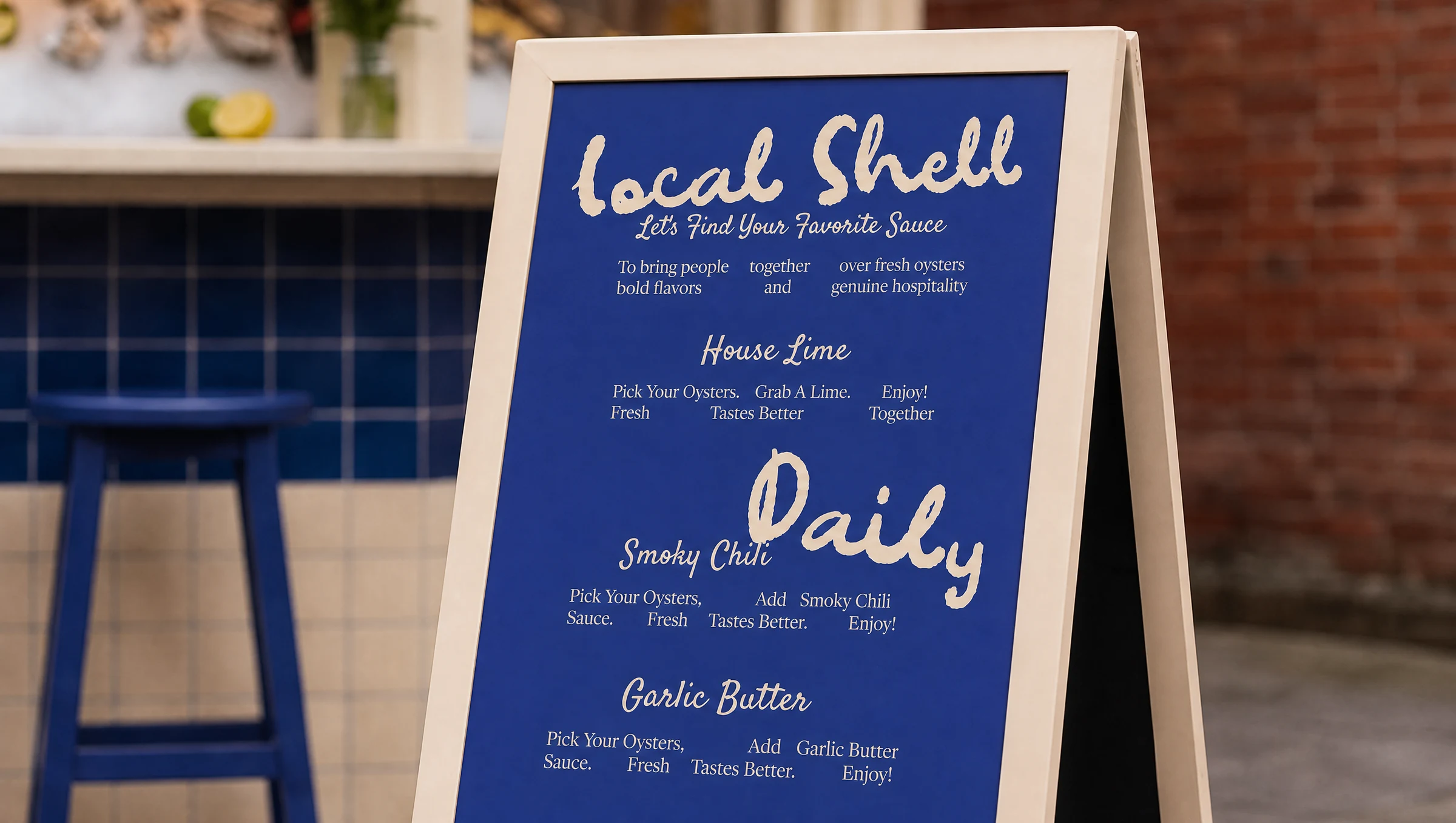
One sheet, printed two ways round. The name, the question, and the three answers with the same four words under each. Drag the handle: it is the same drawing on the other ground, which is the whole colour system in one gesture.
Local Shell. Let's find your favorite sauce. To bring people together over fresh oysters, bold flavors and genuine hospitality. Daily. House Lime: pick your oysters, grab a lime, fresh tastes better, enjoy. Smoky Chili: pick your oysters, add smoky chili sauce, fresh tastes better, enjoy. Garlic Butter: pick your oysters, add garlic butter sauce, fresh tastes better, enjoy.
Rebuilt, not photographed. The whole board is the poster's own vectors on a brand ground, so both colourways are one file and the swipe is between two live compositions.
A counter,
an awning, a board.
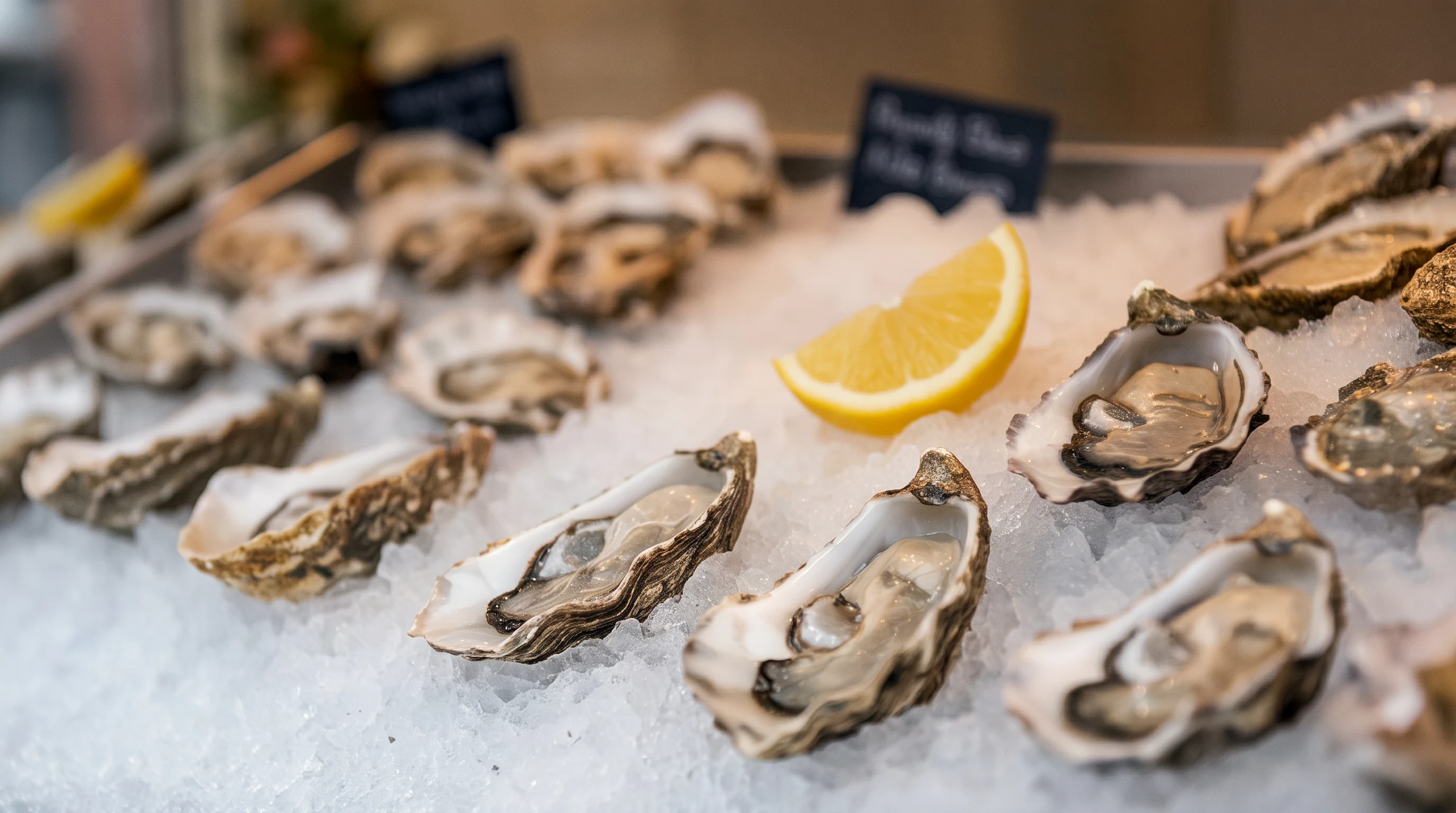
There is no shopfront to design, so the identity has to work on three surfaces: a strip of awning, a tiled counter and a board on the pavement. Each one carries a different part of the message and none of them repeats another.
- Awning
- the question
- Counter
- the blue, and the ice
- A-board
- the three answers
- Card
- what it costs
Three stickers,
stuck on by hand.
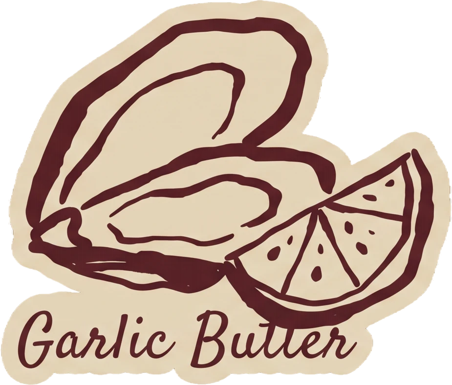
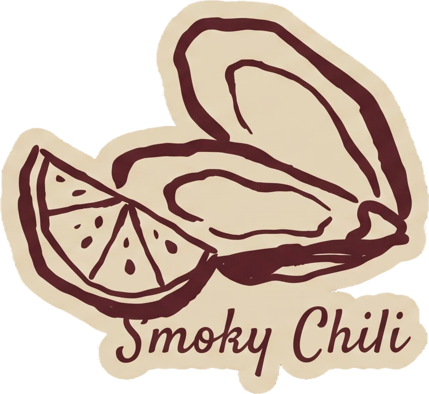
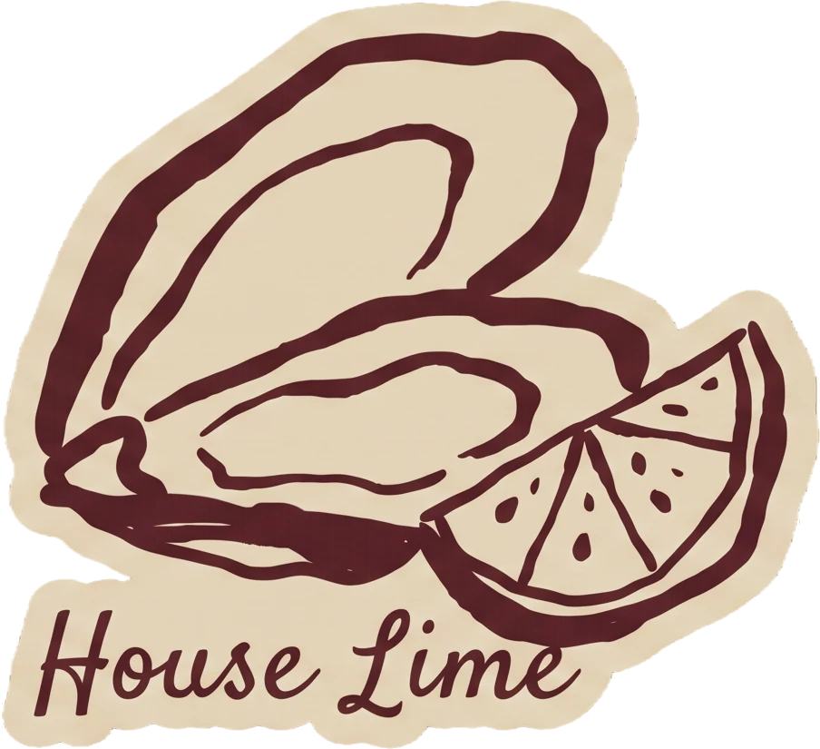
One die-cut per sauce: the oyster in maroon on the same cream as the menu, with the name underneath in the brush script. They close the bags, they mark the pots, and they are how somebody remembers which one they picked.
Shot the way they are used. Three frames to land, then a two-pixel boil at eight frames a second, because paper never holds still.
Pick again
Now you know what they are.
The same control, second time round. The first pass was a colour trick; this one is a choice, because the menu has been read and the three names mean three different things.
The three pots
are the brand.
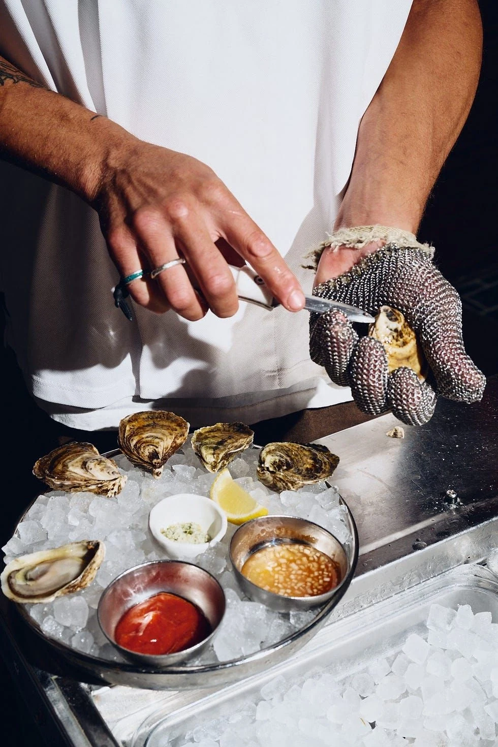
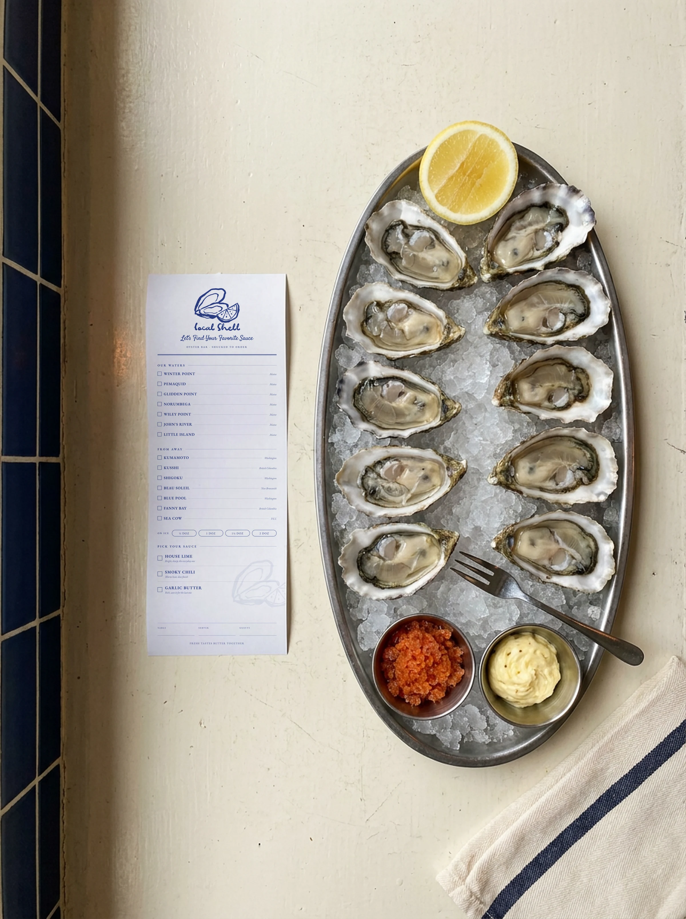
Everything the identity says out loud comes down to what is sitting on the tray beside the ice. Lime, chili, butter. The rest of the system exists to get somebody to the moment where they choose one.
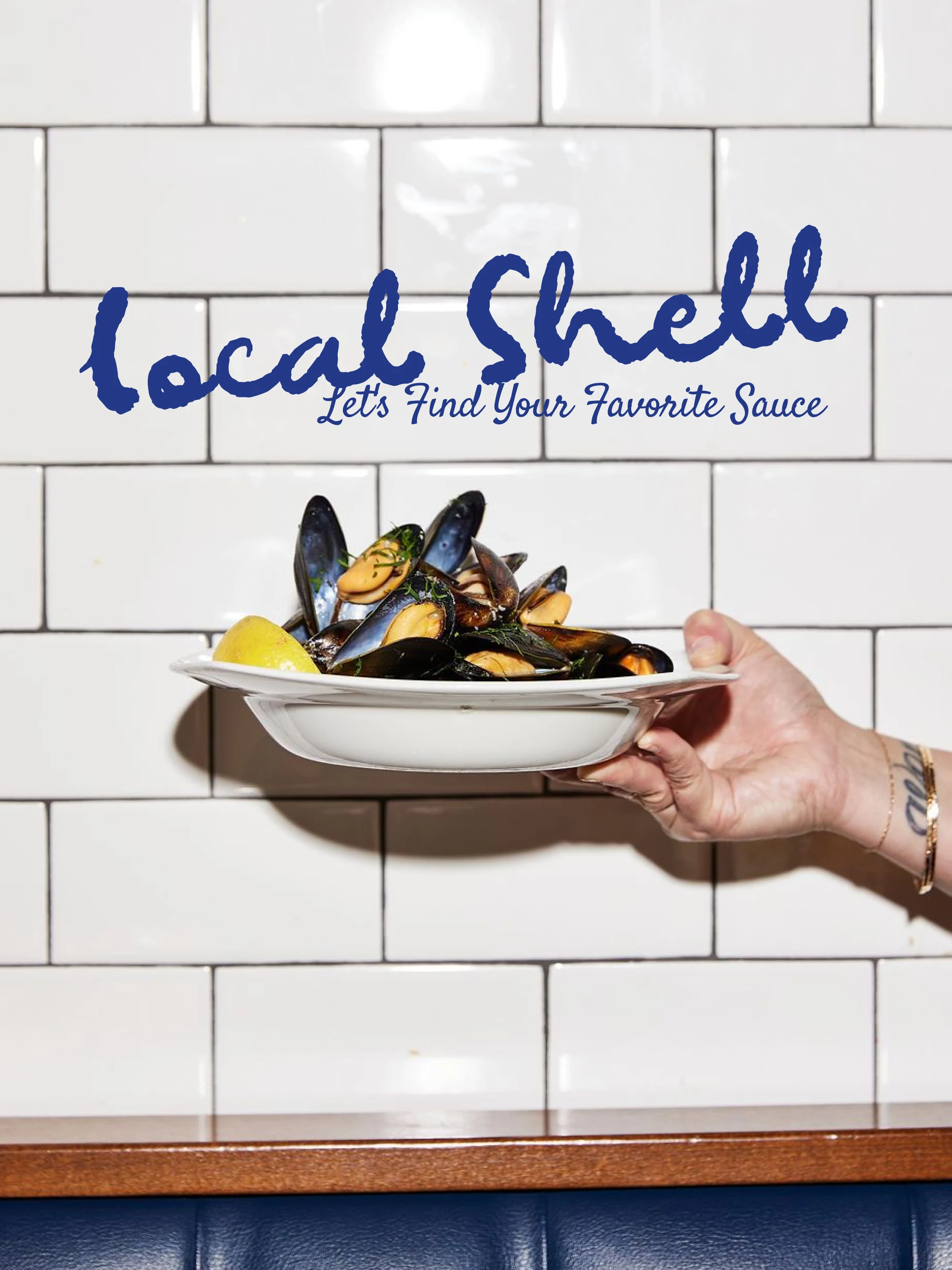
The wordmark and its line painted straight onto the tile, at the height a plate is carried past them.
And the check, which is the smallest thing in the system and the one everybody takes home.
Fresh tastes better together.